The woes of date input
Publikováno: 19.1.2016
One of the many new input types that HTML5 introduced is the date input type which, in theory, should allow a developer to provide the user with a simple, usable, recognisable method of entering a date on a web page. But sadly, this input type has yet to reach its full potential. Briefly, the date […]
One of the many new input types that HTML5 introduced is the date input type which, in theory, should allow a developer to provide the user with a simple, usable, recognisable method of entering a date on a web page. But sadly, this input type has yet to reach its full potential.
Briefly, the date input type is a form element that allows the capture of a date from a user, usually via a datepicker. The implementation of this datepicker is up to the browser vendor, as the HTML5 specification does not tell vendors how to implement the input’s UI.
The input itself can of course be used without using any of its available attributes:
<label for="when">Date:</label>
<input id="when" name="when" type="date">
Or you can specify minimum and maximum date values via the min and max attributes, ensuring that a user can only choose dates within a specific range:
<label for="when">Date:</label>
<input id="when" name="when" type="date" min="2016-01-01" max="2016-12-01">
You can also use the step attribute to specify, in days, how a date can increment. The default is 1.
This of course is the theory and a fine reality it would be, if it were so but alas it is not.
Features
Rather than talk about browser support for the date input type, I will instead talk about the various features that are part of this input type:
The input field
Neither Firefox nor Safari support this input type; it is treated as a simple text field with no formatting and no special interaction.
Microsoft Edge has no special interactions and in fact the input field appears to be read-only.
Chrome and Opera have the same implementations which display a date placeholder (or date value if the input’s value attribute has been set) using the user’s system settings’ date format. There are also some controls that allow the user to clear the input field, some arrows to cycle up and down between values, and an arrow that will open a datepicker (see Figure 1). There are some WebKit prefixed pseudo selectors available that allow you to change the appearance of the various bits within the input date field.

The min and max attributes
All of those browsers that support the date input type also support the min and max attributes.
Chrome and Opera both work fine if both the min and max attributes are set, but the UI is poor when only one of them is set. In these browsers, the date input displays up and down arrows for the user to change each value (day, month, and year). If a date input has a minimum value set at today’s date, then if the user highlights the year and then clicks the down arrow, the year will change to 275760 as the arrows cycle between the valid values and, since no maximum has been set, the default maximum is used (see Figure 2). This has been reported as a bug but has been marked as “won’t fix” as apparently it is the desired behaviour, I disagree.

min value set but no maxSomething similar happens when only a max value is set in that pressing the up arrow will cycle around to the year 0001, which is the default minimum. Again this leads to a very confusing UX for the user, so please use both min and max where possible.
With Android, the setting of these attributes can cause some weird quirks with the datepicker.
The step attribute
None of the browsers tested support the step attribute.
The datepicker
Firefox and Safari do not support the date input type and therefore do not open a datepicker on desktop. But they do open a device’s native datepicker on mobile devices when the date input field receives focus.
Microsoft Edge opens a datepicker, but its UI is very poor (see Figure 3).

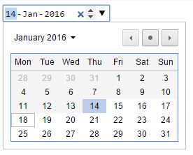
Chrome and Opera open a fairly decent datepicker on desktop but you cannot style it at all. It looks how it looks (see Figure 4), and there’s nothing that you can do about it, no matter what your designer says. With these browsers you can disable the native datepicker if you want and implement your own, but this will not work with mobile devices. This gives you the best of both worlds: you can implement a nicer datepicker for desktop and let a device use its own native datepicker.
All the native datepickers that I tested on Android displayed some sort of confusing display quirks when valid min and max attribute are set. A user is correctly restricted from selecting a date outside of the specified range, but the visual datepickers often display “previous”, “current”, and “next” values for day, month, and year, and the values displayed for “previous” are either empty (in the case of the month) or set to 9999 (in the case of the year, see Figure 5).

Events
Like most of the other input fields, the date input supports the input and changed events. The input event is fired every time a user interacts with the input field, while the change event is usually only fired when the value is committed, i.e. the input field loses focus.
For those browsers mentioned above that support the native date input field, no specific events are fired that will allow you to determine if the user has done anything “date specific” such as opened or closed the datepicker, or cleared the input field. You can work out if the field has been cleared by listening for the input or change events and then checking the input field’s value.
If you have an event listener set up for the change event and one for the input event, changed will never actually fire as input takes precendence.
Conclusion
So, what can we deduce from all this? Should we use the input date type or not? And as usual the answer is “it depends” as only you know what you’re building and how and where it will be used, so it might fit perfectly for your needs or it might not.
I think in general it’s safe to use the input date type on occasions where a min and max does not need to be set as the quirks when these attributes are used are too irritating to ignore. Since not all browsers support a datepicker and you will have to get one from somewhere else to support these browsers, I would also recommend turning off the datepicker for all desktop browsers (using the method linked to above) as this will still allow devices to use their own.
Have fun!
The woes of date input originally appeared on HTML5 Doctor on January 19, 2016.