Web3 Must Overcome Significant UX Challenges to Reach Mass Adoption
Publikováno: 12.11.2022
 User experience (UX) design affects nearly every waking moment of our lives. It’s not just digital either. Have you ever thought about the UX of doors? Perhaps a brief refresher of what UX is, will help. A useful definition of UX is as follows: ”A person’s perception and responses that result from the use or […]

User experience (UX) design affects nearly every waking moment of our lives. It’s not just digital either. Have you ever thought about the UX of doors? Perhaps a brief refresher of what UX is, will help. A useful definition of UX is as follows: ”A person’s perception and responses that result from the use or anticipated use of a product, system or service” (from The International Organization for Standardization).
The following opinion editorial was written by Bitcoin.com’s head of product experience Alex Knight.
Back to doors. We’ve all experienced a door that didn’t open the way it should. That’s a UX failure right there (there’s a name for such doors, search for “Norman doors”).
Thankfully Norman doors are rare, as are their computer software and web2 counterparts. Unfortunately, web3, still in its infancy, is rife with Norman doors. Until we fix most of these proverbial doors, web3 mass adoption is unlikely.
In this article I’m going to discuss three areas web3 needs to work on. Caveats: this list is not comprehensive and since my area of focus is web3 wallets I’m going to talk about UX challenges through that lens. The three areas are:
- Security
- Education
- Ease of use
Security
That security is vital for software that handles financial instruments is obvious. Two of the bigger security challenges right now are:
- Handling cryptographic keys
- Unintelligible crypto transactions.
I believe that self-custody is the most important concept in crypto. This is not to say everyone must use self-custody. However, that it always remains a viable option is critical. I direct you to Bitcoin.com’s CEO Dennis Jarvis’ article on the topic for a compelling defense of self-custody. So far, self-custody has meant users must manage cryptographic keys. An early UX advancement was using recovery phrases, sometimes called seed phrases, instead of handling cumbersome unintelligible cryptographic keys.

While recovery phrases improved upon cryptographic keys, recovery phrases have proven to also be pretty complicated. There is a constant drip of stolen crypto due to people not fully grasping the importance of their recovery phrases, for example exposing or losing them. This leads to the second security problem: unintelligible crypto transactions. In most crypto scams, people willingly enter into transactions they don’t fully understand that send their cryptoassets away.
Moving Away From Recovery Phrases
Many people are working on the problem of recovery phrases. Vitalik Buterin advocates something called social recovery wallets that don’t require recovery phrases. This concept has a lot of promise, though I believe a lot more work needs to be done to make it usable for most people.
Another tactic is to replace recovery phrases with something more familiar — passwords. Just as a recovery phrase (set of random words) is more familiar than a cryptographic key (string of hexadecimal characters), a password is more familiar than a recovery phrase.
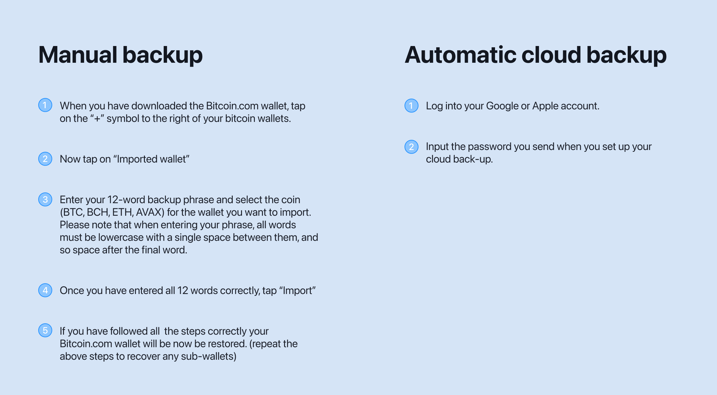
We offer automatic cloud backup services. Create a single custom password that decrypts a file stored in your Google Drive or Apple iCloud account. If you lose access to your device, you can reinstall the Wallet app on a new device, enter your password, and you’ll again have access to all of your cryptoassets. By creating a mix of encryption and cloud services tied with custodial services to help retrieve things, we can maintain a self-custody service while leveraging centralized technologies to lower the burden on the user. The ease-of-use of automatic cloud backup compared to manual backups through recovery phrases is easy to visualize:
Human Readable Transactions
Wallets need to get better at warning users of unintended outcomes of transactions. For example, a common approach is to get users to sign a ‘SetApprovalForAll’ transaction, which allows an adversary to transfer assets out of your wallet into theirs. Wallets should alert users when this kind of transaction comes up, describing the dangers clearly.
Even better, wallets could present users with a more human-readable summary of potential asset changes transactions allow. For example, you might think you are swapping one asset for an appropriate amount of another, when in fact you are swapping all of your assets for nothing. The following helps visualize better what assets a potential transaction can change.
Education
There are two ways that most people first interact with blockchain technology: a centralized exchange and a self-custodial software wallet. The first time people interact with a blockchain “directly” will almost always be through the latter. Software wallets entail a large amount of responsibility and an even larger challenge in easing new users into the “deep end” of crypto – decentralized finance (DeFi).
Education is a major component of this. It’s essential for providing the right opportunities for users to upskill and build towards full self-custody and safely move away from reliance on centralized support. People being more comfortable/safe with crypto will help increase adoption and utility as it becomes a more viable alternative to traditional finance. The abundance of technical jargon doesn’t help. As is common with most new technology, early adopters are usually extremely technical.
Continuing Education
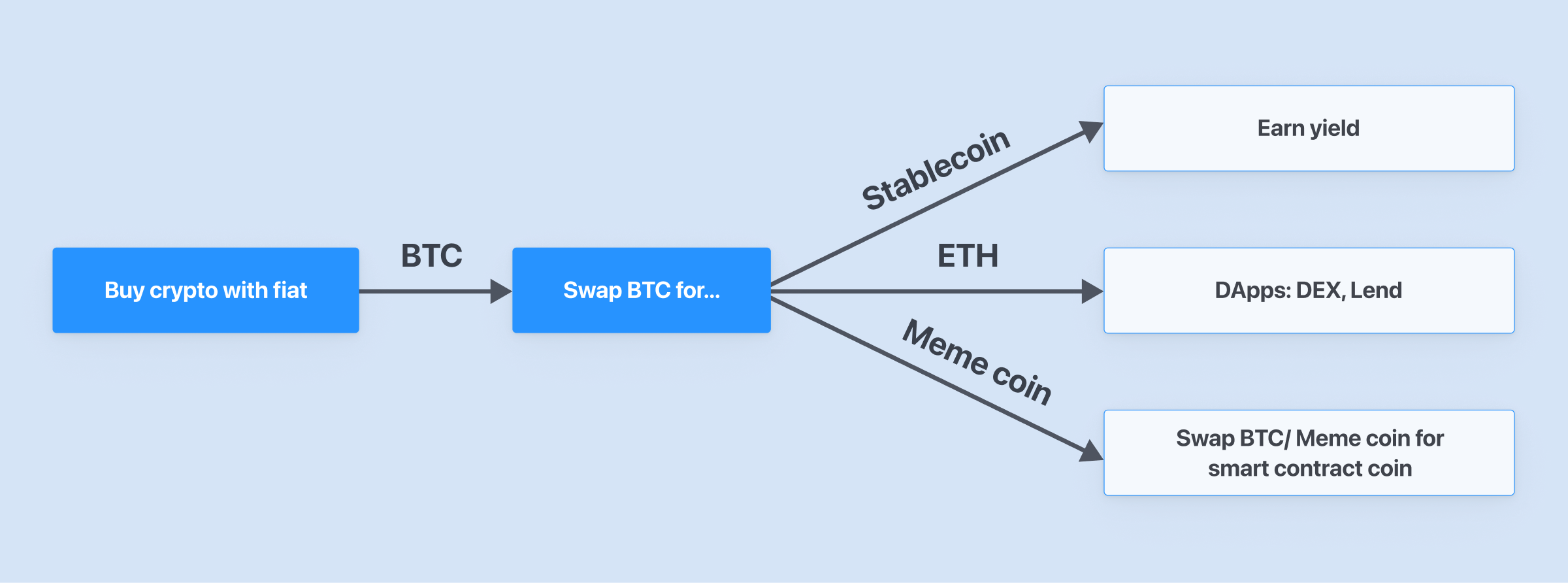
Every action your wallet has should keep in mind a future action that you wish the user to take. For example, let’s assume that the first action a new user should take upon downloading the wallet is buying crypto with fiat. You don’t want to overwhelm new users with hundreds of choices. It’s probably prudent to only give new users a curated list to purchase, with an option of the fully expanded list.

First actions, such as buy, should lead to a chain of in-app prompts/notifications/emails to try other actions like swap. Swapping is a big step from buying since every action in a DApp requires paying a transaction fee in the blockchain’s native token, something that has no analog in web2.
Jargon
Wallets are full of technical jargon that is non-descriptive to most people. A great example of this is “non-custodial wallets.” What does this mean? It has recently been adjusted to “self-custody” which is better, but still not perfect. Another is “multisig wallet.” Even knowing the full meaning, “multiple signature wallet,” will not tell already-knowledgeable people what it means. Even users who persist, digging deeper by reading full explanations, will probably have some difficulty understanding what it is and how to use it. At Bitcoin.com we use “shared wallets,” which we believe anyone can understand while not compromising the original meaning.
Ease of Use
This last category is not only one of the biggest issues we face, but is interwoven into the previous categories. As crypto matures, it must find a wider audience. The developer-driven process must make room for design. We are slowly starting to see a shift to more design-driven solutions, but there is a long way to go. Let’s look at a couple of examples, starting with mulitsig wallets.
No new user will be able to guess the usefulness of these from that name. Worse still, even advanced crypto users don’t use them because of complicated interfaces. This is tragic, because, like Vitalik Buterin co-founder of Ethereum says, multisig is likely the safest way to store your cryptoassets.
IMO fancy hardware stuff is all overrated and most people should just store the bulk of their coins in a multisig (>= 5 participants) where most of the keys are held by trusted family and friends.
— vitalik.eth (@VitalikButerin) August 14, 2022
Shared Wallets
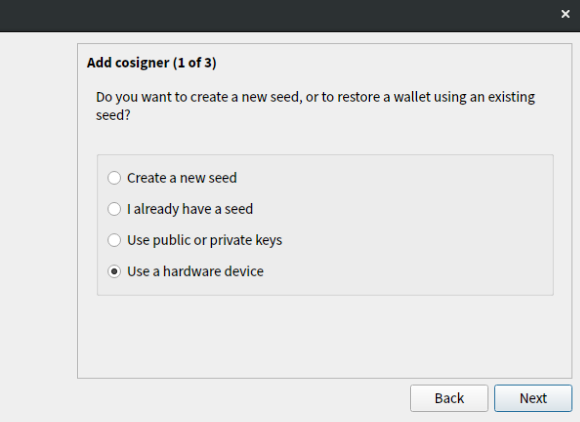
First, “multisig” needs to be retired. Next, multisig options need to be stripped out for most users. Most people would abandon the process when met at a screen like this:
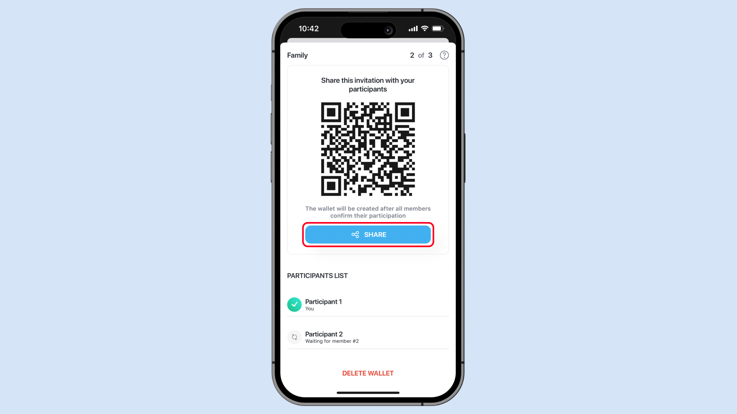
Sharing the newly created wallet should be as seamless as possible, unlike this:
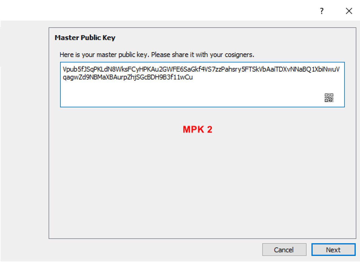
The QR code is enough, extraneous info like the public key can be taken away:

A “share” button makes it even easier for users.
Human Readable Send Transactions
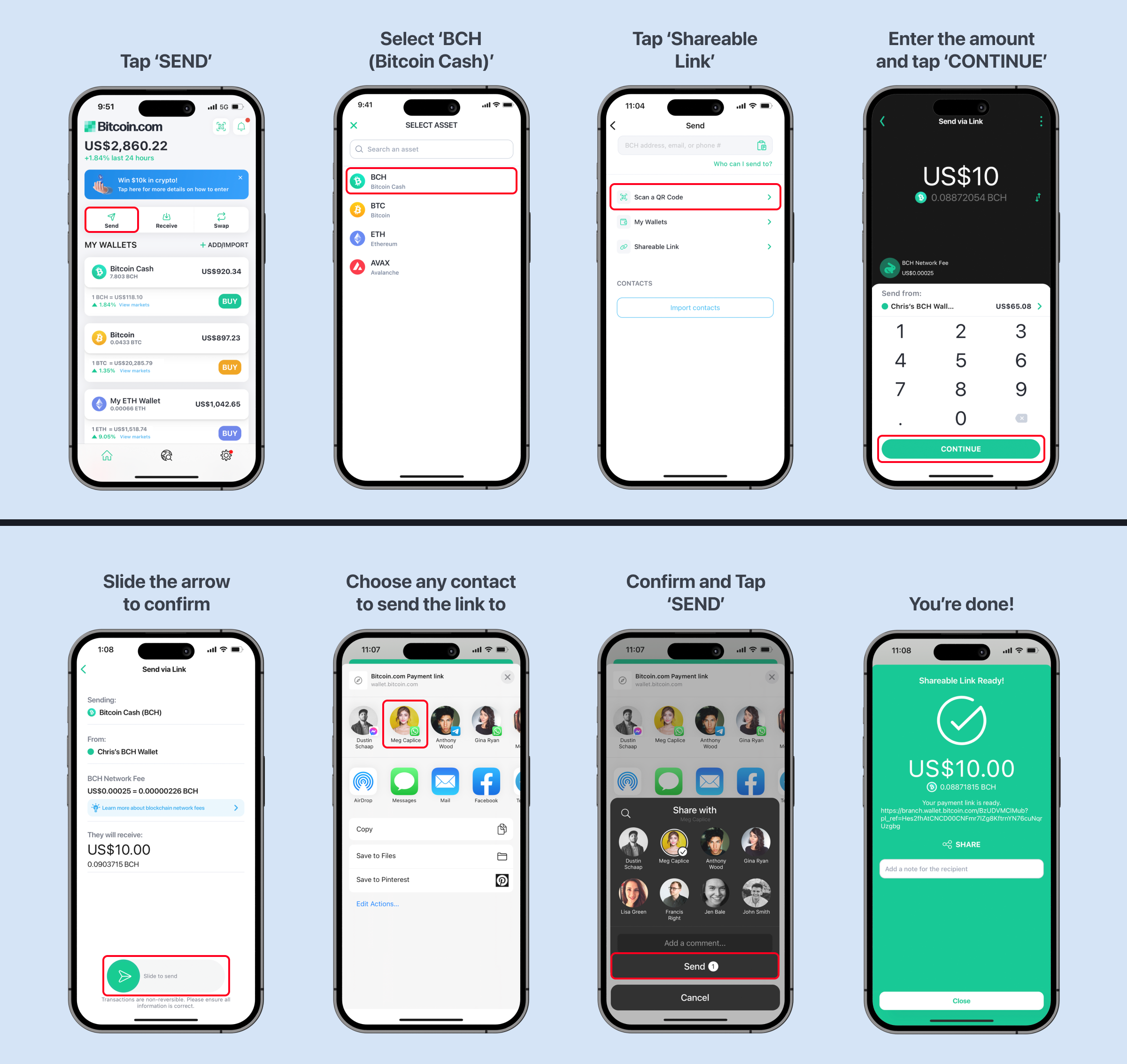
Sending crypto, arguably the most basic action one can take, is still too difficult. There have been attempts like those made by ENS, Unstoppable Domains, and FIO to solve the problem but it’s still a bit of a mess, with different providers using similar domain names and then relying on the wallet to choose which one is correct and so on.
We’ve taken a different, I’d argue easier, approach: shareable links. You don’t need to know the person’s crypto address or ENS. Instead, you send the recipient a link via any messaging app (email, Whatsapp, SMS, etc.). The recipient just has to click on the link and follow the instructions to receive the payment.
Conclusion
I have no doubt that web3 will change the world. The future is already taking shape, but suboptimal designs must be relentlessly chiseled away. I am proud of the design choices Bitcoin.com has made, but have no illusions that they are destined to be the best ones. Bitcoin.com is one of many companies making products that push web3 design forward. I can’t wait to see all of the design innovations that will have helped bring our industry to mass adoption.
What are your thoughts on this story? Be sure to let us know in the comments section below.