A responsive grid layout with no media queries
Publikováno: 9.5.2019
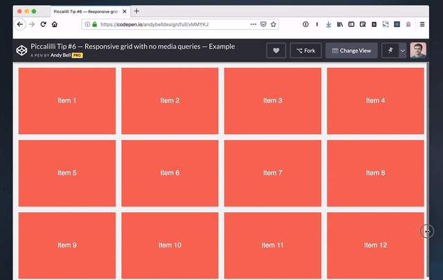
Andy Bell made a really cool demo that shows us how to create a responsive grid layout without any media queries at all. It happens to look like this when you change the size of the browser window:
I think this is a wonderful layout technique that’s just 6 lines (!) of CSS.
.auto-grid {
  --auto-grid-min-size: 16rem;
  display: grid;
  grid-template-columns: repeat(auto-fill, minmax(var(--auto-grid-min-size), 1fr));
  grid-gap: 1rem;
}
What this shows us is that we don’t have to write a million media … Read article
The post A responsive grid layout with no media queries appeared first on CSS-Tricks.
Andy Bell made a really cool demo that shows us how to create a responsive grid layout without any media queries at all. It happens to look like this when you change the size of the browser window:
I think this is a wonderful layout technique that’s just 6 lines (!) of CSS.
.auto-grid {
  --auto-grid-min-size: 16rem;
  display: grid;
  grid-template-columns: repeat(auto-fill, minmax(var(--auto-grid-min-size), 1fr));
  grid-gap: 1rem;
}
What this shows us is that we don’t have to write a million media queries to change the number of columns in a grid. Andy also proves that CSS Grid can automate so much of the tedious work of styling layouts.
I’ve seen this technique used in a couple of places (and we have a few starter grid templates to boot) but Andy’s article about how it all works finally made it all sink in just how useful grid is.
Direct Link to Article — Permalink
The post A responsive grid layout with no media queries appeared first on CSS-Tricks.