An Introduction To Storybook: Organize How You Build JS Components
Publikováno: 24.4.2019
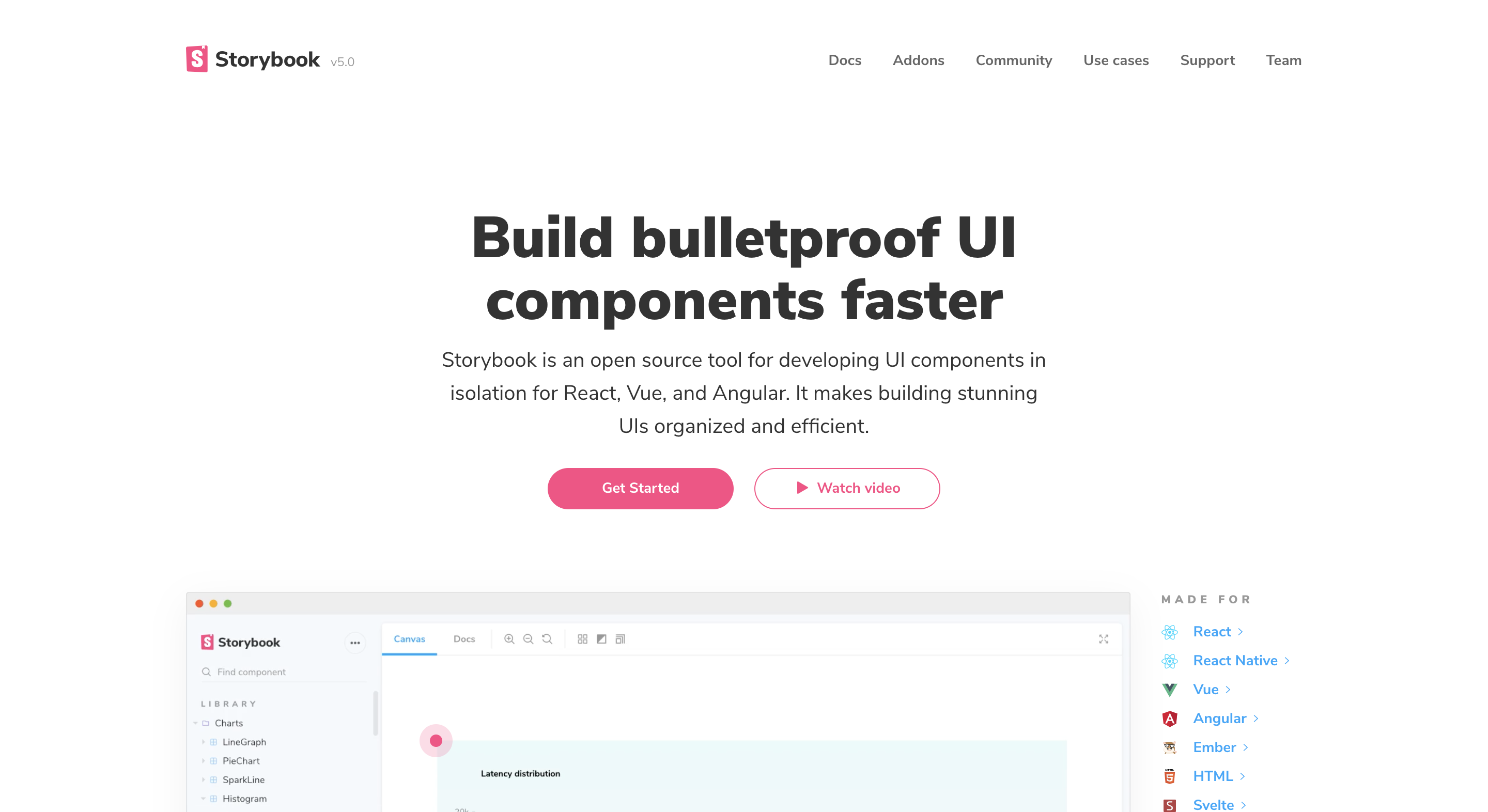
What is Storybook?
Storybook is an open source tool for developing UI components in isolation and it integrates pretty well with most front end fram...
What is Storybook?
Storybook is an open source tool for developing UI components in isolation and it integrates pretty well with most front end frameworks including React, Vue, and Angular and a host of other frameworks. It makes building stunning UIs organized and efficient that means developers don’t get distracted with flaky data, unfinished API or business logic.
Storybook runs outside of the main app so users can create UI components in a different environment without worrying about app-specific dependencies and requirements and this makes it easy to keep track of edge cases and as a result, you ship components with confidence.

Use Cases for Storybook
Storybook is currently being used by a lot of teams and engineers as a UI component library because of the way it helps you build components in isolation. Several teams rely on storybook to do the heavy lifting of composing a component library and also as a building block for their design systems. Companies like Algolia, Salesforce, Artsy ,Gov.uk, and GitHub use Storybook to build and distribute UI components that impact millions of people.

Here's a couple of use cases for Storybook.
Component Library: With the way Storybook works, we can maintain a component library by utilizing this process of having all components in our application in one location with the ability to test each state of the component.
Design Systems:A design system is a series of components that can be reused in different combinations. Design systems allow you to manage design at scale. With storybook, this becomes easy to achieve you get a design system out of the box.
Visual Testing: With Storybook addons, we can integrate visual regression testing in order to test and keep your component library consistent no matter how big it is.
Share across teams:Storybook can be shared across teams because of the way it can be deployed as a static site functioning solely on its own. It can be shared amongst designers, project managers in a team to give feedback or comments on the current design of the components which improves collaboration within teams.
Writing Stories with Storybook
From the name Storybook what comes to mind when you hear stories is that a combination of stories forms a Storybook right? My thoughts exactly! A Storybook is a combination of different stories for different components. Stories are functions that return something that can be rendered to screen. A story can contain a single state of one component or can be seen as a visual representation of a component.
Building UI components with Storybook is a good choice what this means is you have all components in your application isolated whereby they function regardless of the connection between them and it becomes easy to test out UI components.
When building with Storybook there are several ways to structure and organize stories within your application.
- Stories inside a component directory
.
 └── src/
  └── components/
   └── button
    └── button.js
└── button.stories.js- Stories outside the src directory
.
 └── src
  └── components
   └── button.js
 └── stories
└── button.stories.js- Stories sub-folder in a component directory
.
 └── src/
  └── components/
   └── button
    └── button.js
    └── stories
     └── button.stories.js
Following any of these methods is a matter of choice. It’s up to you to pick what works best for you or/and your team.
Integrating Addons
Addons are extra features that can be added to a storybook to make them more interactive and useful. With addons we have two ways of implementing them, One way is by using Decorators and another is by using Native Addons. A list of all addons curated by Storybook team can be found on this page.
Decorators: Decorators are wrapper components that wrap a story. An instance where decorators can be handy is when you need to center a story on the displayed screen. We can create a wrapper component and then use it within the story.
const styles = {
  textAlign: 'center',
};
const Center = ({ children }) => <div style={styles}>{children}</div>;
import { storiesOf } from '@storybook/react';
import { action } from '@storybook/addon-actions';
import Center from './center';
import Button from './button';
storiesOf('Button', module).add('with text', () => (
<Center>
<Button onClick={action('clicked')}>Hello Button</Button>
</Center>
));Native Addons: Native addons use Storybook as a platform and interact with it. Native addons can add extra features beyond wrapping stories. An example is the storybook-action addon, this helps with logging the data received by event handlers in Storybook.

Deploying Storybook as a Static App
Storybook can be used alongside with the project we are developing because it gives a great developer experience with features, like hot reloading via Webpack HMR. But also we can extend this further by deploying the Storybook as a static site on its own. This will enable us to showcase our components to everyone and can even pass as a style guide for our application. To do this all you need to do is to configure your storybook using this script.
{
  "scripts": {
    "build-storybook": "build-storybook -c .storybook -o .out"
  }
}
When you run yarn build-storybook this will build the storybook configured in the Storybook directory into a static web app and place it inside the directory called out and then you can proceed to deploy that directory using one of any of these services GitHub Pages, Netlify or Now, etc.
Integrating with Other Frameworks
Storybook supports almost all the frontend frameworks available and in order for you to integrate with either of these frameworks a guide has been written by the storybook team that you can follow to setup storybook for individual frameworks and they include:
Wrapping Up
Storybook works for a lot of use cases as we have seen and integrating it into our workflow will enable us to build comprehensive UI components for our applications in isolation. In this article, I’ve covered what Storybook is all about and when it is useful to take advantage of when building web applications. The next part of this article will entail how we can start building interactive UI components using React and Storybook.