Animate a Blob of Text with SVG and Text Clipping
Publikováno: 6.2.2019
I came across this neat little animation in a designer newsletter — unfortunately, I lost track of the source, so please give a shout out if you recognize it! In it, a block of text appears to bleed into view with a swirl of colors, then goes out the same way it came in. It’s a slick effect and one I wanted to recreate in code.
The approach I took was to use SVG text as a clip path for … Read article
The post Animate a Blob of Text with SVG and Text Clipping appeared first on CSS-Tricks.
I came across this neat little animation in a designer newsletter — unfortunately, I lost track of the source, so please give a shout out if you recognize it! In it, a block of text appears to bleed into view with a swirl of colors, then goes out the same way it came in. It’s a slick effect and one I wanted to recreate in code.

The approach I took was to use SVG text as a clip path for an SVG background. We must use SVG text because CSS currently only allows us to animate the background with text clipping if the background is a GIF, which we’re not going to do.
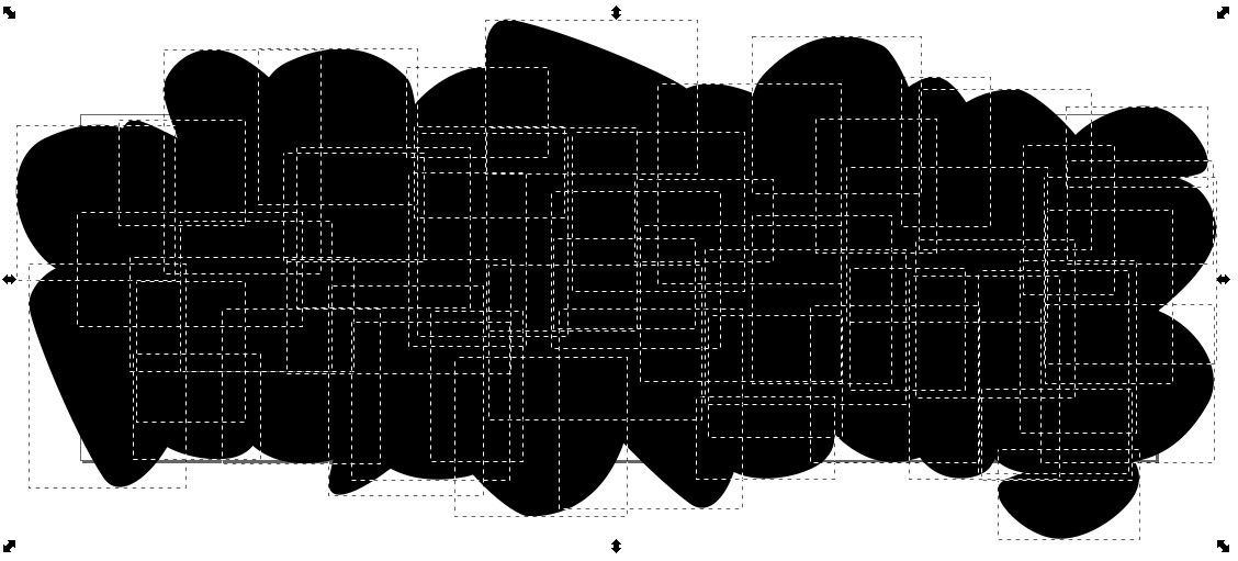
Our first task is to create a background of different SVG shapes. Oval-y blobs work pretty well. The thing to make sure of is to match the size the artboard/canvas in whatever illustration app you’re using to the same dimension as the viewBox you want the final work to be. (In Inkscape, this option is under the Scale section of Document Properties.)
The goal is to cover most of the artboard with a variety of shapes. I've found that it looks best if some of the shapes overlap.
Next, we’ll create some text in a <clipPath>, group the objects that make up the background inside a <g> element, and apply a CSS clip-path on that group. Altogether it looks something like this:
<svg viewbox="0 0 700 225">

  <clipPath id="textClip" class="filled-heading">
    <text y="70">We are</text>
    <text y="140">Creators</text>
    <text y="210">+Innovators</text>
  </clipPath>


  <g id="background" clip-path="url(#textClip)">
    <path d="m449.78..." />

  </g>
</svg>
At this point, all we get is some plain text because we haven’t gotten around to the background animation quite yet.

So what about that animation? We can use a relatively simple CSS animation like this:
/* Animate the background shapes */
#background path {
  animation: pulse 4s cubic-bezier(0.455, 0.030, 0.515, 0.955) infinite;

  /* Necessary to keep the SVG objects in place while scaling */
  transform-origin: 50% 50%;
  transform-box: fill-box;
}

@keyframes pulse {
  /* Rotating it along with the scale makes it a little bit more fancy */
  0%, 100% { transform: scale(0) rotate(33deg); }
  35%, 65% { transform: scale(1) rotate(0deg); }
}
So far, so good.
transform-box: fill-box; is not supported in Internet Explorer or Edge at this point, so if you need to support those browsers, you’ll need to use a JavaScript workaround, like this one.
See the Pen
Animated blob SVG text clipping effect - Pt. 1 by Zach Saucier (@Zeaklous)
on CodePen.
We could start painting things in by hard-coding color values using a text or vector editor, but it's more fun to color the shapes dynamically. Something like this:
// Define an array of colors
const colors = ['#f5a147','#51cad8','#112b39'];
// Select the SVG paths
var blobs = document.querySelectorAll("path");

// Randomly apply colors to the SVG fill property
blobs.forEach(blob => {
  blob.style.fill = colors[Math.floor(Math.random() * colors.length)];
});
In order to change the text values for each iteration, we need to first add them to the SVG clip path.
<clipPath id="text" class="filled-heading">
  <text y="70">We are</text>
  <text y="140">Creators</text>
  <text y="210">+Innovators</text>

  <text y="70">We are</text>
  <text y="140">Movers</text>
  <text y="210">+Shakers</text>

  <text y="70">We are</text>
  <text y="140">Stylish</text>
  <text y="210">+Techy</text>
</clipPath>
Then we can either use CSS or JavaScript to reveal the lines of text in our preferred order. Unfortunately, we can't surround each section of <text> using a <g> element because <g> elements don't work inside of a clipPath. For this post, we’re going to split things up into three CSS animations, one for each group of three paths:
/* Selects paths 1-3 */
#textClip text:nth-of-type(n + 1):nth-of-type(-n + 3) {
  animation: showFirst 12s infinite;
}

/* Selects paths 4-6 */
#textClip text:nth-of-type(n + 4):nth-of-type(-n + 6) {
  animation: showSecond 12s infinite;
}

/* Selects paths 7-9 */
#textClip text:nth-of-type(n + 7):nth-of-type(-n + 9) {
  animation: showThird 12s infinite;
}

@keyframes showFirst {
  0%, 33% {
    opacity: 1;
  }
  33.0001%, 100% { opacity: 0; }
}

@keyframes showSecond {
  33.0001%, 66% {
    opacity: 1;
  }
  0%, 33%, 66.0001%, 100% { opacity: 0; }
}

@keyframes showThird {
  66.0001%, 99.999% {
    opacity: 1;
  }
  0%, 66%, 100% { opacity: 0; }
}
That does the trick!
See the Pen
Animated blob SVG text clipping effect - Pt. 2 by Zach Saucier (@Zeaklous)
on CodePen.
At this point, we can have a little fun. For example, we can swap backgrounds for a different effect. I used Inkscape's star tool with three to four points to generate some random shapes (using Inkscape’s random parameter) and then colored them using a palette from one of the many color scheme generators (I used Palx) to produce this version:
See the Pen
Animated blob SVG text clipping effect - Pt. 3 by Zach Saucier (@Zeaklous)
on CodePen.
The backgrounds don't even need to fill up the entire background, depending on the effect that we want to create. For example, we could duplicate the text using a element and fill in the text using that as seen in this demo.
Or we could mix it up by rotating the background blobs like this:
See the Pen
Animated blob SVG text clipping effect - Pt. 5 by Zach Saucier (@Zeaklous)
on CodePen.
To make the colors change for every new set of words, we could use either a CSS or JavaScript for the animation. I used JavaScript (and moved the CSS animation that was hiding the text lines to the JavaScript):
See the Pen
Animated blob SVG text clipping effect - Pt. 6 by Zach Saucier (@Zeaklous)
on CodePen.
To center the text horizontally, add x="50%" text-anchor="middle" to each <text> element (Demo). Centering it vertically would take more manual calculation since we’re working with a multi-line format.
One of the nice things about this approach is that, since it uses SVG, it is responsive by default!
P.S. After I made this approach and was looking for the original GIF author, I came across another recreation by Martí Fenosa doing the same effect using a different approach. Check his demo out as well because it’s clever!
The post Animate a Blob of Text with SVG and Text Clipping appeared first on CSS-Tricks.