Auto Layout lands in Figma
Publikováno: 5.12.2019
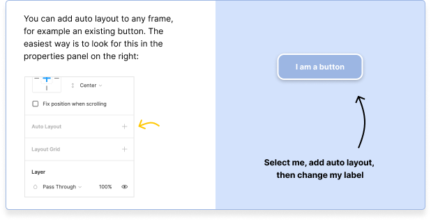
Here’s a fresh update to my favorite design tool that is thoroughly exciting: Auto layout! That means we can make frames that resize based on the size of the content within it. That's particularly useful for buttons in a design system where you want to drop a button on the page and then keep its left and right padding equal.
However! The other exciting part of this update is that content can now be nudged down based on the … Read article
Here’s a fresh update to my favorite design tool that is thoroughly exciting: Auto layout! That means we can make frames that resize based on the size of the content within it. That's particularly useful for buttons in a design system where you want to drop a button on the page and then keep its left and right padding equal.
However! The other exciting part of this update is that content can now be nudged down based on the content above it, too — just like on a webpage. If you’re interested in trying out this feature then I’d recommend just booting up Figma where you can immediately hop over to a playground that explains how this game-changing new feature works with a handy step-by-step tutorial.
