Building a Conference Schedule with CSS Grid
Publikováno: 24.6.2019
It’s hard to beat the feeling of finding a perfect use for a new technology. You can read every handy primer under the sun and ooh-and-ahh at flashy demos, but the first time you use it on your own project… that’s when things really click.
I gained a new appreciation for CSS Grid when building a flexible layout for a conference schedule. The needs of the project aligned perfectly with grid’s strengths: a two-dimensional (vertical and horizontal) layout with … Read article
The post Building a Conference Schedule with CSS Grid appeared first on CSS-Tricks.
It’s hard to beat the feeling of finding a perfect use for a new technology. You can read every handy primer under the sun and ooh-and-ahh at flashy demos, but the first time you use it on your own project… that’s when things really click.
I gained a new appreciation for CSS Grid when building a flexible layout for a conference schedule. The needs of the project aligned perfectly with grid’s strengths: a two-dimensional (vertical and horizontal) layout with complex placement of child elements. In the process of building a proof of concept, I found a few techniques that made the code highly readable and outright fun to work with.
The resulting demo included some interesting uses of CSS Grid features and forced me to grapple with some details of grid you don’t run into in every day.
Before we get started, it might be a good idea to keep another tab open with the CSS-Tricks guide to CSS Grid to reference the concepts we cover throughout the post.
Defining our layout requirements
I set out to create the following layout thanks to WordCamp, the hundreds of WordPress-focused conferences that happen around the world each year. These varied events range in size and format, yet all use the same schedule layout tool.
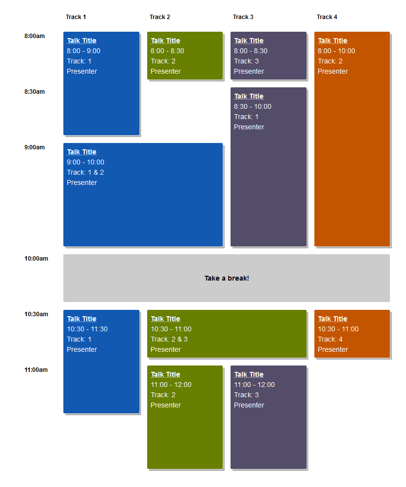
I helped schedule a couple WordCamps and styled a WordCamp website, so I knew the shortcomings of the existing HTML table layout. If your schedule didn’t fit in a uniform grid, well…¯\_(ツ)_/¯
Setting out to find a better way, I started by listing the layout requirements:
- Sessions of variable length (limited to set time increments)
Imagine back-to-back one-hour talks in three rooms alongside a two-hour workshop in another. - Sessions spanning one or more "Tracks"Tracks are usually associated with a specific room in the venue. In the case of my local WordCamp in Seattle, the venue can literally remove a wall to combine two rooms!
- Schedule can include empty space
A last-minute cancellation or extra-short session creates gaps in a schedule. - Design is easy to customize with CSS
WordCamp websites allow theming only via CSS. - Layout can be automatically generated from CMS content
Since we’re building a layout from structured session data on thousands of websites, we can’t rely on any HTML or CSS that’s too clever or bespoke.
Getting started: Solid HTML
Before I write any CSS, I always start with rock-solid HTML.
The top-level <div> will have a class of .schedule and serve as the grid parent. Each unique start time gets its own heading followed by all sessions starting at that time. The markup for each session isn’t very important, but make sure that seeing the layout isn’t required to understand when and where a session happens. (You’ll see why in a moment.)
<h2>Conference Schedule</h2>
<div class="schedule">

  <h3 class="time-slot">8:00am</h3>
  <div class="session session-1 track-1">
    <h4 class="session-title"><a href="#">Session Title</a></h4>
    <span class="session-time">8:00am - 9:00am</span>
    <span class="session-track">Track 1</span>
    <span class="session-presenter">Presenter Name</span>
  </div>
  <!-- Sessions 2, 3, 4 -->

  <h3 class="time-slot">9:00am</h3>
  <div class="session session-5 track-1">
    <h4 class="session-title"><a href="#">Session Title</a></h4>
    <span class="session-time">9:00am - 10:00am</span>
    <span class="session-track">Track 1</span>
    <span class="session-presenter">Presenter Name</span>
  </div>
  <!-- Sessions 6, 7, 8 -->

  <!-- etc... -->

</div> <!-- end .schedule -->
Mobile layout and grid fallback complete!
Adding in a bit of up-to-you CSS to make things pretty, our mobile layout and fallback for browsers that don’t support CSS Grid is already complete!
Here’s how mine looks with the colors I used:

Adding the grid layout
Now for the actual CSS Grid part!
My ah-ha moment when building this came from reading Robin’s article here on CSS-Tricks, "Making a Bar Chart with CSS Grid."TL;DR: One grid row represents 1% of the chart's height, so a bar spans the same number of rows as the percentage it represents.
.chart {
  display: grid;
  grid-template-rows: repeat(100, 1fr); /* 1 row = 1%! */
}

.fifty-percent-bar {
  grid-row: 51 / 101; /* 101 - 51 = 50 => 50% */
}
That helped me realize that grid is perfect for any layout tied to some regular incremental unit. In the case of a schedule, that unit is time! For this demo, we’ll use increments of 30 minutes, but do whatever makes sense for you. (Just watch out for the Chrome bug that limits Grid layouts to 1000 rows.)
The first version I tried used similar syntax to the bar chart in Robin’s and some basic math to place the sessions. We’re using eight rows because there are eight 30-minute increments between 8 a.m. and 12 p.m. Remember that implicit grid line numbers start at one (not zero), so the grid rows are numbered one through nine.
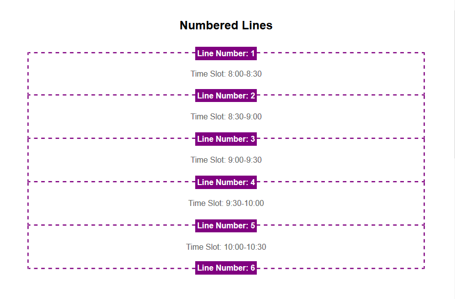
.schedule {
  display: grid;
  grid-template-rows: repeat(8, 1fr);
}

.session-1 {
  grid-row: 1 / 3; /* 8am - 9am, 3 - 1 = 2 30-minute increment */
}

.session-2 {
  grid-row: 3 / 6; /* 9am - 10:30am, 6-3 = 3 30-minute increments */
}
The problem with this technique is that placing items on a grid with a lot of rows is very abstract and confusing. (This issue added a ton of complexity to Robin’s bar chart demo, too.)
This is where named grid lines come to the rescue! Instead of relying on grid line numbers, we can give each line a predictable name based on the corresponding time of day.
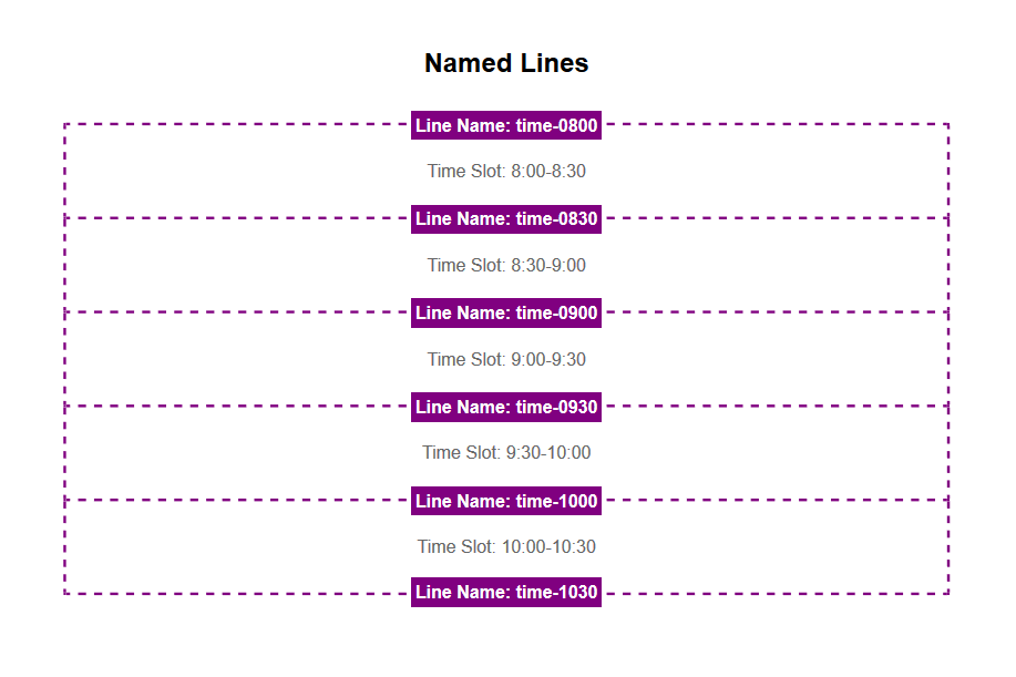
.schedule {
  display: grid;
  grid-template-rows:
    [time-0800] 1fr
    [time-0830] 1fr
    [time-0900] 1fr
    [time-0930] 1fr;
    /* etc...
        Note: Use 24-hour time for line names */
}

.session-1 {
  grid-row: time-0800 / time-0900;
}

.session-2 {
  grid-row: time-0900 / time-1030;
}
That is gloriously easy to understand. There is no complicated math to figure out how many rows there are before and after a session starts or ends. Even better, we can generate grid line names and session layout styles with information stored in WordPress. Throw a start and end time at the grid, and you’re good to go!
Since the schedule has multiple tracks, we’ll need a column for each one. The tracks work in a similar way to the times, using named track lines for each grid column line. There’s also an extra first column for the start time headings.
.schedule { /* continued */
  grid-template-columns:
    [times] 4em
    [track-1-start] 1fr
    [track-1-end track-2-start] 1fr
    [track-2-end track-3-start] 1fr
    [track-3-end track-4-start] 1fr
    [track-4-end];
}
Here though, we take named grid lines one step further. Each line gets two names: one for the track it starts and one for the track it ends. This isn’t strictly necessary, but it makes the code much clearer, especially when a session spans more than one column.
With the time- and track-based grid lines defined, we can now place any session we want just from knowing it’s time and track!
.session-8 {
  grid-row: time-1030 / time-1100;
  grid-column: track-2-start / track-3-end; /* spanning two tracks! */
}
Putting that all together, we get some lengthy but extremely readable code that is a real joy to work with.
@media screen and (min-width: 700px) {
  .schedule {
    display: grid;
    grid-gap: 1em;
    grid-template-rows:
      [tracks] auto /* Foreshadowing! */
      [time-0800] 1fr
      [time-0830] 1fr
      [time-0900] 1fr
      [time-0930] 1fr
      [time-1000] 1fr
      [time-1030] 1fr
      [time-1100] 1fr
      [time-1130] 1fr
      [time-1200] 1fr;
    grid-template-columns:
      [times] 4em
      [track-1-start] 1fr
      [track-1-end track-2-start] 1fr
      [track-2-end track-3-start] 1fr
      [track-3-end track-4-start] 1fr
      [track-4-end];
  }

  .time-slot {
    grid-column: times;
  }
}
<div class="session session-1 track-1" style="grid-column: track-1; grid-row: time-0800 / time-0900;">
<!-- details -->
</div>
<div class="session session-2 track-2" style="grid-column: track-2; grid-row: time-0800 / time-0900">
<!-- details -->
</div>
<!-- etc... -->The final code uses inline styles for session placement which feels right to me. If you don’t like this and are working with more modern browsers, you could pass the line names to CSS via CSS variables.
Quick note: using fr units versus the auto value for row heights
One detail worth noting is the use of the fr unit for defining row heights.
When using 1fr to determine row heights, all rows have the same height. That height is determined by the content of the tallest row in the schedule. (I had to read the W3C spec for fr to figure this out!) That produces a beautiful schedule where height is proportional to time, but can also lead to a very tall layout.
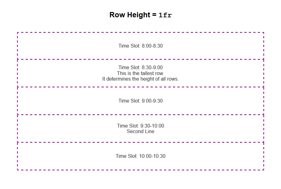
1fr produces equal-height rows determined by the tallest row in the grid. (View Demo: Grid row heights 1fr vs auto)For example, if your schedule grid has 15-minute increments from 7 a.m. to 6 p.m., that’s a total of 48 grid rows. In that case, you probably want to use auto for your row height because the schedule is much more compact with each grid row's height determined by its content.
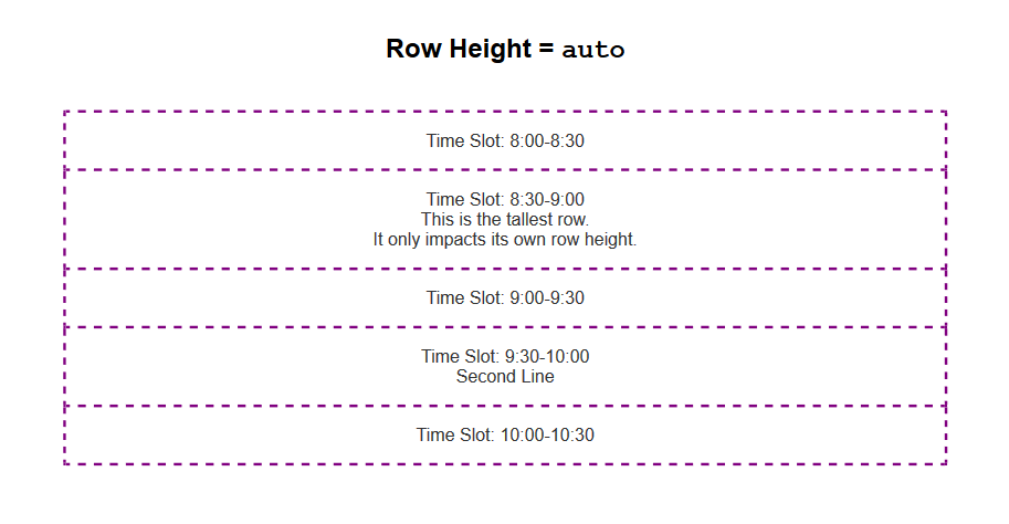
auto makes each row the height of its content. (View Demo: Grid row heights 1fr vs auto)A word about accessibility
There are real concerns about the accessibility of certain CSS Grid techniques. Specifically, the ability to change the order of information visually in ways that don’t match the source order causes problems for people using keyboard navigation.
This layout uses that ability to arbitrarily place items on a grid, so some caution is warranted. However, because the heading and source order align with the visualization of start times, this seems like a safe use to me.
If you’re inspired to do something similar, carefully consider accessibility. It makes sense to order information by time in this case, but I can imagine a legitimate case for TAB order to go down columns rather than across rows. (Modifying this demo to do that shouldn’t be too hard!)
Whatever you do, always consider accessibility.
Adding sticky track names
Finally, it’s time to add in the track names that look like table headers at the top of each column. Since a session’s track is already visible, I chose to hide the "headers" from assistive technology with aria-hidden="true".
The track names go in the first grid row, conveniently named "tracks." As long as you don’t have any weird overflow issues, position: sticky keeps those in view while you scroll.
<span class="track-slot" aria-hidden="true" style="grid-column: track-1;">Track 1</span>
<span class="track-slot" aria-hidden="true" style="grid-column: track-2;">Track 2</span>
<span class="track-slot" aria-hidden="true" style="grid-column: track-3;">Track 3</span>
<span class="track-slot" aria-hidden="true" style="grid-column: track-4;">Track 4</span>
.track-slot {
display: none; /* only visible with Grid layout */
}
@supports( display:grid ) {
@media screen and (min-width:700px) {
.track-slot {
grid-row: tracks;
display: block;
position: sticky;
top: 0;
z-index: 1000;
background-color: rgba(255,255,255,.9);
}
}
}It’s a slick little finishing touch to the final demo. ✨
The result
Here’s how things look with everything we’ve covered put together!
See the Pen
Conference Schedule with CSS Grid by Mark Root-Wiley (@mrwweb)
on CodePen.
We’re just getting started
This schedule is definitely the most satisfying use of CSS Grid I’ve ever made. I love how "data-driven" and semantic the line naming is, and the accessibility and CMS requirements fit in perfectly without any inconvenience.
The only question left for me is what other types of "data-driven" grids are out there to build? I’ve seen some great calendar layouts and here’s a Monopoly board layout. What about a football field, a timeline, restaurant tables, or theater seats? What else?
The post Building a Conference Schedule with CSS Grid appeared first on CSS-Tricks.