Color contrast accessibility tools
Publikováno: 29.5.2019
Accessibility is all the rage these days, specifically when it comes to color contrast. I’ve stumbled upon a couple of tools this week that I think are pretty nifty for helping make sure that all of the text on our websites is legible regardless of what background color they might have.
First up is the Accessible Color Generator which happens to be a wonderful tool for picking alternative colors. Let’s say you’re working on a brand with color X. You … Read article
The post Color contrast accessibility tools appeared first on CSS-Tricks.
Accessibility is all the rage these days, specifically when it comes to color contrast. I’ve stumbled upon a couple of tools this week that I think are pretty nifty for helping make sure that all of the text on our websites is legible regardless of what background color they might have.
First up is the Accessible Color Generator which happens to be a wonderful tool for picking alternative colors. Let’s say you’re working on a brand with color X. You can generate a host of other complimentary colors like this:
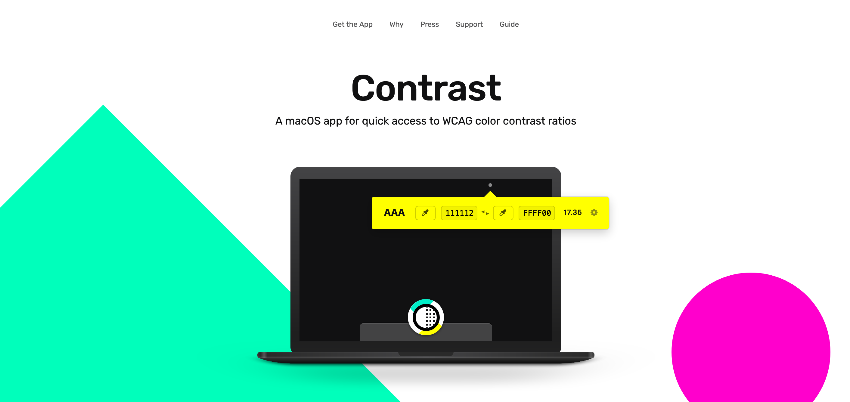
Next up is Contrast, a rather great MacOS app that sits in the menu bar at all times and helps identify accessible color pairings based on WCAG Guidelines. This one is particularly useful if you happen to be a designer:

This reminds me of a wonderful post about how the Lyft design team re-approached the way they use color in their app. Kevyn Arnott explains:
Color, at least on the surface, appears almost naively simple, yet as it scales across larger products it becomes unbelievably complex. You have thousands of people building products all at once, and those products are all heavily reliant on color. This puts a lot of pressure on the color system to ensure that all the products are being created consistently, but very hard to implement since it’s all too easy to apply colors on a one-off basis.
The team then went ahead and built ColorBox.io which lets you systematically build out a ton of colors for your design systems work. It’s pretty nifty!
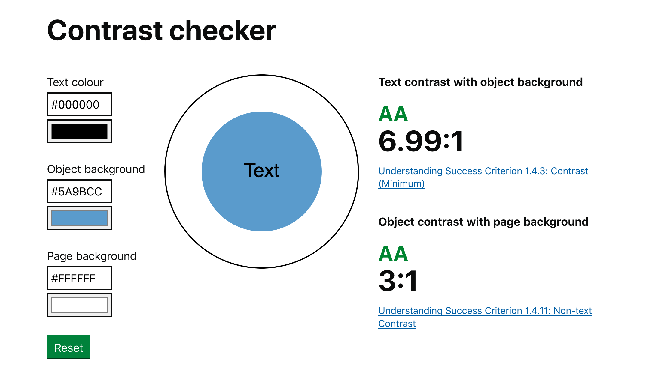
Plus the folks over at GOV.UK made their own color accessibility tool called Contrast Checker which (as you have guessed by the name) helps check the contrast between the background of an element and the page itself:

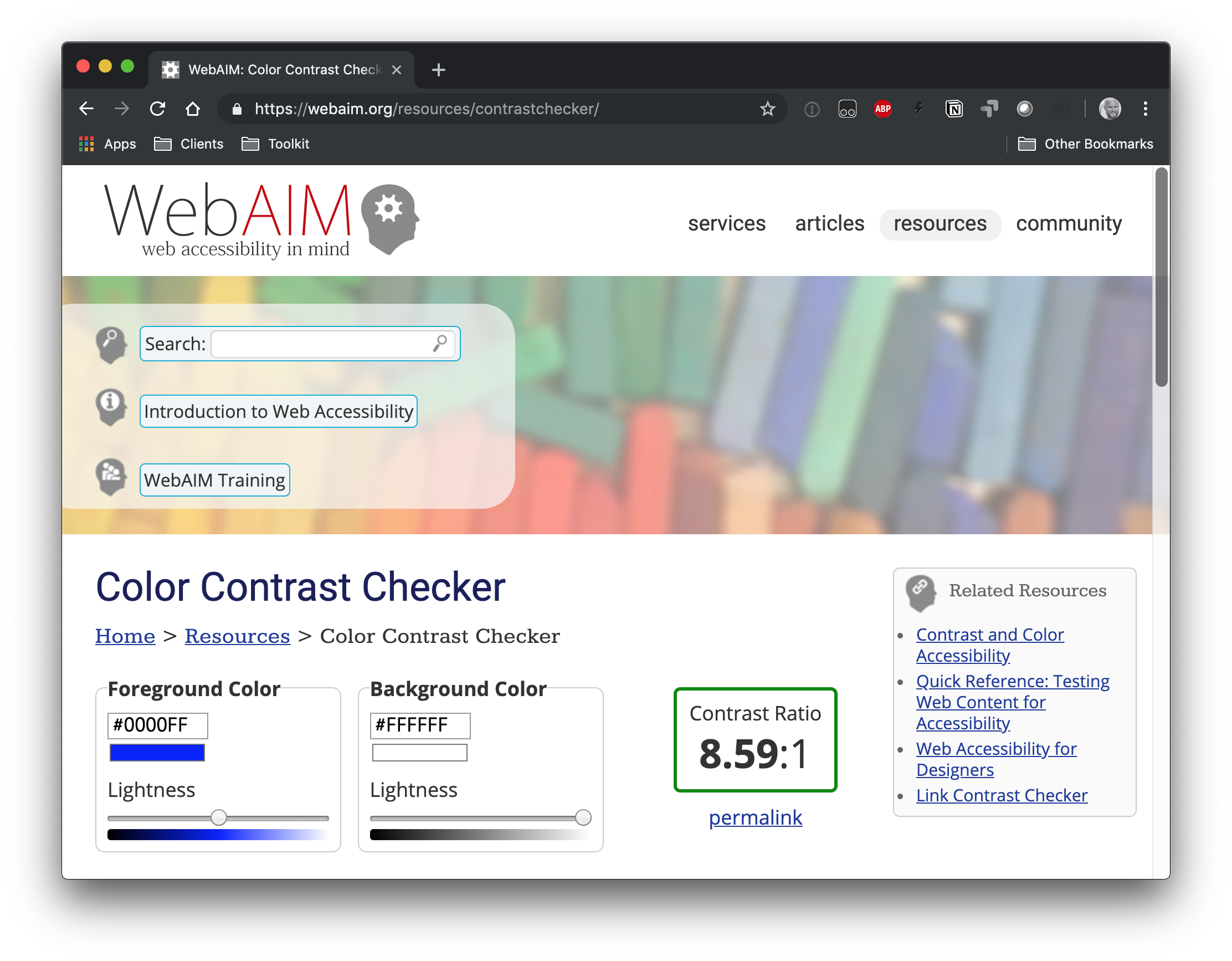
And, of course, there's the trusty WebAIMcontrast checker, which is a go-to for many developers out there.

So far, we've looked at tools that check contrast. But there is a class of tooling that can automate accessible contrasts during development. Josh Bader wrote up an approach that enforces high contrast by pairing CSS custom properties with the calc() function. Facundo Corradini did something similar that switches font color based on the background color behind it.
Oh! And we may have something to look forward to with the color-adjust property. It is proposed in the CSS Color Module Level 4 specification and could give browsers more control to adjust color values that are declared in the stylesheet. It's not really geared towards color contrast, but there's something interesting about handing off the responsibility of rendering color values to the browser based on certain conditions.
The post Color contrast accessibility tools appeared first on CSS-Tricks.