CSS Painting Order
Publikováno: 17.7.2020
Usually, when I see terms like “painting order” or “stacking context” my brain will start to shut off and my eyes will gloss over. Not that my brain doesn’t normally shut off more often than not, but that’s another topic for another time.
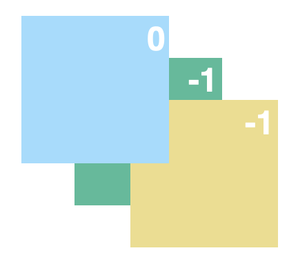
Martin Robinson over at Igalia touches on these concepts using an example that’s pretty easy to grok, even for me. He starts with two boxes that overlap with negative margins.
Then he introduces a third box that’s … Read article “CSS Painting Order”
The post CSS Painting Order appeared first on CSS-Tricks.
You can support CSS-Tricks by being an MVP Supporter.
Usually, when I see terms like “painting order” or “stacking context” my brain will start to shut off and my eyes will gloss over. Not that my brain doesn’t normally shut off more often than not, but that’s another topic for another time.
Martin Robinson over at Igalia touches on these concepts using an example that’s pretty easy to grok, even for me. He starts with two boxes that overlap with negative margins.

Then he introduces a third box that’s a child of the green box. The green box is given a z-index of -1. As you might expect, both the green and yellow boxes stack below the blue box.

Here’s where my brain started melting. If the z-index of the green box stays the same at -1 but we give it’s child a massive value, say 1,000, things look… exactly the same.

I’m sure many of you can already guess (or simply flat out know) why the blue box stays on top, even though changing the yellow box’s z-index implies it should be on top instead, but I sure didn’t. Martin found the technical answer in the CSS2 specification buried deep down in Appendix E, which he graciously linked up — otherwise, I’m sure I’d never have found it.
We learn from the Appendix E that a stacking context is an atomically painted collection of page items. What does this mean? To put it simply, it means that things inside a stacking context are painted together, as a unit, and that items outside the stacking content will never be painted between them. Having an active
z-indexis one of the situations in CSS which triggers the creation of a stacking context. Is there a way we can adjust our example above so that the third element belongs to the same stacking context as the first two elements? The answer is that we must remove it from the stacking context created by the second element.
So, yeah. As long as the yellow box is a child of the green box, the two form a stacking context that the blue box has no part of. Getting yellow above blue requires removing it from blue’s stacking context.

That’s the crux of Martin’s post, but he takes it even further and it’s worth heading over there. If you do, you’ll see how stacking order leads to some bonafide CSS tricks.

It’s not the first time we’ve linked up proof that z-indexis not a level playing field so I’m going to try to commit this to memory the next (and inevitable) time I wrestle with stacking elements.
Direct Link to Article — Permalink
The post CSS Painting Order appeared first on CSS-Tricks.
You can support CSS-Tricks by being an MVP Supporter.