Design Systems and Portfolios
Publikováno: 15.3.2019
In my experience working with design systems, I’ve found that I have to sacrifice my portfolio to do it well. Unlike a lot of other design work where it’s relatively easy to present Dribbble-worthy interfaces and designs, I fear that systems are quite a bit trickier than that.
You could make things beautiful, but the best work that happens on a design systems team often isn’t beautiful. In fact, a lot of the best work isn’t even visible.
For … Read article
The post Design Systems and Portfolios appeared first on CSS-Tricks.
In my experience working with design systems, I’ve found that I have to sacrifice my portfolio to do it well. Unlike a lot of other design work where it’s relatively easy to present Dribbble-worthy interfaces and designs, I fear that systems are quite a bit trickier than that.
You could make things beautiful, but the best work that happens on a design systems team often isn’t beautiful. In fact, a lot of the best work isn’t even visible.
For example, most days I’m pairing up with folks on my team to help them understand how our system works; from the CSS architecture, to the font stack, to the UI Kit to how a component can be manipulated to solve a specific problem, to many things in between. I’m trying as best as I can to help other designers understand what would be hard to build and what would be easy, as well as when to change their designs based on technical or other design constraints.
Further, there's a lot of hard and diligent work that goes into projects that have no visible impact on the system at all. Last week, I noticed a weird thing with our checkboxes. Our Checkbox React component would output HTML like this:
<div class="checkbox">
  <label for="ch-1">
    <input id="ch-1" type="checkbox" class="checkbox" />
  </label>
</div>
We needed to wrap the checkbox with a <div> for styling purposes and, from a quick glance, there’s nothing wrong with this markup. However, the <div> and the <input> both have a class of .checkbox and there were confusing styles in the CSS file that styled the <div> first and then un-did those styles to fix the <input> itself.
The fix for this is a pretty simple one: all we need to do is make sure that the class names are specific so that we can safely refactor any confusing CSS:
<div class="checkbox-wrapper">
  <label for="ch-1">
    <input id="ch-1" type="checkbox" class="checkbox" />
  </label>
</div>
The thing is that this work took more than a week to ship because we had to refactor a ton of checkboxes in our app to behave in the same way and make sure that they were all using the same component. These checkboxes are one of those things that are now significantly better and less confusing, but it’s difficult to make it look sexy in a portfolio. I can’t simply drop them into a big iPhone mockup and rotate it as part of a fancy portfolio post if I wanted to write about my work or show it to someone else.
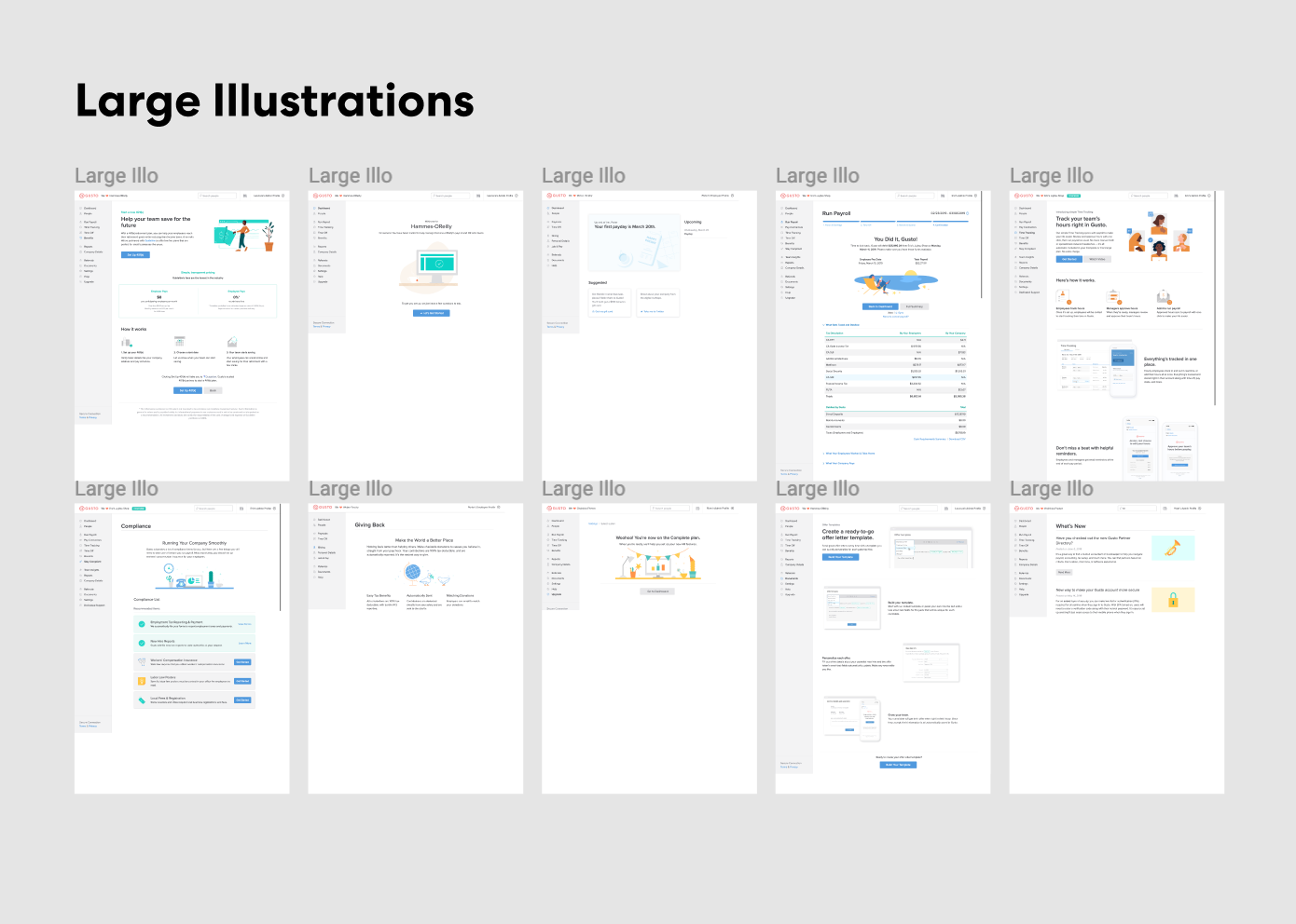
Take another example: I spent an entire day making an audit of our illustrations to help our team get an understanding of how we use them in our application. I opened up Figma and took dozens of screenshots:

It’s sort of hard to take credit for this work because the heavy lifting is really moderating a discussion and helping the team plan. It’s important work! But I feel like it’s hard to show that this work is valuable and to show the effects of it in a large org. “Things are now less confusing,” isn’t exactly a great accomplishment – but it really should be. These boring, methodical changes are vital for the health of a good design system.
Also... it’s kind of weird to putm “I wrote documentation” in a portfolio as much as it is to say, “I paired with designers and engineers for three years.” It’s certainly less satisfying than a big, glossy JPEG of a cool interface you designed. And I’m not sure if this is the same everywhere, but only about 10% of the work I do is visual and worthy of showing off.
My point is that building new components like this RadioCard I designed a while back is extraordinarily rare and accounts for a tiny amount of the useful work that I do:
See the Pen
Gusto App – RadioCard Prototype by Robin Rendle (@robinrendle)
on CodePen.
I’d love to see how you’re dealing with this problem though. How do you show off your front-end and design systems work? How do you make it visible and valuable in your organization? Let me know in the comments!
The post Design Systems and Portfolios appeared first on CSS-Tricks.