Do CSS Custom Properties Beat Sass Loops?
Publikováno: 2.3.2019
I reckon that a lot of our uses of Sass maps can be replaced with CSS Custom properties – but hear me out for a sec.
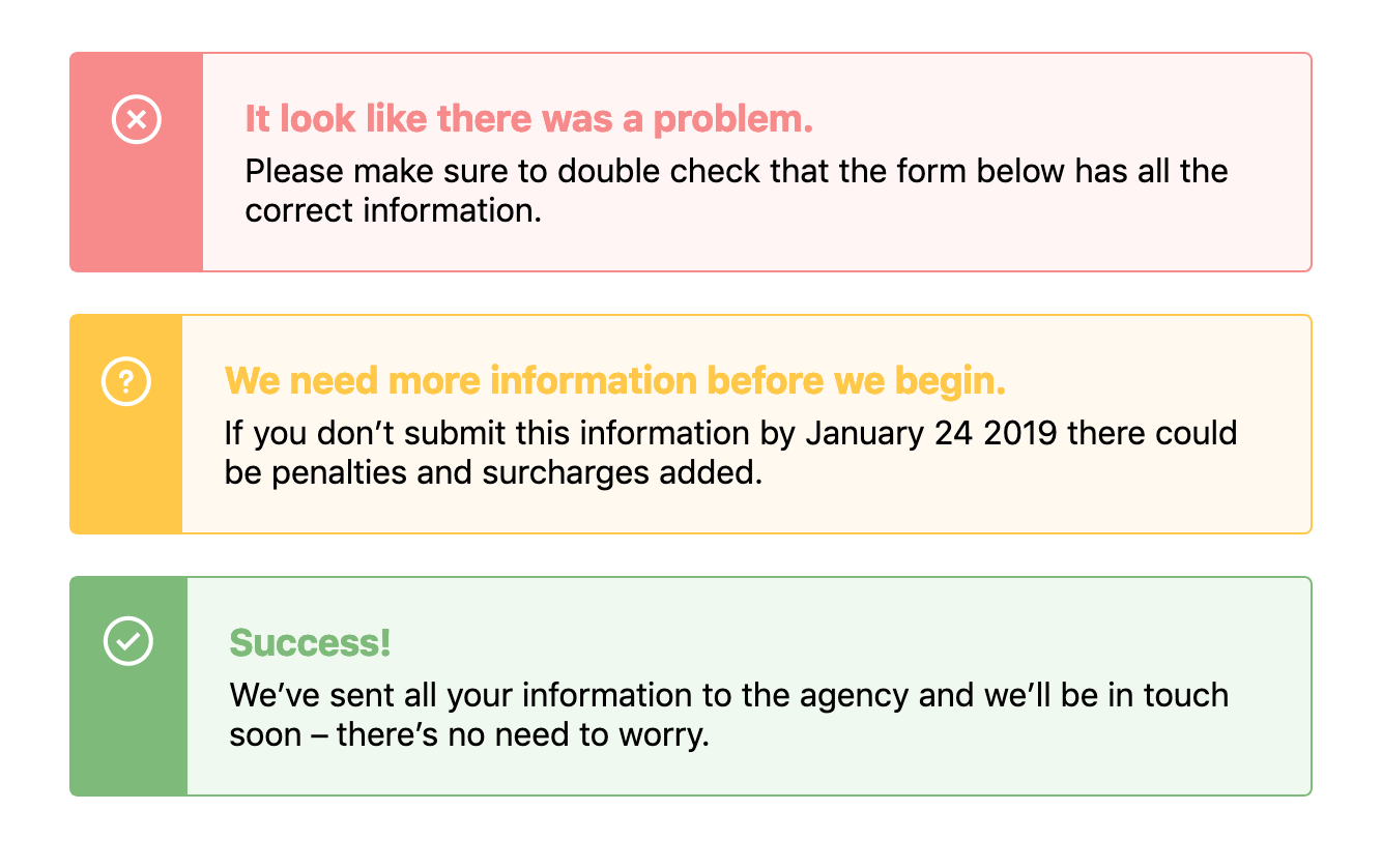
When designing components we often need to use the same structure of a component but change its background or text color based on a theme. For example, in an alert, we might need a warning style, an error style, and a success style – each of which might be slightly different, like this: … Read article
The post Do CSS Custom Properties Beat Sass Loops? appeared first on CSS-Tricks.
I reckon that a lot of our uses of Sass maps can be replaced with CSS Custom properties – but hear me out for a sec.
When designing components we often need to use the same structure of a component but change its background or text color based on a theme. For example, in an alert, we might need a warning style, an error style, and a success style – each of which might be slightly different, like this:

There’s a few ways we could tackle building this with CSS, and if you were asking me a couple of years ago, I would’ve tried to solve this problem with Sass maps. First, I would have started with the base alert styles but then I’d make a map that would hold all the data:
$alertStyles: (
  error: (
    theme: #fff5f5,
    icon: 'error.svg',
    darkTheme: #f78b8b
  ),
  success: (
    theme: #f0f9ef,
    icon: 'success.svg',
    darkTheme: #7ebb7a
  ),
  warning: (
    theme: #fff9f0,
    icon: 'warning.svg',
    darkTheme: #ffc848
  )
);
Then we can loop through that data to change our core alert styles, like this:
@each $state, $property in $alertStyles {
  $theme: map-get($property, theme);
  $darkTheme: map-get($property, darkTheme);
  $icon: map-get($property, icon);

  .alert-#{$state} {
    background-color: $theme;
    border-color: $darkTheme;
    &:before {
      background-color: $darkTheme;
      background-image: url($icon);
    }
    .alert-title {
      color: $darkTheme;
    }
  }
}
Pretty complicated, huh? This would output classes such as .alert-error, .alert-success and .alert-warning, each of which would have a bunch of CSS within them that overrides the default alert styles.
This would leave us with something that looks like this demo:
See the Pen
Alerts – Sass Loops by Robin Rendle (@robinrendle)
on CodePen.
However! I’ve always found that using Sass maps and looping over all this data can become unwieldy and extraordinarily difficult to read. In recent projects, I’ve stumbled into fantastically complicated uses of maps and slowly closed the file as if I’d stumbled into a crime scene.
How do we keep the code easy and legible? Well, I think that CSS Custom Properties makes these kinds of loops much easier to read and therefore easier to edit and refactor in the future.
Let’s take the example above and refactor it so that it uses CSS Custom Properties instead. First we’ll set out core styles for the .alert component like so:
See the Pen
Alerts – Custom Variables 1 by Robin Rendle (@robinrendle)
on CodePen.
As we create those base styles, we can setup variables in our .alert class like this:
.alert {
  --theme: #ccc;
  --darkTheme: #777;
  --icon: '';
  background: var(--theme);
  border: 1px solid var(--darkTheme);
  /* other styles go here */

  &:before {
    background-image: var(--icon);
  }
}
We can do a lot more with CSS Custom Properties than changing an interface to a dark mode or theme. I didn’t know until I tried that it's possible to set an image in a custom property like that – I simply assumed it was for hex values.
Anyway! From there, we can style each custom .alert class like .alert-warning by overriding these properties in .alert:
.alert-success {
  --theme: #f0f9ef;
  --darkTheme: #7ebb7a;
  --icon: url(https://s3-us-west-2.amazonaws.com/s.cdpn.io/14179/success.svg);
}

.alert-error {
  --theme: #fff5f5;
  --darkTheme: #f78b8b;
  --icon: url(https://s3-us-west-2.amazonaws.com/s.cdpn.io/14179/error.svg);
}

.alert-warning {
  --theme: #fff9f0;
  --darkTheme: #ffc848;
  --icon: url(https://s3-us-west-2.amazonaws.com/s.cdpn.io/14179/warning.svg);
}
And that’s about it! We’ll get the exact same visual interface that we had with a Sass loop:
See the Pen
Alerts – Custom Variables 2 by Robin Rendle (@robinrendle)
on CodePen.
However! I think there’s an enormous improvement here that’s been made in terms of legibility. It’s much easier to look at this code and to understand it right off the bat. With the Sass loop it almost seems like we are trying to do a lot of clever things in one place – namely, nest classes within other classes and create the class names themselves. Not to mention we then have to go back and forth between the original Sass map and our styles.
With CSS Custom Properties, all the styles are contained within the original .alert.
There you have it! I think there’s not much to mention here besides the fact that CSS Custom Properties can make code more legible and maintainable in the future. And I reckon that’s something we should all be a little excited about.
Although there is one last thing: we should probably be aware of browser support whilst working with Custom Properties although it’s pretty good across the board.
The post Do CSS Custom Properties Beat Sass Loops? appeared first on CSS-Tricks.