DRY State Switching With CSS Variables: Fallbacks and Invalid Values
Publikováno: 6.12.2018
This is the second post in a two-part series that looks into the way CSS variables can be used to make the code for complex layouts and interactions less difficult to write and a lot easier to maintain. The first installment walks through various use cases where this technique applies. This post covers the use of fallbacks and invalid values to extend the technique to non-numeric values.
The strategy of using CSS Variables to drive the switching of layouts and …
The post DRY State Switching With CSS Variables: Fallbacks and Invalid Values appeared first on CSS-Tricks.
This is the second post in a two-part series that looks into the way CSS variables can be used to make the code for complex layouts and interactions less difficult to write and a lot easier to maintain. The first installment walks through various use cases where this technique applies. This post covers the use of fallbacks and invalid values to extend the technique to non-numeric values.
The strategy of using CSS Variables to drive the switching of layouts and interactions that we covered in the first post in this series comes with one major caveat: it only works with numeric values — lengths, percentages, angles, durations, frequencies, unit-less number values and so on. As a result, it can be really frustrating to know that you're able to switch the computed values of more than ten properties with a single CSS variable, but then you need to explicitly switch the non-numeric values of properties like flex-direction or text-align from row to column or from left to right or the other way around.
One example would be the one below, where the text-align property depends on parity and the flex-direction depends on whether we are viewing the front end in the wide screen scenario or not.
I complained about this and got a very interesting suggestion in return that makes use of CSS variable fallbacks and invalid values. It was interesting and gives us something new to work with, so let's start with a short recap of what these are and go from there!
Fallback values
The fallback value of a CSS variable is the second and optional argument of the var() function. For example, let's consider we have some .box elements whose background is set to a variable of --c:
.box { background: var(--c, #ccc) }If we haven't explicitly specified a value for the --c variable elsewhere, then the fallback value #ccc is used.
Now let's say some of these boxes have a class of .special. Here, we can specify --c as being some kind of orange:
.special { --c: #f90 }This way, the boxes with this .special class have an orange background, while the others use the light grey fallback.
See the Pen by thebabydino (@thebabydino) on CodePen.
There are a few things to note here.
First off, the fallback can be another CSS variable, which can have a CSS variable fallback itself and... we can fall down a really deep rabbit hole this way!
background: var(--c, var(--c0, var(--c1, var(--c2, var(--c3, var(--c4, #ccc))))))Secondly, a comma separated list is a perfectly valid fallback value. In fact, everything specified after the first comma inside the var() function constitutes the fallback value, as seen in the example below:
background: linear-gradient(90deg, var(--stop-list, #ccc, #f90))See the Pen by thebabydino (@thebabydino) on CodePen.
And last, but certainly not least, we can have different fallback values for the same variable used in different places, as illustrated by this example:
$highlight: #f90;

a {
  border: solid 2px var(--c, #{rgba($highlight, 0)})
  color: var(--c, #ccc);

  &:hover, &:focus { --c: #{$highlight} }
}
See the Pen by thebabydino (@thebabydino) on CodePen.
Invalid values
First off, I want to clarify what I mean by this. "Invalid values" is shorter and easier to remember, but what it really refers to any value that makes a declaration invalid at computed value time.
For example, consider the following piece of code:
--c: 1em;
background: var(--c)
1em is a valid length value, but this is not a valid value for the background-color property, so here this property will take its initial value (which is transparent) instead.
Putting it all together
Let's say we have a bunch of paragraphs where we change the lightness of the color value to switch between black and white based on parity (as explained in the previous post in this series):
p {
  --i: 0;
  /* for --i: 0 (odd), the lightness is 0*100% = 0% (black)
   * for --i: 1 (even), the lightness is 1*100% = 100% (white)* /
  color: hsl(0, 0%, calc(var(--i)*100%));

  &:nth-child(2n) { --i: 1 }
}
We also want the odd paragraphs to be right-aligned, while keeping the even ones left-aligned. In order to achieve this, we introduce a --parity variable which we don't set explicitly in the general case — only for even items. What we do set in the general case is our previous variable, --i. We set it to the value of --parity with a fallback of 0:
p {
  --i: var(--parity, 0);
  color: hsl(0, 0%, calc(var(--i)*100%));

  &:nth-child(2n) { --parity: 1 }
}
So far, this achieves exactly the same as the previous version of our code. However, if we take advantage of the fact that, we can use different fallback values in different places for the same variable, then we can also set text-align to the value of --parity using a fallback of... right!
text-align: var(--parity, right)In the general case, where we're not setting --parity explicitly; text-align uses the fallback right, which is a valid value, so we have right alignment. For the even items however, we're setting --parity explicitly to 1, which is not a valid value for text-align. That means text-align reverts to its initial value, which is left.
See the Pen by thebabydino (@thebabydino) on CodePen.
Now we have right alignment for the odd items and left alignment for the even items while still putting a single CSS variable to use!
Dissecting a more complex example
Let's consider we want to get the result below:
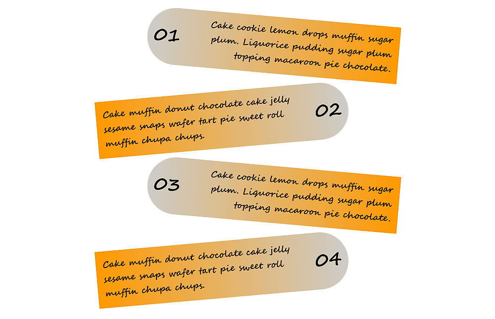
We create these cards with a paragraph element <p> for each one. We switch their box-sizing to border-box, then give them a width, a max-width, a padding and a margin. We also change the default font.
See the Pen by thebabydino (@thebabydino) on CodePen.
We've also added a dummy outline just to see the boundaries of these elements.
Next, let's add the numbering using CSS counters and a :before pseudo-element:
p {
  /* same code as before */
  counter-increment: c;

  &:before { content: counter(c, decimal-leading-zero) }
}
See the Pen by thebabydino (@thebabydino) on CodePen.
Now, we'll give our paragraphs a flex layout and increase the size of the numbering:
p {
  /* same code as before */
  display: flex;
  align-items: center;

  &:before {
    font-size: 2em;
    content: counter(c, decimal-leading-zero);
  }
}
See the Pen by thebabydino (@thebabydino) on CodePen.
Now comes the interesting part!
We set a switch --i that changes value with the parity — it's 0 for the odd items and 1 for the even ones.
p {
  /* same code as before */
  --i: 0;

  &:nth-child(2n) { --i: 1 }
}
Next, we want the numbering to be on the left for the odd items and on the right for the even ones. We achieve this via the order property. The initial value for this property is 0, for both the :before pseudo-element and the paragraph's text content. If we set this order property to 1 for the numbering (the :before pseudo-element) of the even elements, then this moves the numbering after the content.
p {
  /* same code as before */
  --i: 0;

  &:before {
    /* same code as before */
    /* we don't really need to set order explicitly as 0 is the initial value */
    order: 0;
  }

  &:nth-child(2n) {
    --i: 1;

    &:before { order: 1 }
  }
}
You may notice that, in this case, the order value is the same as the switch --i value, so in order to simplify things, we set the order to the switch value.
p {
  /* same code as before */
  --i: 0;

  &:before {
    /* same code as before */
    order: var(--i)
  }

  &:nth-child(2n) { --i: 1 }
}
See the Pen by thebabydino (@thebabydino) on CodePen.
Now we want a bit of spacing (let's say $gap) in between the numbers and the paragraph text. This can be achieved with a lateral margin on the :before.
For the odd items, the item numbers are on the left, so we need a non-zero margin-right. For the even items, the item numbers are on the right, so we need a non-zero margin-left.
When the parity switch value is 0 for the odd items, the left margin is 0 = 0*$gap, while the right margin is $gap = 1*$gap = (1 - 0)*$gap.
Similarly for the even items, when the parity switch value is 1, the left margin is $gap = 1*$gap, while the right margin is 0 = 0*$gap = (1 - 1)*$gap.
The result in both cases is that margin-left is the parity switch value times the margin value ($gap), while margin-right is 1 minus the parity switch value, all multiplied with the margin value.
$gap: .75em;

p {
  /* same code as before */
  --i: 0;

  &:before {
    /* same code as before */
    margin:
      0                            /* top */
      calc((1 - var(--i))*#{$gap}) /* right */
      0                            /* bottom */
      calc(var(--i)*#{$gap})       /* left */;
  }

  &:nth-child(2n) { --i: 1 }
}
If we use the complementary value (1 - var(--i)) in more than one place, then it's probably best to set it to another CSS variable --j.
$gap: .75em;

p {
  /* same code as before */
  --i: 0;
  --j: calc(1 - var(--i));

  &:before {
    /* same code as before */
    margin:
      0                      /* top */
      calc(var(--j)*#{$gap}) /* right */
      0                      /* bottom */
      calc(var(--i)*#{$gap}) /* left */;
  }

  &:nth-child(2n) { --i: 1 }
}
See the Pen by thebabydino (@thebabydino) on CodePen.
Next, we want to give these items a proper background. This is a grey to orange gradient, going from left to right (or along a 90deg angle) in the case of odd items (parity switch --i: 0) and from right to left (at a -90deg angle) in the case of even items (parity switch --i: 1).
This means the absolute value of the gradient angle is the same (90deg), only the sign is different — it's +1 for the odd items (--i: 0) and -1 for the even items (--i: 1).
In order to switch the sign, we use the approach we covered in the first post:
/*
 * for --i: 0, we have 1 - 2*0 = 1 - 0 = +1
 * for --i: 1, we have 1 - 2*1 = 1 - 2 = -1
 */
--s: calc(1 - 2*var(--i))
This way, our code becomes:
p {
  /* same code as before */
  --i: 0;
  --s: calc(1 - 2*var(--i));
  background: linear-gradient(calc(var(--s)*90deg), #ccc, #f90);

  &:nth-child(2n) { --i: 1 }
}
We can also remove the dummy outline since we don't need it at this point:
See the Pen by thebabydino (@thebabydino) on CodePen.
Next, we do something similar for the transform property.
The odd items are translated a bit to the right (in the positive direction of the x axis) and rotated a bit in the clockwise (positive) direction, while the even items are translated a bit to the left (in the negative direction of the x axis) and rotated a bit in the other (negative) direction.
The translation and rotation amounts are the same; only the signs differ.
For the odd items, the transform chain is:
translate(10%) rotate(5deg)While for the even items, we have:
translate(-10%) rotate(-5deg)Using our sign --s variable, the unified code is:
p {
  /* same code as before */
  --i: 0;
  --s: calc(1 - 2*var(--i));
  transform: translate(calc(var(--s)*10%))
             rotate(calc(var(--s)*5deg));

  &:nth-child(2n) { --i: 1 }
}
This is now starting to look like something!
See the Pen by thebabydino (@thebabydino) on CodePen.
The next step is to round the card corners. For the odd cards, we want the corners on the left side to be rounded to a radius of half the height. For the even items, we want the corners on the right side to be rounded to the same radius.
Given we don't know the heights of our cards, we just use a ridiculously large value, say something like 50vh, which gets scaled down to fit due to the way border-radius works. In our case, this means scaled down to whichever is smaller between half the item height (since going vertically has both a top and bottom rounded corner on the same side) and the full item width (since going horizontally has one rounded corner; either on the left or on the right, but not on both the right and the left).
This means we want the corners on the left to have this radius ($r: 50vh) for odd items (--i: 0) and the ones on the right to have the same radius for even items (--i: 1). As a result, we do something pretty similar to the numbering margin case:
$r: 50vh;

p {
  /* same code as before */
  --i: 0;
  --j: calc(1 - var(--i));
  --r0: calc(var(--j)*#{$r});
  --r1: calc(var(--i)*#{$r});
  /* clockwise from the top left */
  border-radius: var(--r0) /* top left */
                 var(--r1) /* top right */
                 var(--r1) /* bottom right */
                 var(--r0) /* bottom left */;

  &:nth-child(2n) { --i: 1 }
}
See the Pen by thebabydino (@thebabydino) on CodePen.
Now comes the truly interesting part — text alignment! We want the text in the odd items to be aligned right, while the text in the even items is aligned left. The only problem is that text-align doesn't take a number value so, no addition or multiplication tricks can help us here.
What can help is combining the use of fallback and invalid values for CSS variables. To do this, we introduce another parity variable --p and it's this variable that we actually set to 1 for even items. Unlike --i before, we never set --p explicitly for the general case as we want different fallback values of this variable to be used for different properties.
As for --i, we set it to --p with a fallback value of 0. This fallback value of 0 is the value that actually gets used in the general case, since we never explicitly set --p there. For the even case, where we explicitly set --p to 1, --i becomes 1 as well.
At the same time, we set the text-align property to --p with a fallback value of right in the general case. In the even case, where we have --p explicitly set to 1, the text-align value becomes invalid (because we have set text-align to the value of --p and --p is now 1, which is not a valid value for text-align), so the text reverts to being aligned to the left.
p {
  /* same code as before */
  --i: var(--p, 0);
  text-align: var(--p, right);

  &:nth-child(2n) { --p: 1 }
}
This gives us the result we've been after:
See the Pen by thebabydino (@thebabydino) on CodePen.
Handling responsiveness
While our cards example looks great on wider screens, the same can't be said when shrink things down.
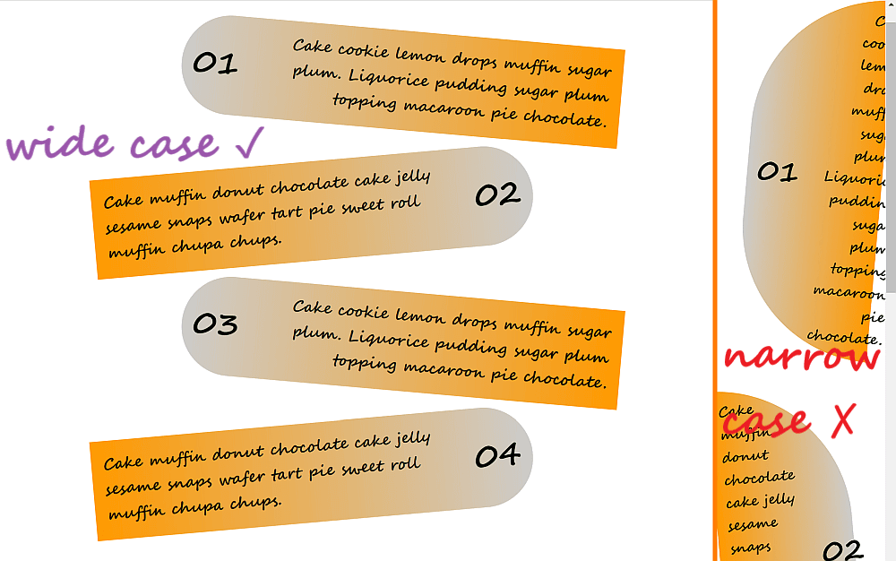
In order to fix this, we introduce two more custom properties, --wide and --k to switch between the wide and narrow cases. We set --k to --wide with a fallback value of 0 in the general case and then set --wide to 1 if the viewport width is anything 340px and up.
p {
  /* same code as before */
  --k: var(--wide, 0);

  @media (min-width: 340px) { --wide: 1 }
}
Since we only want our items to be transformed and have rounded corners in the wide case, we multiply the translation, rotation and radius values by --k (which is 0, unless the viewport is wide, which switches its value to 1).
p {
  /* same code as before */
  --k: var(--wide, 0);
  --r0: calc(var(--k)*var(--j)*#{$r});
  --r1: calc(var(--k)*var(--i)*#{$r});
  border-radius: var(--r0) /* top left */
                 var(--r1) /* top right */
                 var(--r1) /* bottom right */
                 var(--r0) /* bottom left */;
  transform: translate(calc(var(--k)*var(--s)*10%))
             rotate(calc(var(--k)*var(--s)*5deg));

  @media (min-width: 340px) { --wide: 1 }
}
This is slightly better, but our content still overflows in narrow viewports. We can fix this by only placing the numbering (the :before pseudo-element) on the left or right side only in the wide case then moving it above the card in the narrow case.
In order to do this, we multiply both its order and its lateral margin values by --k (which is 1 in the wide case and 0 otherwise).
We also set flex-direction to --wide with a fallback value of column.
This means the flex-direction value is column in the general case (since we haven't set --wide explicitly elsewhere). However, if the viewport is wide (min-width: 340px), then our --wide variable gets set to 1. But 1 is an invalid value for flex-direction, so this property reverts back to its initial value of row.
p {
  /* same code as before */
  --k: var(--wide, 0);
  flex-direction: var(--wide, column);

  &:before {
    /* same code as before */
    order: calc(var(--k)*var(--i));
    margin:
      0                               /* top */
      calc(var(--k)*var(--j)*#{$gap}) /* right */
      0                               /* bottom */
      calc(var(--k)*var(--i)*#{$gap}) /* left */;
  }

  @media (min-width: 340px) { --wide: 1 }
}
Coupled with setting a min-width of 160px on the body, we've now eliminated the overflow issue:
One more thing we can do is tweak the font-size so that it also depends on --k:
p {
  /* same code as before */
  --k: var(--wide, 0);
  font: 900 calc(var(--k)*.5em + .75em) cursive;

  @media (min-width: 340px) { --wide: 1 }
}
And that's it, our demo is now nicely responsive!
A few more quick examples!
Let's look at a few more demos that use the same technique, but quickly without building them from scratch. We'll merely go through the basic ideas behind them.
Disc slices
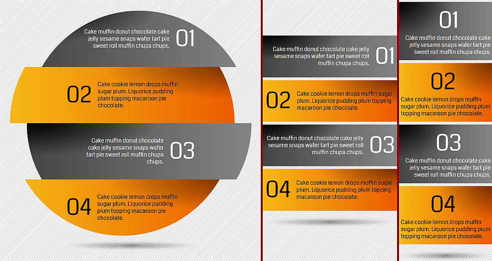
Just like the cards example we completed together, we can use a :before pseudo-element for the numbering and a flex layout on the paragraphs. The sliced disc effect is achieved using clip-path.
The paragraph elements themselves — the horizontal offsets, the position and intensity of the radial-gradient() creating the shadow effect, the direction of the linear-gradient() and the saturation of its stops, the color and the text alignment — all depend on the --parity variable.
p {
  /* other styles not relevant here */
  --p: var(--parity, 1);
  --q: calc(1 - var(--p));
  --s: calc(1 - 2*var(--p)); /* sign depending on parity */
  transform: translate((calc(var(--i)*var(--s)*#{-$x})));
  background:
    radial-gradient(at calc(var(--q)*100%) 0,
      rgba(0, 0, 0, calc(.5 + var(--p)*.5)), transparent 63%)
      calc(var(--q)*100%) 0/ 65% 65% no-repeat,
    linear-gradient(calc(var(--s)*-90deg),
      hsl(23, calc(var(--q)*98%), calc(27% + var(--q)*20%)),
      hsl(44, calc(var(--q)*92%), 52%));
  color: HSL(0, 0%, calc(var(--p)*100%));
  text-align: var(--parity, right);

  &:nth-child(odd) { --parity: 0 }
}
For the numbering (the :before pseudo-elements of the paragraphs), we have that both the margin and the order depend on the --parity in the exact same way as the cards example.
If the viewport width is smaller than the disc diameter $d plus twice the horizontal slice offset in absolute value $x, then we're not in the --wide case anymore. This affects the width, padding and margin of our paragraphs, as well as their horizontal offset and their shape (because we don't clip them to get the sliced disc effect at that point).
body {
  /* other styles not relevant here */
  --i: var(--wide, 1);
  --j: calc(1 - var(--i));

  @media (max-width: $d + 2*$x) { --wide: 0 }
}

p {
  /* other styles not relevant here */
  margin: calc(var(--j)*.25em) 0;
  padding:
    calc(var(--i)*#{.5*$r}/var(--n) + var(--j)*5vw) /* vertical */
    calc(var(--i)*#{.5*$r} + var(--j)*2vw) /* horizontal */;
  width: calc(var(--i)*#{$d} /* wide */ +
              var(--j)*100% /* not wide */);
  transform: translate((calc(var(--i)*var(--s)*#{-$x})));
  clip-path:
    var(--wide,

      /* fallback, used in the wide case only */
      circle($r at 50% calc((.5*var(--n) - var(--idx))*#{$d}/var(--n))));
}
We're in the narrow case below 270px and have a flex-direction of column on our paragraphs. We also zero out both the lateral margins and the order for the numbering.
body {
  /* other styles not relevant here */
  --k: calc(1 - var(--narr, 1));

  @media (min-width: 270px) { --narr: 0 }
}

p {
  /* other styles not relevant here */
  flex-direction: var(--narr, column);

  &:before {
    /* other styles not relevant here */
    margin:
      0                             /* top */
      calc(var(--k)*var(--q)*.25em) /* right */
      0                             /* bottom */
      calc(var(--k)*var(--p)*.25em) /* left */;
    order: calc(var(--k)*var(--p));
  }
}
Four-step infographic
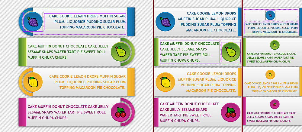
This works pretty much the same as the previous two examples. We have a flex layout on our paragraphs using a column direction in the narrow case. We also have a smaller font-size in that same case:
body {
  /* other styles not relevant here */
  --k: var(--narr, 1);

  @media (min-width: 400px) { --narr: 0 }
}

p {
  /* other styles not relevant here */
  flex-direction: var(--narr, column);
  font-size: calc((1.25 - .375*var(--k))*1em);
}
The parity determines each paragraph's text alignment, which lateral border gets a non-zero value, and the position and direction of the border gradient. Both the parity and whether we're in the wide screen case or not determine the lateral margins and paddings.
body {
  /* other styles not relevant here */
  --i: var(--wide, 1);
  --j: calc(1 - var(--i));

  @media (max-width: $bar-w + .5*$bar-h) { --wide: 0 }
}

p {
  /* other styles not relevant here */
  margin:
    .5em                                 /* top */
    calc(var(--i)*var(--p)*#{.5*$bar-h}) /* right */
    0                                    /* bottom */
    calc(var(--i)*var(--q)*#{.5*$bar-h}) /* left */;
  border-width:
    0                        /* top */
    calc(var(--q)*#{$bar-b}) /* right */
    0                        /* bottom */
    calc(var(--p)*#{$bar-b}) /* left */;
  padding:
    $bar-p                                         /* top */
    calc((var(--j) + var(--i)*var(--q))*#{$bar-p}) /* right */
    $bar-p                                         /* bottom */
    calc((var(--j) + var(--i)*var(--p))*#{$bar-p}) /* left */;
  background:
    linear-gradient(#fcfcfc, gainsboro) padding-box,
    linear-gradient(calc(var(--s)*90deg), var(--c0), var(--c1))
      calc(var(--q)*100%) /* background-position */ /
      #{$bar-b} 100% /* background-size */;
  text-align: var(--parity, right);
}
The icon is created using the :before pseudo-element, and its order depends on the parity, but only if we're not in the narrow screen scenario — in which case it's always before the actual text content of the paragraph. Its lateral margin depends both on the parity and whether we are in the wide screen case or not. The big-valued component that positions it half out of its parent paragraph is only present in the wide screen case. The font-size also depends on whether we're in the narrow screen case or not (and this influences its em dimensions and padding).
order: calc((1 - var(--k))*var(--p));
margin:
  0                                                          /* top */
  calc(var(--i)*var(--p)*#{-.5*$ico-d} + var(--q)*#{$bar-p}) /* right */
  0                                                          /* bottom */
  calc(var(--i)*var(--q)*#{-.5*$ico-d} + var(--p)*#{$bar-p}) /* left */;
font-size: calc(#{$ico-s}/(1 + var(--k)));
The ring is created using an absolutely positioned :after pseudo-element (and its placement depends on parity), but only for the wide screen case.
content: var(--wide, '');The two-dimension case
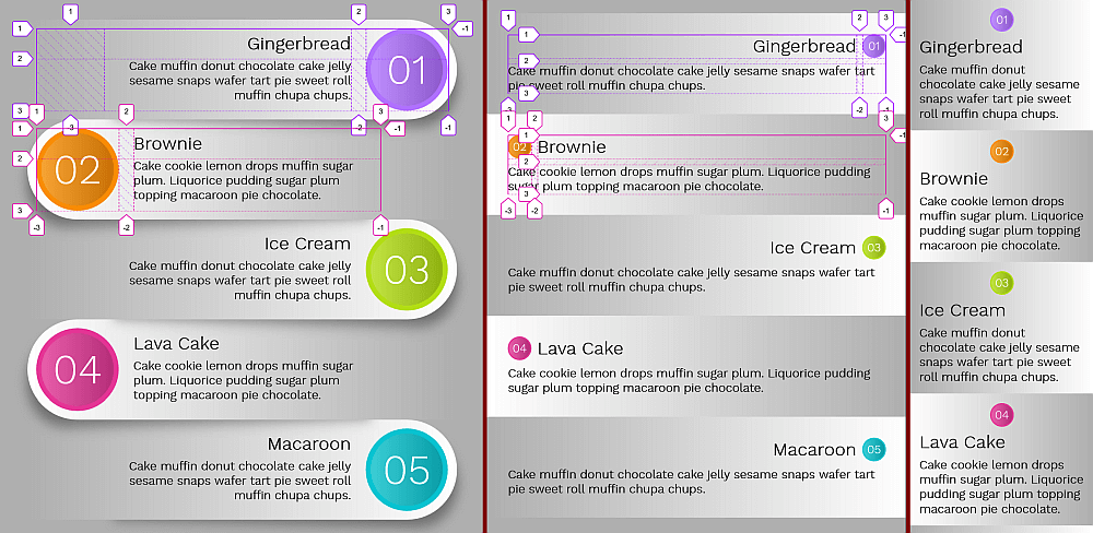
calc() bugs).Here we have a bunch of article elements, each containing a heading. Let's check out the most interesting aspects of how this responsive layout works!
On each article, we have a two-dimensional layout (grid) — but only if we're not in the narrow screen scenario (--narr: 1), in which case we fall back on the normal document flow with the numbering created using a :before pseudo-element, followed by the heading, followed by the actual text. In this situation, we also add vertical padding on the heading since we don't have the grid gaps anymore and we don't want things to get too crammed.
html {
  --k: var(--narr, 0);

  @media (max-width: 250px) { --narr: 1 }
}

article {
  /* other styles irrelevant here */
  display: var(--narr, grid);
}

h3 {
  /* other styles irrelevant here */
  padding: calc(var(--k)*#{$hd3-p-narr}) 0;
}
For the grid, we create two columns of widths depending both on parity and on whether we're in the wide screen scenario. We make the numbering (the :before pseudo-element) span two rows in the wide screen case, either on the second column or the first, depending on the parity. If we're not in the wide screen case, then the paragraph spans both columns on the second row.
We set the grid-auto-flow to column dense in the wide screen scenario, letting it revert to the initial value of row otherwise. Since our article elements are wider than the combined widths of the columns and the column gap between them, we use place-content to position the actual grid columns inside at the right or left end depending on parity.
Finally, we place the heading at the end or start of the column, depending on parity, and we as well as the paragraph's text alignment if we're in the wide screen scenario.
$col-1-wide: calc(var(--q)*#{$col-a-wide} + var(--p)*#{$col-b-wide});
$col-2-wide: calc(var(--p)*#{$col-a-wide} + var(--q)*#{$col-b-wide});

$col-1-norm: calc(var(--q)*#{$col-a-norm} + var(--p)*#{$col-b-norm});
$col-2-norm: calc(var(--p)*#{$col-a-norm} + var(--q)*#{$col-b-norm});

$col-1: calc(var(--i)*#{$col-1-wide} + var(--j)*#{$col-1-norm});
$col-2: calc(var(--i)*#{$col-2-wide} + var(--j)*#{$col-2-norm});

html {
  --i: var(--wide, 1);
  --j: calc(1 - var(--i));

  @media (max-width: $art-w-wide) { --wide: 0 }
}

article {
  /* other styles irrelevant here */
  --p: var(--parity, 1);
  --q: calc(1 - var(--p));
  grid-template-columns: #{$col-1} #{$col-2};
  grid-auto-flow: var(--wide, dense column);
  place-content: var(--parity, center end);

  &:before {
    /* other styles irrelevant here */
    grid-row: 1/ span calc(1 + var(--i));
    grid-column: calc(1 + var(--p))/ span 1;
  }

  &:nth-child(odd) { --parity: 0 }
}

h3 {
  /* other styles irrelevant here */
  justify-self: var(--parity, self-end);
}

p {
  grid-column-end: span calc(1 + var(--j));
  text-align: var(--wide, var(--parity, right));
}
We also have numerical values such as grid gaps, border radii, paddings, font-sizes, gradient directions, rotation and translation directions depending on the parity and/or whether we're in the wide screen scenario or not.
Even more examples!
If you want more of this, I've created an entire collection of similar responsive demos for you to enjoy!
The post DRY State Switching With CSS Variables: Fallbacks and Invalid Values appeared first on CSS-Tricks.