How to Make a List Component with Emotion
Publikováno: 8.7.2020
I’ve been doing a bit of refactoring this week at Sentry and I noticed that we didn’t have a generic List component that we could use across projects and features. So, I started one, but here’s the rub: we style things at Sentry using Emotion, which I have only passing experience with and is described in the docs as…
[…] a library designed for writing css styles with JavaScript. It provides powerful and predictable style composition in addition to
… Read article “How to Make a List Component with Emotion”
The post How to Make a List Component with Emotion appeared first on CSS-Tricks.
I’ve been doing a bit of refactoring this week at Sentry and I noticed that we didn’t have a generic List component that we could use across projects and features. So, I started one, but here’s the rub: we style things at Sentry using Emotion, which I have only passing experience with and is described in the docs as…
[…] a library designed for writing css styles with JavaScript. It provides powerful and predictable style composition in addition to a great developer experience with features such as source maps, labels, and testing utilities. Both string and object styles are supported.
If you’ve never heard of Emotion, the general idea is this: when we’re working on big codebases with lots of components, we want to ensure that we can control the cascade of our CSS. So, let’s say you have an .active class in one file and you want to make sure that doesn’t impact the styles of a completely separate component in another file that also has a class of.active.
Emotion tackles this problem by adding custom strings to your classnames so they don’t conflict with other components. Here’s an example of the HTML it might output:
<div class="css-1tfy8g7-List e13k4qzl9"></div>Pretty neat, huh? There’s lots of other tools and workflows out there though that do something very similar, such as CSS Modules.
To get started making the component, we first need to install Emotion into our project. I’m not going to walkthrough that stuff because it’s going to be different depending on your environment and setup. But once that’s complete we can go ahead and create a new component like this:
import React from 'react';
import styled from '@emotion/styled';

export const List = styled('ul')`
  list-style: none;
  padding: 0;
`;
This looks pretty weird to me because, not only are we writing styles for the <ul> element, but we’re defining that the component should render a <ul>, too. Combining both the markup and the styles in one place feels odd but I do like how simple it is. It just sort of messes with my mental model and the separation of concerns between HTML, CSS, and JavaScript.
In another component, we can import this <List> and use it like this:
import List from 'components/list';

<List>This is a list item.</List>
The styles we added to our list component will then be turned into a classname, like .oefioaueg, and then added to the <ul> element we defined in the component.
But we’re not done yet! With the list design, I needed to be able to render a <ul> and an <ol> with the same component. I also needed a version that allows me to place an icon within each list item. Just like this:
The cool (and also kind of weird) thing about Emotion is that we can use the as attribute to select which HTML element we’d like to render when we import our component. We can use this attribute to create our <ol> variant without having to make a custom type property or something. And that happens to look just like this:
<List>This will render a ul.</List>
<List as="ol">This will render an ol.</List>
That’s not just weird to me, right? It’s super neat, however, because it means that we don’t have to do any bizarro logic in the component itself just to change the markup.
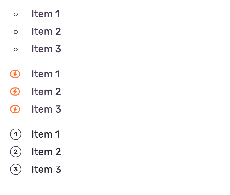
It was at this point that I started to jot down what the perfect API for this component might look like though because then we can work our way back from there. This is what I imagined:
<List>
  <ListItem>Item 1</ListItem>
  <ListItem>Item 2</ListItem>
  <ListItem>Item 3</ListItem>
</List>

<List>
  <ListItem icon={<IconBusiness color="orange400" size="sm" />}>Item 1</ListItem>
  <ListItem icon={<IconBusiness color="orange400" size="sm" />}>Item 2</ListItem>
  <ListItem icon={<IconBusiness color="orange400" size="sm" />}>Item 3</ListItem>
</List>

<List as="ol">
  <ListItem>Item 1</ListItem>
  <ListItem>Item 2</ListItem>
  <ListItem>Item 3</ListItem>
</List>
So after making this sketch I knew we’d need two components, along with the ability to nest icon subcomponents within the <ListItem>. We can start like this:
import React from 'react';
import styled from '@emotion/styled';

export const List = styled('ul')`
  list-style: none;
  padding: 0;
  margin-bottom: 20px;

  ol& {
    counter-reset: numberedList;
  }
`;
That peculiar ol& syntax is how we tell emotion that these styles only apply to an element when it’s rendered as an <ol>. It’s often a good idea to just add a background: red; to this element to make sure your component is rendering things correctly.
Next up is our subcomponent, the <ListItem>. It’s important to note that at Sentry we also use TypeScript, so before we define our <ListItem> component, we’ll need to set our props up first:
type ListItemProps = {
  icon?: React.ReactNode;
  children?: string | React.ReactNode;
  className?: string;
};
Now we can add our <IconWrapper> component that will size an <Icon> component within the ListItem. If you remember from the example above, I wanted it to look something like this:
<List>
  <ListItem icon={<IconBusiness color="orange400" size="sm" />}>Item 1</ListItem>
  <ListItem icon={<IconBusiness color="orange400" size="sm" />}>Item 2</ListItem>
  <ListItem icon={<IconBusiness color="orange400" size="sm" />}>Item 3</ListItem>
</List>
That IconBusiness component is a preexisting component and we want to wrap it in a span so that we can style it. Thankfully, we’ll need just a tiny bit of CSS to align the icon properly with the text and the <IconWrapper> can handle all of that for us:
type ListItemProps = {
  icon?: React.ReactNode;
  children?: string | React.ReactNode;
  className?: string;
};

const IconWrapper = styled('span')`
  display: flex;
  margin-right: 15px;
  height: 16px;
  align-items: center;
`;
Once we’ve done this we can finally add our <ListItem> component beneath these two, although it is considerably more complex. We’ll need to add the props, then we can render the <IconWrapper> above when the icon prop exists, and render the icon component that’s passed into it as well. I’ve also added all the styles below so you can see how I’m styling each of these variants:
export const ListItem = styled(({icon, className, children}: ListItemProps) => (
  <li className={className}>
    {icon && (
      <IconWrapper>
        {icon}
      </IconWrapper>
    )}
    {children}
  </li>
))<ListItemProps>`
  display: flex;
  align-items: center;
  position: relative;
  padding-left: 34px;
  margin-bottom: 20px;

  /* Tiny circle and icon positioning */
  &:before,
	& > ${IconWrapper} {
    position: absolute;
    left: 0;
  }

  ul & {
    color: #aaa;
    /* This pseudo is the tiny circle for ul items */
    &:before {
      content: '';
      width: 6px;
      height: 6px;
      border-radius: 50%;
      margin-right: 15px;
      border: 1px solid #aaa;
      background-color: transparent;
      left: 5px;
      top: 10px;
    }

    /* Icon styles */
    ${p =>
      p.icon &&
      `
      span {
        top: 4px;
      }
      /* Removes tiny circle pseudo if icon is present */
      &:before {
        content: none;
      }
    `}
  }
  /* When the list is rendered as an <ol> */
  ol & {
    &:before {
      counter-increment: numberedList;
      content: counter(numberedList);
      top: 3px;
      display: flex;
      align-items: center;
      justify-content: center;
      text-align: center;
      width: 18px;
      height: 18px;
      font-size: 10px;
      font-weight: 600;
      border: 1px solid #aaa;
      border-radius: 50%;
      background-color: transparent;
      margin-right: 20px;
    }
  }
`;
And there you have it! A relatively simple <List> component built with Emotion. Although, after going through this exercise I’m still not sure that I like the syntax. I reckon it sort of makes the simple stuff really simple but the medium-sized components much more complicated than they should be. Plus, it could be pretty darn confusing to a newcomer and that worries me a bit.
But everything is a learning experience, I guess. Either way, I’m glad I had the opportunity to work on this tiny component because it taught me a few good things about TypeScript, React, and trying to make our styles somewhat readable.
The post How to Make a List Component with Emotion appeared first on CSS-Tricks.