In Defense of a Fussy Website
Publikováno: 26.6.2020
The other day, I was doom-scrolling Twitter and saw a delightful article titled “The Case for Fussy Breakfasts.” I love food — especially breakfast — and since the pandemic hit I’ve been using my breaks in between meetings (or, shh, sometimes in meetings) to make a full bacon, poached egg, vegetable plate. Suffice to say, I really got into the article. This small joy of creating a bit of space for myself for the most important meal … Read article “In Defense of a Fussy Website”
The post In Defense of a Fussy Website appeared first on CSS-Tricks.
The other day, I was doom-scrolling Twitter and saw a delightful article titled “The Case for Fussy Breakfasts.” I love food — especially breakfast — and since the pandemic hit I’ve been using my breaks in between meetings (or, shh, sometimes in meetings) to make a full bacon, poached egg, vegetable plate. Suffice to say, I really got into the article. This small joy of creating a bit of space for myself for the most important meal of the day has been meaningful to me — while everything else feels out of control, indulging in some ceremony has done a tiny part to offset the intensity of our collective situation.
It caused me to think of this “fussiness” as applied to other inconsequential joys. A walk. A bath. What about programming?
While we’re all laser-focused on shipping the newest feature with the hottest software and the best Lighthouse scores, I’ve been missing some joy on the web. For example, I’ve come across apps that seem to convey little care for UX, guidance, richness, and… well, let’s just say that for humans trying to communicate through a computer, we’re certainly bending a lot to… the computer.
Which is a good reminder for us all: the web is more than a mere document reader. While I do love me a healthy Lighthouse score, some of these point matrixes seem to be driven more by our own developer ego in some form of gamification race to the creative bottom rather than a challenge or opportunity. It’s like a hyper-focused attention to shedding bytes and server requests is coming at the expense of creative ways to accomplish delightful experiences. It’s still possible to dazzle users with a solid combination of content, color, and layout if we’re willing to be a bit adventurous — with little to no additional weight at all!
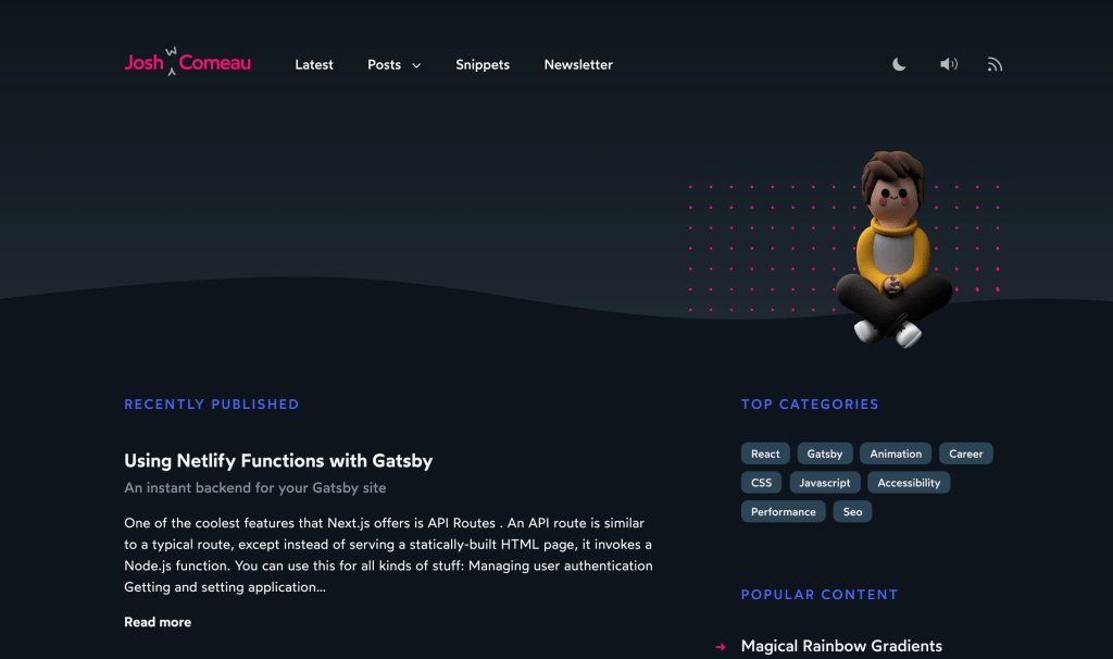
A few of my favorite personal developer sites these days are from Josh Comeau, Johnson Ogwuru and Cassie Evans. The small touches and careful attention to detail lead to these little a-ha! moments that make me want to stick around for a while. I wander around the site, exploring, learning, and feeling more connected to each of these talented devs as people. And notice how they pull it off without laggy performance. They flex their creative and technical muscles and put pure pride into their work and it intrigues me!
It’s easy to get stuck in absolutes and one absolute to watch out for is the belief that anything fun or featuring a flair of style mean it’s “not useful.” I’d argue that the opposite is true. Emotions attach to the limbic system, making memories easier to recall. If your site is a flat bit of text, how will anyone remember it?
Don’t you want to build the site that teams in companies the world over remember and cite as an inspiration? I’ve been at four different companies where people have held up Stripe’s site as an aspirational example. Stripe took chances. Stripe told stories. Stripe engaged the imagination of developer and spoke directly to us.

It honestly makes me a little sad to acknowledge the irony of using a site as an example of what to do then tossing out the things that make it great for other priorities. Any creativity, risk, and intention that goes into great experiences like this gets slowly, piece by piece, chipped away by the drumbeat of “usefulness.” It’s like missing the forest for the trees.
It’s clearly apparent when a site is done with care and excitement. You feel it as you visit, that hum of intention. These are the sites with low bounce rates and the best engagement metrics. They’re the ones that elicit questions like “How can I contribute?” No gimmicks necessary.
Sure, there are lots of factors at play. I get it. Every person or company has constraints and competing priorities. Of course, we all have to get things over the line.
Perhaps a challenge: What small thing can you incorporate into a project that adds a dash of delight to the user experience? Can you start with a something like a hover effect on a link or button? Hey, I didn’t start my new breakfast regimen with a perfectly poached egg; I started by making a goofy scrambled one and I improved on it from there. We can all do the same when it comes to finding opportunities to create engaging websites. Can you outsource one graphic? Can you introduce a tiny easter egg? Perhaps you can write something with a little more personality than the typical corporate lingo.
If something is meaningful to you, the audience you gather will likely be the folks that find it meaningful too.
The post In Defense of a Fussy Website appeared first on CSS-Tricks.