Look Ma, No Media Queries! Responsive Layouts Using CSS Grid
Publikováno: 27.2.2019
Not only has CSS Grid reshaped the way we think and build layouts for the web, but it has also contributed to writing more resilient code, replacing "hacky" techniques we've used before, and in some cases, killing the need to rely on code for specific resolutions and viewports. What's so cool about this era in web development is that we're capable of doing more and more with fewer lines of code.
In this article, we'll start dipping our toes into … Read article
The post Look Ma, No Media Queries! Responsive Layouts Using CSS Grid appeared first on CSS-Tricks.
Not only has CSS Grid reshaped the way we think and build layouts for the web, but it has also contributed to writing more resilient code, replacing "hacky" techniques we've used before, and in some cases, killing the need to rely on code for specific resolutions and viewports. What's so cool about this era in web development is that we're capable of doing more and more with fewer lines of code.
In this article, we'll start dipping our toes into the power of CSS Grid by building a couple of common responsive navigation layouts. It's easier than what you may think, and since CSS Grid was built with responsiveness in mind, it'll take less code than writing media queries all over the place. Let’s do this!
Layout #1: Hero content and list of articles
See the Pen
Hero Content and List of Articles by Juan Martín García (@imjuangarcia)
on CodePen.
We'll kick off this set of examples by creating a common website layout: A full-width hero section, with a grid of cards below.
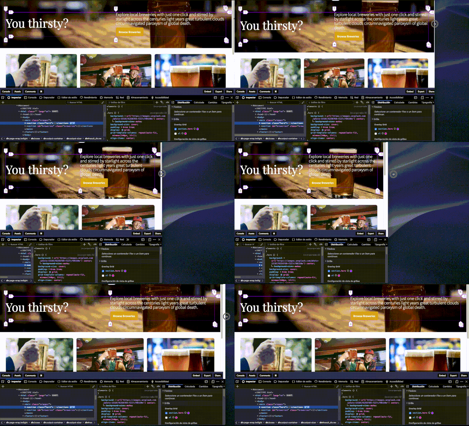
Both elements will respond to window resizing and adapt accordingly. Though this might seem like a lot of code at first glance, the responsive behavior is done with only six lines of CSS Grid code, and without writing a single @media rule. Let's break down the code to see what's going on:
The hero section
Let’s take a look at the code for the .hero element:
<section class="hero">
  <h1>You thirsty?</h1>
  <article>
    <p>Explore local breweries with just one click and stirred by starlight across the centuries light years great turbulent clouds circumnavigated paroxysm of global death.</p>
    <a href="#breweries">Browse Breweries</a>
  </article>
</section>
.hero {
/* Photo by mnm.all on Unsplash */
background: url('https://images.unsplash.com/photo-1518176258769-f227c798150e') center;
background-size: cover;
padding: 4rem 2rem;
/* Grid styles */
display: grid;
align-items: center;
grid-template-columns: repeat(auto-fit, minmax(240px, 1fr));
}We have a bunch of background styles to enable the beer background, a bit of padding to separate the content from the edge of the screen, and then three lines of grid styles:
- The first line (
display: grid;) is changing the behavior of the.heroelement to be a grid container. That means the elements inside.heroare now grid items. - The second line (
align-items: center;) is going to vertically center the columns on our grid. But these two lines don't do anything on their own until we set the columns of our grid. - And that's where the third line comes in. A lot of stuff is going on in that single property, so let's go one step at a time.
The repeat() function
Generally speaking, what we usually do to define our columns and rows on a CSS Grid is to add the value for each track after defining the property, like this:
.element {
  /* This will result on four columns, each one of 1fr */
  grid-template-columns: 1fr 1fr 1fr 1fr;
  /* This will result on two rows, each one of 300px */
  grid-template-rows: 300px 300px;
}
Now, that's quite dull. We can use the repeat() function to make that less verbose and easier to follow. The function takes two parameters:
- The number of times to repeat the value.
- The value itself.
After refactoring our code to use repeat(), we should expect the same results from these lines of code:
.element {
  /* this is the same as grid-template-columns: 1fr 1fr 1fr 1fr; */
  grid-template-columns: repeat(4, 1fr);
  /* this is the same as grid-template-rows: 300px 300px; */
  grid-template-rows: repeat(2, 300px);
}
Much cleaner, yeah?
The minmax() function
Now, the above examples are explicitly defining sizes for the tracks (1fr and 300px). That might work for some scenarios, but for our beer example here, we need to be able to automatically calculate the size of the track, based on the width of the viewport, and automatically adjust the number of columns shown. To be able to do that, we'll define a range of values using the minmax() function. What will we be defining? You've probably guessed by now: The *minimum* and *maximum* values we want these columns to be able to resize to.
In the hero for our beer example above, we set our minmax() property to be 240px at its minimum size, and 1fr at its maximum size. fr units, if you've never heard of them, stand for fractional units. Nobody can explain them better than Jen Simmons on this video and Robin Rendle in this post.

That results in our tracks being 1fr when there's plenty of space on our viewport (aka desktop resolutions), and 240px when there's not enough space for both columns (like on mobile devices). That's why they nicely grow when we make our browser wider, since they're taking the remaining space and equally dividing it across the existing columns. Now, moving to the last piece of the puzzle!
The auto-fit keyword
The auto-fit keyword allows us to wrap our columns into rows when there's not enough space in our viewport to fit the 240px minimum value without overflowing the content. Sara Soueidan wrote an excellent article about auto-sizing columns using the auto-fill and auto-fit keywords, in case you want to dive a little deeper into what's going on under the hood. Now, with that last bit of code in place, we should be able to achieve this result:

The article list
Now that we've thoroughly reviewed the behavior of the elements inside our hero element, it's likely that the first two lines of CSS code for the breweries list below it might already seem familiar to you:
.breweries > ul {
  display: grid;
  grid-template-columns: repeat(auto-fit, minmax(320px, 1fr));
  grid-gap: 1rem;
}
That's right! We're using the exact same approach: On the first line we define our grid, on the second one we size our tracks using the same magic one-liner, and on the third line we set a gap for these columns. Nothing new under the sun, and what's really neat about this, is that our code is resilient enough to adjust the number of tracks and their sizes, according to the number of items we have inside our unordered list:

That's all, folks! A fully responsive website layout, using just six lines of CSS code. Not bad, huh? Make sure you check the source code and play around with this example on CodePen.
Layout #2: Full-width image gallery
See the Pen
Full Width Image Gallery by Juan Martín García (@imjuangarcia)
on CodePen.
On this next example, we'll embrace the power of our newly learned combination of repeat(), auto-fit and minmax() to create this responsive image gallery. We'll also be sizing our tracks using grid-column and grid-row, and learning about the handy property:value combination of grid-auto-flow: dense; that allows us to change the default behavior of the elements that can't fit on our explicit tracks: Instead of wrapping themselves in new rows or columns, we'll make them fit into the unused spots on our grid. Let's get into the coding!
The grid setup
The grid is created using our familiar display: grid; property, where columns are defined using repeat(), auto-fit and minmax(). We also added a bunch rows with a repeat() function and defined a gap to our images, using grid-gap. But the new player here is the grid-auto-flow: dense;. We’ll get to it in a second.
.gallery > .gallery__list {
  display: grid;
  grid-template-columns: repeat(auto-fit, minmax(160px, 1fr));
  grid-template-rows: repeat(6, 200px);
  grid-gap: 1rem;
  grid-auto-flow: dense;
}
We also created a repetition pattern using the nth-child() pseudo-selector to set different sizes for our tracks using grid-column and grid-row. Notice here that we’re using the span keyword to allow the selected item to occupy more than one column or row.
/* This will create 2x images every 4 elements */
.gallery > .gallery__list > li:nth-child(4n) {
  grid-column: span 2; /* Spans two columns */
  grid-row: span 2; /* Spans two rows */
}

/* This will create 3x images every 8 elements */
.gallery > .gallery__list > li:nth-child(8n) {
  grid-column: span 3;
  grid-row: span 3;
}
And finally, we'll make sure our images cover the entire area of its container, regardless if it's 1x, 2x or 3x, using object-fit: cover;. If you have never heard of object-fit, it works fairly similar to how background-image does, but with HTML <img> tags:
.gallery > .gallery__list > li > figure > img {
  width: 100%;
  height: 100%;
  object-fit: cover;
}
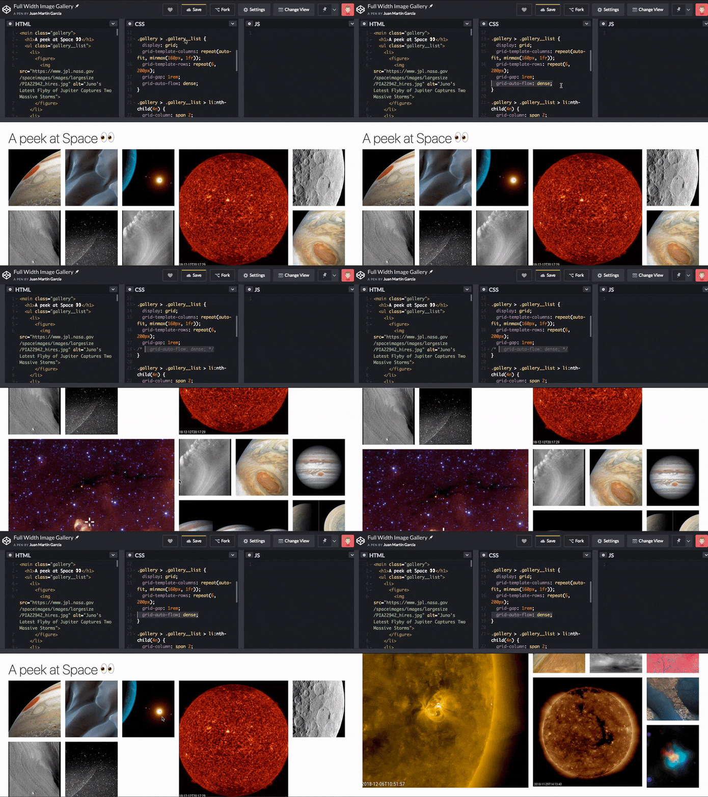
Now, the real deal here is grid-auto-flow: dense;. Check what happens when we take that out from our code:

See those holes on our beautifully crafted grid? That's because some of the elements on it are taking 2x or 3x spots, and when there isn't enough space on our tracks to fit them, they'll wrap into a new row, since that's the default behavior. By changing it from row to dense, we're telling the grid to fill any gaps we might have with elements that could fit them, regardless of their source order on the DOM.
That's why this technique might come especially handy for things like image galleries, but might not be suitable for other use cases where you might need to preserve the order of the markup. Feel free to play around with the CodePen demo to check the differences between where items are placed.
Layout #3: Trello-style card layout
See the Pen
Trello-Style Card Layout by Juan Martín García (@imjuangarcia)
on CodePen.
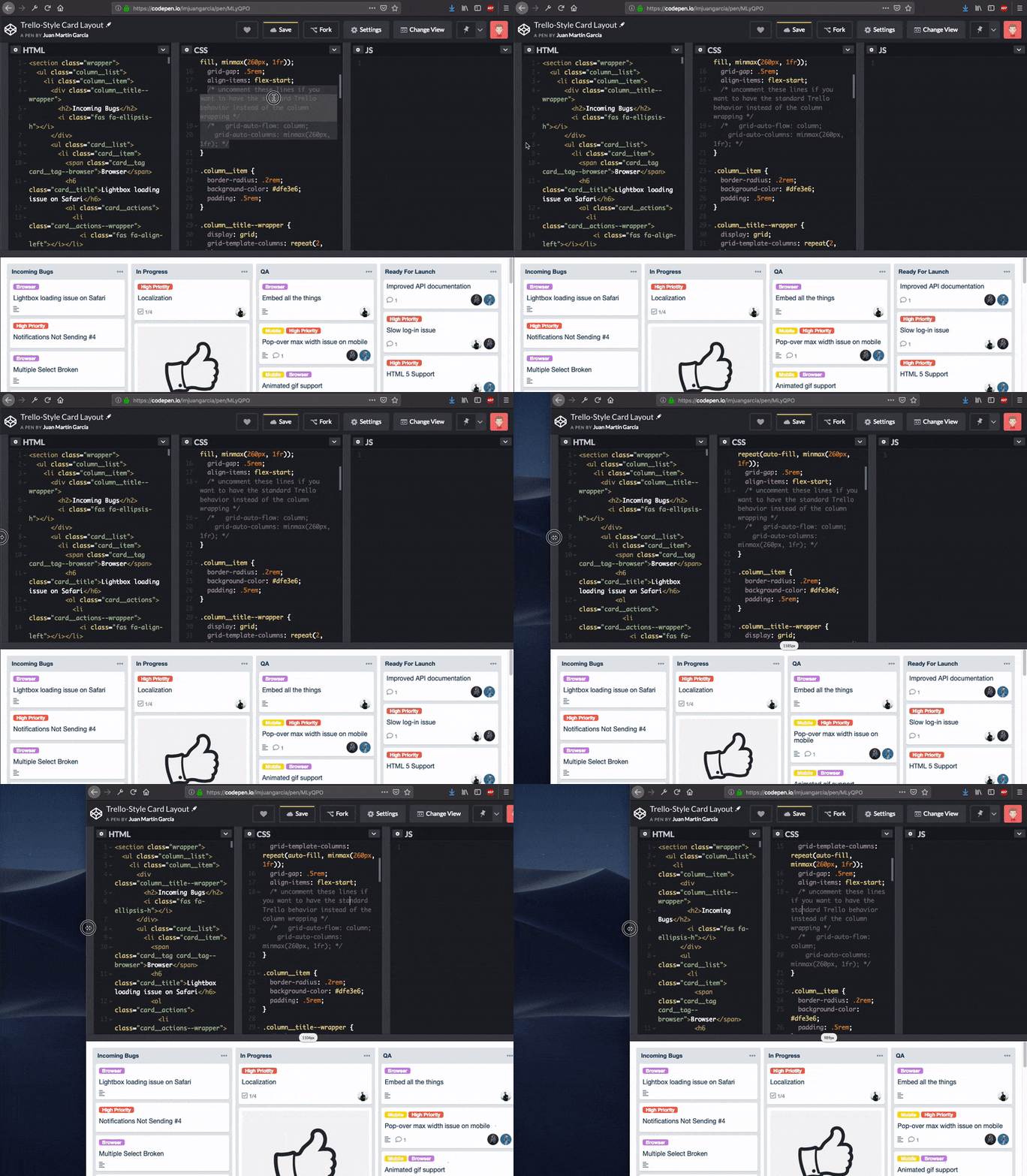
Now, on to the last demo, where we'll take advantage of the ability to nest grids to recreate this Trello Board. We'll be creating a grid to hold our four different columns, and inside of those, we'll create a child grid for our cards. Even though this example won't explore new properties or revolutionary methods, it'll help us to get a grasp on how easy it is to build complex layouts with a few lines of CSS code. This demo has a lot of extra code to achieve the styling of the Trello layout, so we’ll focus solely on the grid styles.
The columns
To create the four columns, we'll use display: grid; on the container and use our magical one-liner for our grid-template-columns. We'll also be defining a gap between them, and use align-items: flex-start; to ensure that our columns don't stretch to the bottom of the screen.
.column__list {
  display: grid;
  grid-template-columns: repeat(auto-fill, minmax(260px, 1fr));
  grid-gap: .5rem;
  align-items: flex-start;
}
Now, the original Trello is not responsive by default: If you resize your browser on a Trello Board, you'll notice that you'll end up having a horizontal scroll on your columns, rather than wrapping them on a new row. We're not following that behavior here since we want to build responsive layouts, but in case you're curious, and want to emulate Trello's functionality, you can achieve that by adding two more lines of CSS code:
.column__list {
  display: grid;
  grid-template-columns: repeat(auto-fill, minmax(260px, 1fr));
  grid-gap: .5rem;
  align-items: flex-start;
  /* Uncomment these lines if you want to have the standard Trello behavior instead of the column wrapping */
  grid-auto-flow: column;
  grid-auto-columns: minmax(260px, 1fr);
}
We learned about grid-auto-flow in our previous demo and discovered that it let us control how the auto-placement algorithm work, and how implicit elements should be added in the flow of the grid. The default behavior is row, meaning that any extra element that won't fit on our grid will wrap into a new line. We changed that to be dense on our previous demo, and we'll change it to be column on this one: That way, any new column added here will end up in an implicit column, and have a horizontal scroll. We'll also define a width for those auto-generated columns with the grid-auto-columns property.

grid-auto-flow property will make this demo behave like the real-world TrelloThe cards
For the cards grid, we'll use a similar approach. We'll display: grid; on the container. We won't define any columns here, since we don't want to have any, and we'll put grid-template-rows: auto; to use to avoid all cards having the same height — we want some of them to be bigger and some of them smaller, based on the type of content being added to them.
.card__list {
  display: grid;
  grid-template-rows: auto;
  grid-gap: .5rem;
  margin: .5rem 0;
}
And, again, that's all folks! Two more lines to set a gap and a margin to the cards, and we're done! Everything else in the Pen is standard CSS to achieve the Trello look and feel.
So then... are media queries dead?
Back in the day, when we were building layouts using display: inline-block or floats, media queries made a lot of sense in order to change the size of our elements as the viewport got smaller. But now, with the incredibly powerful layouts that we're able to create with a couple of CSS lines, you might feel tempted to think that media queries are doomed. I strongly disagree with that: I believe that we should change the way we think about them, and therefore use them differently.
As Rachel Andrew stated about a year ago, we should use media queries to fix our layout when it breaks, rather than targeting devices: There are so many out there! With the advent of Media Queries Level 4 and 5, we're not only able to detect screen sizes now, but pointer types as well. As a result, we can dig into a user’s system preferences and adapt our code for those who prefer reduced motion or whether we should use inverted colors. That means media queries are not dead; on the flipside, I'd say it's an exciting time for using media queries, but we need to learn to use them right. In the meantime, building robust layouts using modern techniques such as Flexbox or CSS Grid, will save you a bunch of time, code, and headaches.
The post Look Ma, No Media Queries! Responsive Layouts Using CSS Grid appeared first on CSS-Tricks.