Making an Audio Waveform Visualizer with Vanilla JavaScript
Publikováno: 12.11.2019
As a UI designer, I’m constantly reminded of the value of knowing how to code. I pride myself on thinking of the developers on my team while designing user interfaces. But sometimes, I step on a technical landmine.
A few years ago, as the design director of wsj.com, I was helping to re-design the Wall Street Journal’s podcast directory. One of the designers on the project was working on the podcast player, and I came upon Megaphone’s embedded player.… Read article
The post Making an Audio Waveform Visualizer with Vanilla JavaScript appeared first on CSS-Tricks.
As a UI designer, I’m constantly reminded of the value of knowing how to code. I pride myself on thinking of the developers on my team while designing user interfaces. But sometimes, I step on a technical landmine.
A few years ago, as the design director of wsj.com, I was helping to re-design the Wall Street Journal’s podcast directory. One of the designers on the project was working on the podcast player, and I came upon Megaphone’s embedded player.
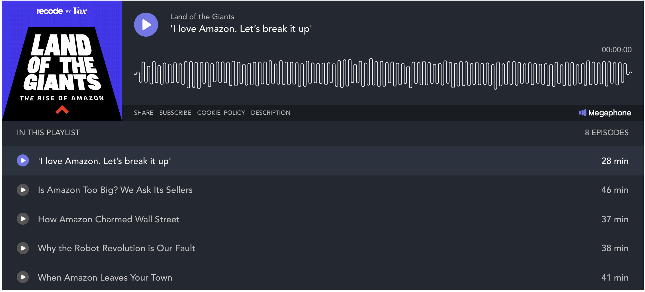
I previously worked at SoundCloud and knew that these kinds of visualizations were useful for users who skip through audio. I wondered if we could achieve a similar look for the player on the Wall Street Journal’s site.
The answer from engineering: definitely not. Given timelines and restraints, it wasn’t a possibility for that project. We eventually shipped the redesigned pages with a much simpler podcast player.
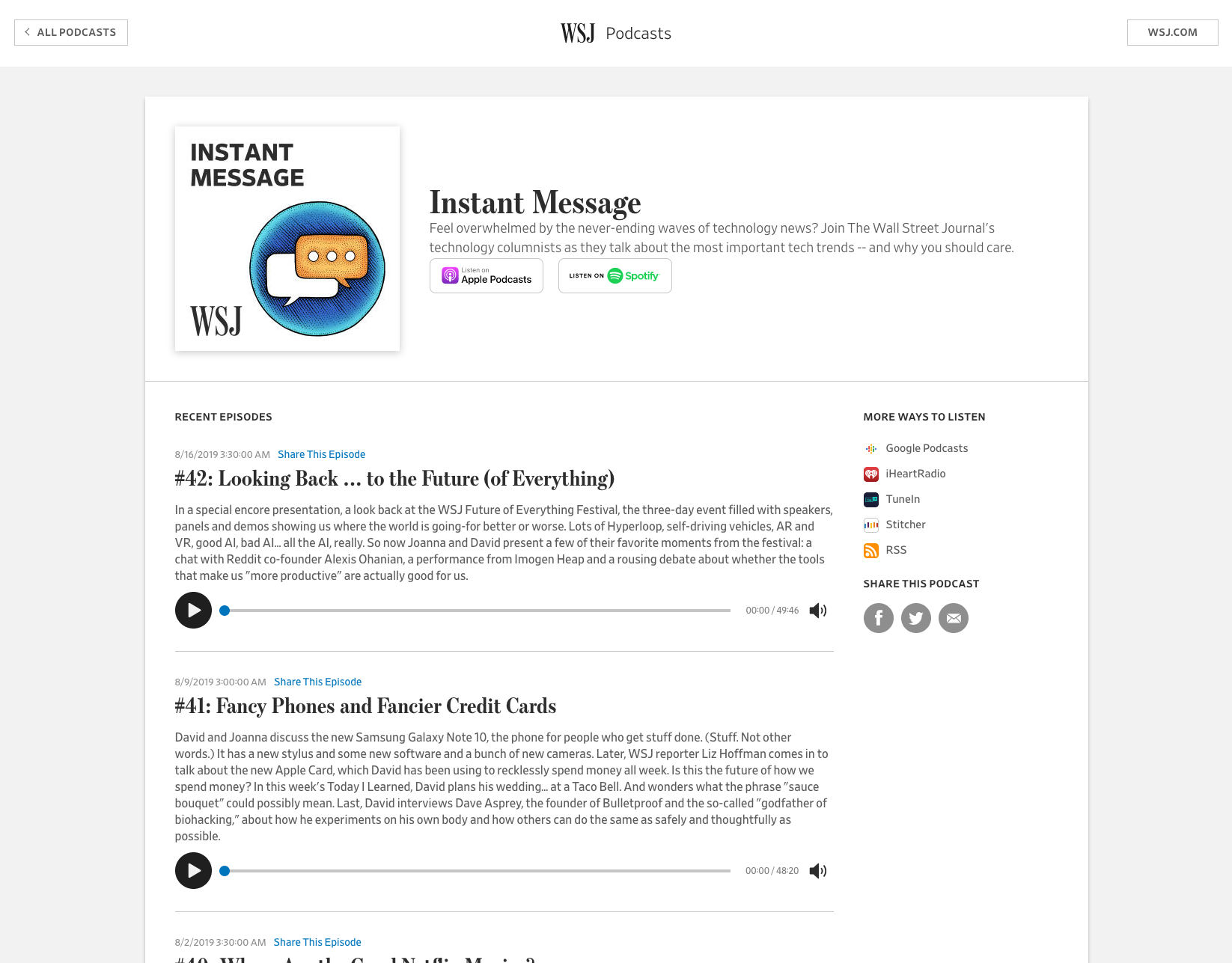
But I was hooked on the problem. Over nights and weekends, I hacked away trying to achieve this
effect. I learned a lot about how audio works on the web, and ultimately was able to achieve the look with less than 100 lines of JavaScript!
It turns out that this example is a perfect way to get acquainted with the Web Audio API, and how to visualize audio data using the Canvas API.
But first, a lesson in how digital audio works
In the real, analog world, sound is a wave. As sound travels from a source (like a speaker) to your ears, it compresses and decompresses air in a pattern that your ears and brain hear as music, or speech, or a dog’s bark, etc. etc.

But in a computer’s world of electronic signals, sound isn’t a wave. To turn a smooth, continuous wave into data that it can store, computers do something called sampling. Sampling means measuring the sound waves hitting a microphone thousands of times every second, then storing those data points. When playing back audio, your computer reverses the process: it recreates the sound, one tiny split-second of audio at a time.
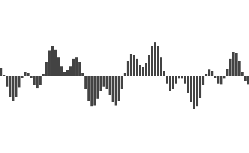
The number of data points in a sound file depends on its sample rate. You might have seen this number before; the typical sample rate for mp3 files is 44.1 kHz. This means that, for every second of audio, there are 44,100 individual data points. For stereo files, there are 88,200 every second — 44,100 for the left channel, and 44,100 for the right. That means a 30-minute podcast has 158,760,000 individual data points describing the audio!
How can a web page read an mp3?
Over the past nine years, the W3C (the folks who help maintain web standards) have developed the Web Audio API to help web developers work with audio. The Web Audio API is a very deep topic; we’ll hardly crack the surface in this essay. But it all starts with something called the AudioContext.
Think of the AudioContext like a sandbox for working with audio. We can initialize it with a few lines of JavaScript:
// Set up audio context
window.AudioContext = window.AudioContext || window.webkitAudioContext;
const audioContext = new AudioContext();
let currentBuffer = null;
The first line after the comment is a necessary because Safari has implemented AudioContext as webkitAudioContext.
Next, we need to give our new audioContext the mp3 file we’d like to visualize. Let’s fetch it using… fetch()!
const visualizeAudio = url => {
  fetch(url)
    .then(response => response.arrayBuffer())
    .then(arrayBuffer => audioContext.decodeAudioData(arrayBuffer))
    .then(audioBuffer => visualize(audioBuffer));
};
This function takes a URL, fetches it, then transforms the Response object a few times.
- First, it calls the
arrayBuffer()method, which returns — you guessed it — anArrayBuffer! AnArrayBufferis just a container for binary data; it’s an efficient way to move lots of data around in JavaScript. - We then send the
ArrayBufferto ouraudioContextvia thedecodeAudioData()method.decodeAudioData()takes anArrayBufferand returns anAudioBuffer, which is a specializedArrayBufferfor reading audio data. Did you know that browsers came with all these convenient objects? I definitely did not when I started this project. - Finally, we send our
AudioBufferoff to be visualized.
Filtering the data
To visualize our AudioBuffer, we need to reduce the amount of data we’re working with. Like I mentioned before, we started off with millions of data points, but we’ll have far fewer in our final visualization.
First, let’s limit the channels we are working with. A channel represents the audio sent to an individual speaker. In stereo sound, there are two channels; in 5.1 surround sound, there are six. AudioBuffer has a built-in method to do this: getChannelData(). Call audioBuffer.getChannelData(0), and we’ll be left with one channel’s worth of data.
Next, the hard part: loop through the channel’s data, and select a smaller set of data points. There are a few ways we could go about this. Let’s say I want my final visualization to have 70 bars; I can divide up the audio data into 70 equal parts, and look at a data point from each one.
const filterData = audioBuffer => {
  const rawData = audioBuffer.getChannelData(0); // We only need to work with one channel of data
  const samples = 70; // Number of samples we want to have in our final data set
  const blockSize = Math.floor(rawData.length / samples); // Number of samples in each subdivision
  const filteredData = [];
  for (let i = 0; i < samples; i++) {
    filteredData.push(rawData[i * blockSize]);
  }
  return filteredData;
}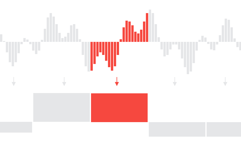
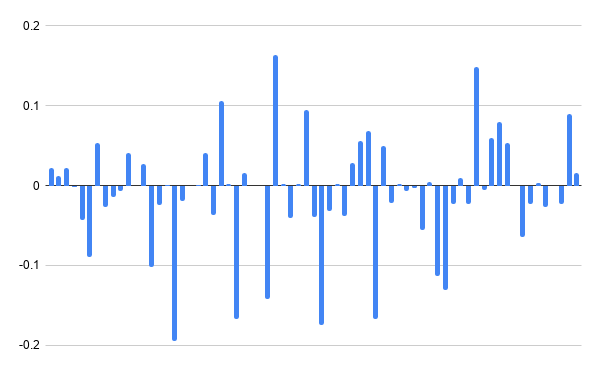
The output caught me off guard! It doesn’t look like the visualization we’re emulating at all. There are lots of data points that are close to, or at zero. But that makes a lot of sense: in a podcast, there is a lot of silence between words and sentences. By only looking at the first sample in each of our blocks, it’s highly likely that we’ll catch a very quiet moment.
Let’s modify the algorithm to find the average of the samples. And while we’re at it, we should take the absolute value of our data, so that it’s all positive.
const filterData = audioBuffer => {
  const rawData = audioBuffer.getChannelData(0); // We only need to work with one channel of data
  const samples = 70; // Number of samples we want to have in our final data set
  const blockSize = Math.floor(rawData.length / samples); // the number of samples in each subdivision
  const filteredData = [];
  for (let i = 0; i < samples; i++) {
    let blockStart = blockSize * i; // the location of the first sample in the block
    let sum = 0;
    for (let j = 0; j < blockSize; j++) {
      sum = sum + Math.abs(rawData[blockStart + j]) // find the sum of all the samples in the block
    }
    filteredData.push(sum / blockSize); // divide the sum by the block size to get the average
  }
  return filteredData;
}
Let’s see what that data looks like.
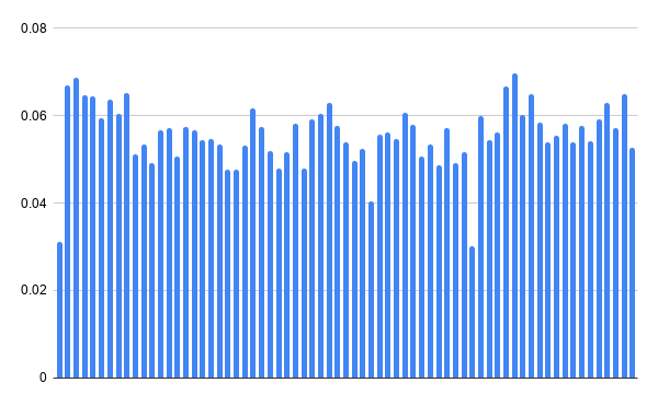
This is great. There’s only one thing left to do: because we have so much silence in the audio file, the resulting averages of the data points are very small. To make sure this visualization works for all audio files, we need to normalize the data; that is, change the scale of the data so that the loudest samples measure as 1.
const normalizeData = filteredData => {
  const multiplier = Math.pow(Math.max(...filteredData), -1);
  return filteredData.map(n => n * multiplier);
}
This function finds the largest data point in the array with Math.max(), takes its inverse with Math.pow(n, -1), and multiplies each value in the array by that number. This guarantees that the largest data point will be set to 1, and the rest of the data will scale proportionally.
Now that we have the right data, let’s write the function that will visualize it.
Visualizing the data
To create the visualization, we’ll be using the JavaScript Canvas API. This API draws graphics into an HTML <canvas> element. The first step to using the Canvas API is similar to the Web Audio API.
const draw = normalizedData => {
  // Set up the canvas
  const canvas = document.querySelector("canvas");
  const dpr = window.devicePixelRatio || 1;
  const padding = 20;
  canvas.width = canvas.offsetWidth * dpr;
  canvas.height = (canvas.offsetHeight + padding * 2) * dpr;
  const ctx = canvas.getContext("2d");
  ctx.scale(dpr, dpr);
  ctx.translate(0, canvas.offsetHeight / 2 + padding); // Set Y = 0 to be in the middle of the canvas
};
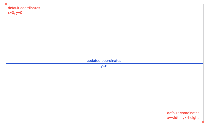
This code finds the <canvas> element on the page, and checks the browser’s pixel ratio (essentially the screen’s resolution) to make sure our graphic will be drawn at the right size. We then get the context of the canvas (its individual set of methods and values). We calculate the pixel dimensions pf the canvas, factoring in the pixel ratio and adding in some padding. Lastly, we change the coordinates system of the <canvas>; by default, (0,0) is in the top-left of the box, but we can save ourselves a lot of math by setting (0, 0) to be in the middle of the left edge.
Now let’s draw some lines! First, we’ll create a function that will draw an individual segment.
const drawLineSegment = (ctx, x, y, width, isEven) => {
  ctx.lineWidth = 1; // how thick the line is
  ctx.strokeStyle = "#fff"; // what color our line is
  ctx.beginPath();
  y = isEven ? y : -y;
  ctx.moveTo(x, 0);
  ctx.lineTo(x, y);
  ctx.arc(x + width / 2, y, width / 2, Math.PI, 0, isEven);
  ctx.lineTo(x + width, 0);
  ctx.stroke();
};
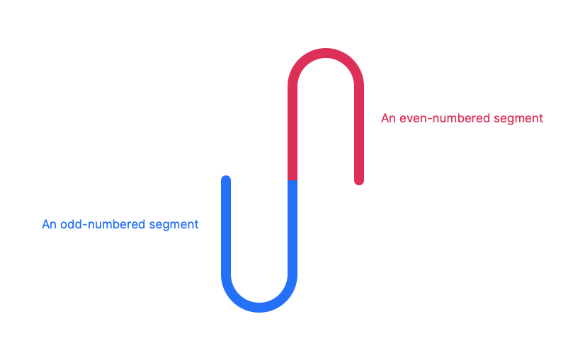
The Canvas API uses an concept called “turtle graphics.” Imagine that the code is a set of instructions being given to a turtle with a marker. In basic terms, the drawLineSegment() function works as follows:
- Start at the center line,
x = 0. - Draw a vertical line. Make the height of the line relative to the data.
- Draw a half-circle the width of the segment.
- Draw a vertical line back to the center line.
Most of the commands are straightforward: ctx.moveTo() and ctx.lineTo() move the turtle to the specified coordinate, without drawing or while drawing, respectively.
Line 5, y = isEven ? -y : y, tells our turtle whether to draw down or up from the center line. The segments alternate between being above and below the center line so that they form a smooth wave. In the world of the Canvas API, negative y values are further up than positive ones. This is a bit counter-intuitive, so keep it in mind as a possible source of bugs.
On line 8, we draw a half-circle. ctx.arc() takes six parameters:
- The x and y coordinates of the center of the circle
- The radius of the circle
- The place in the circle to start drawing (
Math.PIor π is the location, in radians, of 9 o’clock) - The place in the circle to finish drawing (
0in radians represents 3 o’clock) - A boolean value telling our turtle to draw either counterclockwise (if
true) or clockwise (iffalse). UsingisEvenin this last argument means that we’ll draw the top half of a circle — clockwise from 9 o’clock to 3 clock — for even-numbered segments, and the bottom half for odd-numbered segments.
OK, back to the draw() function.
const draw = normalizedData => {
  // Set up the canvas
  const canvas = document.querySelector("canvas");
  const dpr = window.devicePixelRatio || 1;
  const padding = 20;
  canvas.width = canvas.offsetWidth * dpr;
  canvas.height = (canvas.offsetHeight + padding * 2) * dpr;
  const ctx = canvas.getContext("2d");
  ctx.scale(dpr, dpr);
  ctx.translate(0, canvas.offsetHeight / 2 + padding); // Set Y = 0 to be in the middle of the canvas

  // draw the line segments
  const width = canvas.offsetWidth / normalizedData.length;
  for (let i = 0; i < normalizedData.length; i++) {
    const x = width * i;
    let height = normalizedData[i] * canvas.offsetHeight - padding;
    if (height < 0) {
        height = 0;
    } else if (height > canvas.offsetHeight / 2) {
        height = height > canvas.offsetHeight / 2;
    }
    drawLineSegment(ctx, x, height, width, (i + 1) % 2);
  }
};
After our previous setup code, we need to calculate the pixel width of each line segment. This is the canvas’s on-screen width, divided by the number of segments we’d like to display.
Then, a for-loop goes through each entry in the array, and draws a line segment using the function we defined earlier. We set the x value to the current iteration’s index, times the segment width. height, the desired height of the segment, comes from multiplying our normalized data by the canvas’s height, minus the padding we set earlier. We check a few cases: subtracting the padding might have pushed height into the negative, so we re-set that to zero. If the height of the segment will result in a line being drawn off the top of the canvas, we re-set the height to a maximum value.
We pass in the segment width, and for the isEven value, we use a neat trick: (i + 1) % 2 means “find the reminder of i + 1 divided by 2.” We check i + 1 because our counter starts at 0. If i + 1 is even, its remainder will be zero (or false). If i is odd, its remainder will be 1 or true.
And that’s all she wrote. Let’s put it all together. Here’s the whole script, in all its glory.
See the Pen
Audio waveform visualizer by Matthew Ström (@matthewstrom)
on CodePen.
In the drawAudio() function, we’ve added a few functions to the final call: draw(normalizeData(filterData(audioBuffer))). This chain filters, normalizes, and finally draws the audio we get back from the server.
If everything has gone according to plan, your page should look like this:

Notes on performance
Even with optimizations, this script is still likely running hundreds of thousands of operations in the browser. Depending on the browser’s implementation, this can take many seconds to finish, and will have a negative impact on other computations happening on the page. It also downloads the whole audio file before drawing the visualization, which consumes a lot of data. There are a few ways that we could improve the script to resolve these issues:
- Analyze the audio on the server side. Since audio files don’t change often, we can take advantage of server-side computing resources to filter and normalize the data. Then, we only have to transmit the smaller data set; no need to download the mp3 to draw the visualization!
- Only draw the visualization when a user needs it. No matter how we analyze the audio, it makes sense to defer the process until well after page load. We could either wait until the element is in view using an intersection observer, or delay even longer until a user interacts with the podcast player.
- Progressive enhancement. While exploring Megaphone’s podcast player, I discovered that their visualization is just a facade — it’s the same waveform for every podcast. This could serve as a great default to our (vastly superior) design. Using the principles of progressive enhancement, we could load a default image as a placeholder. Then, we can check to see if it makes sense to load the real waveform before initiating our script. If the user has JavaScript disabled, their browser doesn’t support the Web Audio API, or they have the
save-dataheader set, nothing is broken.
I’d love to hear any thoughts y’all have on optimization, too.
Some closing thoughts
This is a very, very impractical way of visualizing audio. It runs on the client side, processing millions of data points into a fairly straightforward visualization.
But it’s cool! I learned a lot in writing this code, and even more in writing this article. I refactored a lot of the original project and trimmed the whole thing in half. Projects like this might not ever go on to see a production codebase, but they are unique opportunities to develop new skills and a deeper understanding of some of the neat APIs modern browsers support.
I hope this was a helpful tutorial. If you have ideas of how to improve it, or any cool variations on the theme, please reach out! I’m @ilikescience on Twitter.
The post Making an Audio Waveform Visualizer with Vanilla JavaScript appeared first on CSS-Tricks.