Making width and flexible items play nice together
Publikováno: 1.7.2019
The short answer:flex-shrink and flex-basis are probably what you’re lookin’ for.
Let’s say you want to align an image and some text next to each other with like this:
Now let's say you reach for flexbox to make it happen. Setting the parent element to display: flex; is a good first start.
.container {
  display: flex;
}
And this results in...
See the Pen
Flex-Shrink Example 1 by Robin Rendle (@robinrendle)
on CodePen.
… Read article
The short answer:flex-shrink and flex-basis are probably what you’re lookin’ for.
The long answer
Let’s say you want to align an image and some text next to each other with like this:

Now let's say you reach for flexbox to make it happen. Setting the parent element to display: flex; is a good first start.
.container {
  display: flex;
}
And this results in...
See the Pen
Flex-Shrink Example 1 by Robin Rendle (@robinrendle)
on CodePen.
Yikes! Well, that's kinda okay, I guess. It makes sense that the image would bump right up against the text like that because we haven’t set a width on the image. Ideally, though, we’d like that image to have a fixed width and then the text should take up whatever space is left over.
Okay, so let’s go do that!
.container {
  display: flex;
}

img {
  width: 50px;
  margin-right: 20px;
}
See the Pen
Flex-Shrink Example 2 by Robin Rendle (@robinrendle)
on CodePen.
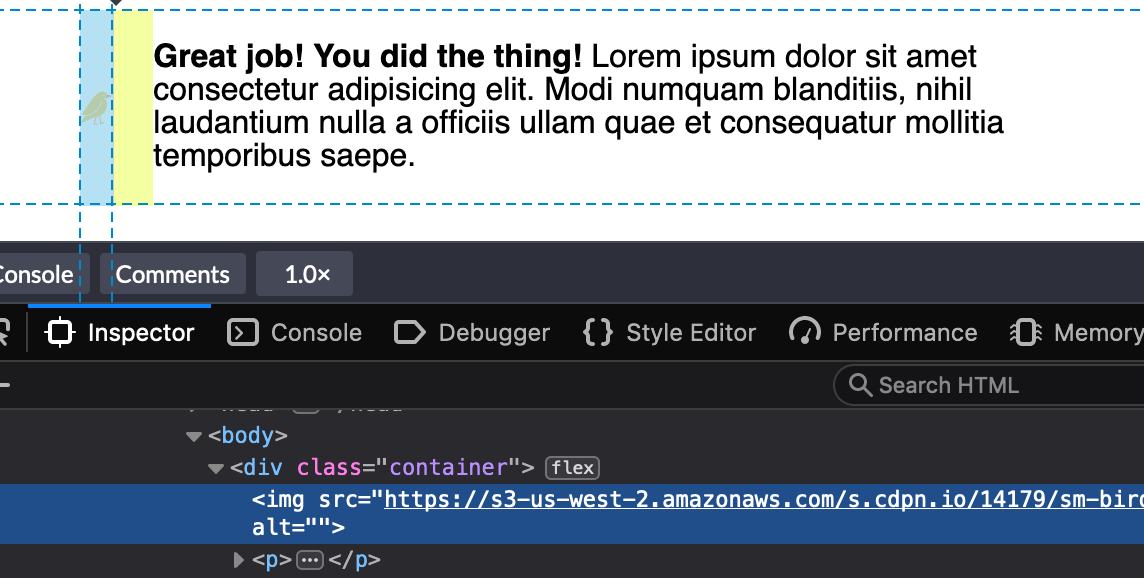
This looks great in Chrome. But wait, what? If we inspect the image tag in Firefox DevTools, we’ll find that it’s not the width value that we set at all:

We could use min-width to force the image to the 50px width we want:
img {
  min-width: 50px;
  margin-right: 20px;
}
Buuuuuuut, that only sets helps with the width so we've got to put a margin in as well.
img {
  min-width: 50px;
  margin-right: 20px;
}
There we go. That's better in Firefox and still works in Chrome.
The even longer answer
I realized the image is getting the squished treatment because we need to use the flex-shrink property to tell flex items not to decrease in size, regardless of whether or not they have a width.
All flex-items have a flex-shrink value of 1. We need to set the image element to 0:
.container {
  display: flex;
}

img {
  width: 50px;
  margin-right: 20px;
  flex-shrink: 0;
}
See the Pen
Flex-Shrink Example 3 by Robin Rendle (@robinrendle)
on CodePen.
Getting better! But we can still do more to improve this.
The director's cut answer
We can tidy things up further because flex-shrink is included in the flex shorthand property.
flex: none | [ <'flex-grow'> <'flex-shrink'>? || <'flex-basis'> ]If we set the flex-shrink value to 0 and the flex-basis value to the default width we want the image to be, then we can get rid of the width property altogether.
.container {
  display: flex;
}

img {
  flex: 0 0 50px;
  margin-right: 20px;
}
Oh yeah:
See the Pen
Flex-Shrink Example 2 by Geoff Graham (@geoffgraham)
on CodePen.
Another example
That flex-shrink property solves a ton of other problems and is pretty dang important if you want to start using flexbox. Here’s another example why: I stumbled upon yet another problem like the one above and I mentioned it in a recent edition of the newsletter. I was building a navigation component that would let users scroll left and right through multiple items. I noticed the following problem when checking my work:
See the Pen
flex-shrink nav item 1 by Robin Rendle (@robinrendle)
on CodePen.
That longer navigation item shouldn’t break into multiple lines like that — but I finally understood why this was happening, thanks to the previous issue. If you set the flex-shrink property to 0 then it will tell each item in this navigation not to shrink and instead assume the width of the content instead, like this:
See the Pen
flex-shrink nav item by Robin Rendle (@robinrendle)
on CodePen.
And, yes, we can go the extra step once again to use the flex property instead, this time using auto as the flex-basis since we want the maximum amount of space for all items to be considered when divvying up space in the navigation container.
See the Pen
Setting flex for flexible nav elements by Geoff Graham (@geoffgraham)
on CodePen.
Huzzah! We figured it out. Even though the answer is a single line of code, it's is pretty essential one to making truly flexible elements.