Material Theming: Making Material Your Own!
Publikováno: 3.6.2019
The web is a beautiful, expressive medium that’s evolved over time as trends and technology have changed. Moments of delight and flair are what set companies apart from one another. At the same time, today’s top products rely on scalable, component-based design systems to efficiently develop a coherent brand. And it’s more important than ever to have accessibility and a solid user experience baked in from the start! But these two worlds — creative web design and systematic web design … Read article
The post Material Theming: Making Material Your Own! appeared first on CSS-Tricks.
The web is a beautiful, expressive medium that’s evolved over time as trends and technology have changed. Moments of delight and flair are what set companies apart from one another. At the same time, today’s top products rely on scalable, component-based design systems to efficiently develop a coherent brand. And it’s more important than ever to have accessibility and a solid user experience baked in from the start! But these two worlds — creative web design and systematic web design — don’t need to be at arms. The beautiful gooey center of the web design world is where we can find a way to meld creative web design in with our systems, and luckily, you can have both!
One of those design systems is called Material Design (the team I just joined at Google!). Material is built on years of research and best practices to give designers and developers access to creating beautiful, accessible UIs with the least amount of work possible. But in its initial launch, one thing was missing from the equation: the ability to express a brand’s personality in an easy-to-implement way. The team heard two key pieces of feedback:
- Material wasn’t stylistically flexible enough to meet the needs of all products, brands, and users.
- It wasn’t easy enough to apply and build brand experiences systematically across products.
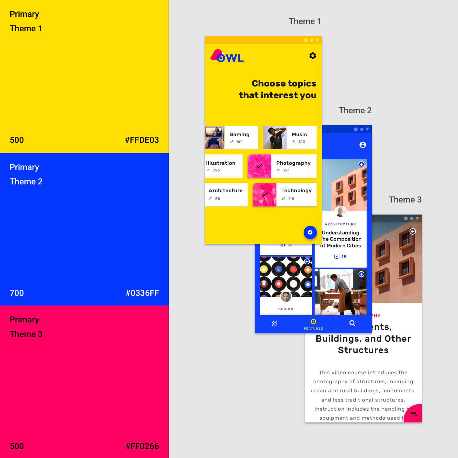
And as of last year (specifically, I/O 2018), Material announced new theming capabilities! Theming allows developers and designers to benefit from all the parts of Material that make it a world-class design system — and make it their own! In other words: You can customize the look and feel of Material Components by applying global changes to your product’s color, shape, and typography.
Material Components are built for multiple systems like Android, iOS, and Flutter, and we’re going to focus on the web for this post (this is CSS-Tricks after all). Let’s start off with a base login template using Material Components for the web to see how easy implementing a theme atop this will be:
About theming
The current theming implementations allow for color, typography, and shape adjustments that trickle down to every component in your product. These three subsystems may not sound like many options, but together they bring a big impact to the design, and are a great springboard to jump off of with more design changes on a more granular level.
Color
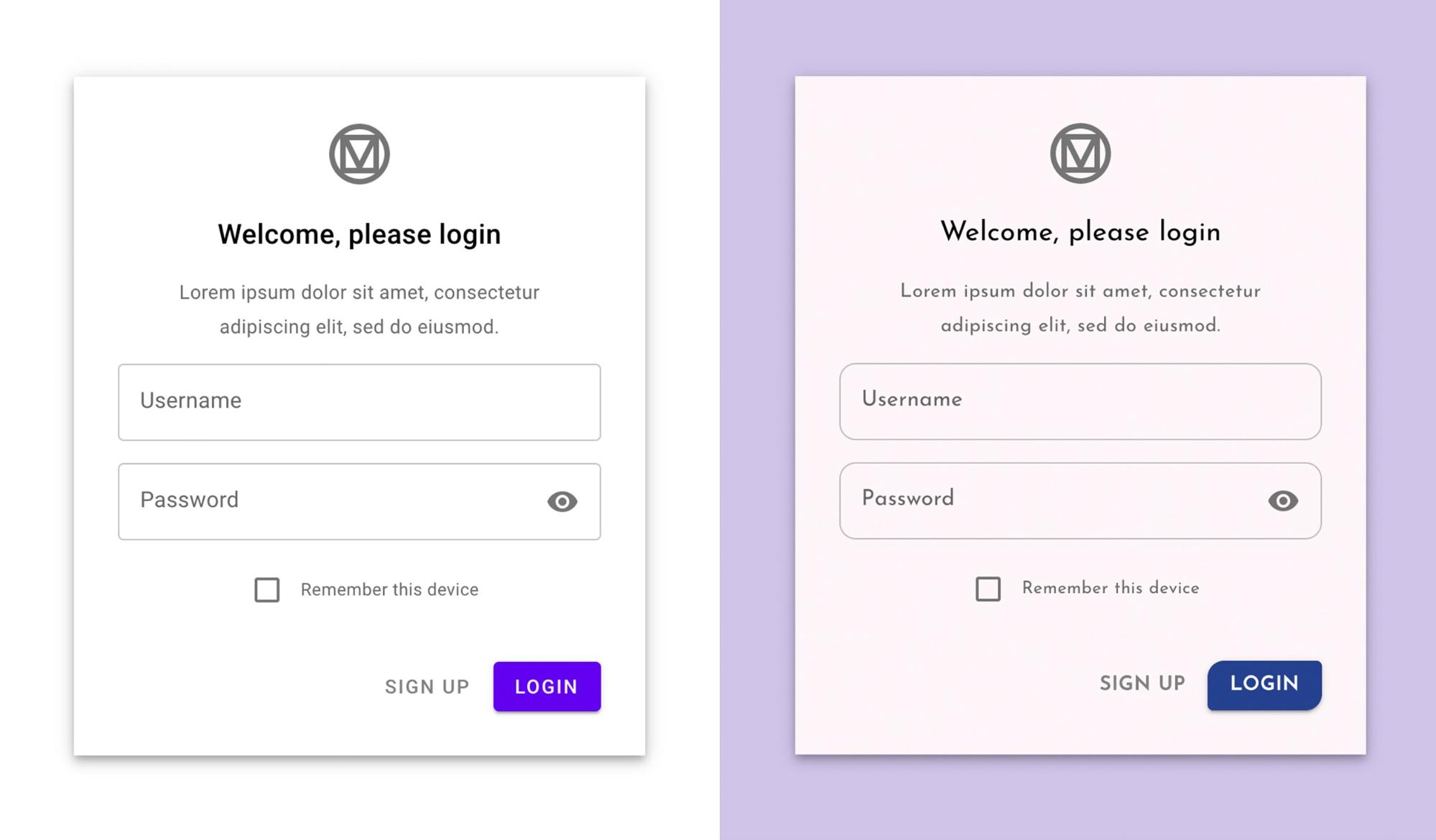
The first themable option is color. There’s a great color picker tool on Material.io for you to be able to see contrast and aid your color selection process. Since this is CSS-Tricks, let’s write some CSS (okay, more like SCSS), to get started with an example. In a few lines of code in our my-theme.scss file, we can entirely change the look and feel of this login screen:
We’ve set:
$mdc-theme-primary: #26418f;
$mdc-theme-secondary: #d1c4e9;
$mdc-theme-background: #fdf6f9;
Even though we have not specified a $mdc-theme-on-primary, the system knows to make this white now (using a Sass contrast function) to help us ensure accessible color contrast. We can also override the text color on the primary and secondary themes with $mdc-theme-on-primary and $mdc-theme-on-secondary. However, if no value is explicitly set, these will either be black or white based on the background. See the color picker for more information.
Typography
Material sets up a base typography scale, which can be customized with theming. You can adjust the typography for each individual headline level and apply it throughout your product in two ways:
- Using CSS classes to apply the styles. I.e.
<h1 class="mdc-typography--headline1"> - Using mixins to extend the styles from a header component onto another (i.e.
h1 {@include mdc-typography(headline1);}). You can see an example of this in our starter kit example on Glitch.
A quick way to change the typeface is by using Google Fonts — a really nice directory of free web fonts. We’re going to make this easy for ourselves and pick out a Google font called Josefin Sans. In order to use this in our project, we’ll need to import it, and then can set the base typography to use it:
@import url('https://fonts.googleapis.com/css?family=Josefin+Sans');
$mdc-typography-font-family: unquote("Josefin Sans, sans-serif");
We use unquote here because the typography in Material is set in a map. We can specify more styles like so:
$mdc-typography-styles-button: (
 font-size: 14px,
 font-weight: 600,
 letter-spacing: 0.05em,
);
Now our login page looks like this:
Shape
Shape is another way to be expressive with your code! What do I mean by shape? In Material, shape affects the corner radius of components, such as buttons, cards, and sheets. In product design, shape helps to define your brand. Is it angular and machine-like, or is it more rounded and organic? Changing shape trickles down through the rest of the system. Here are some examples of shape in Material:
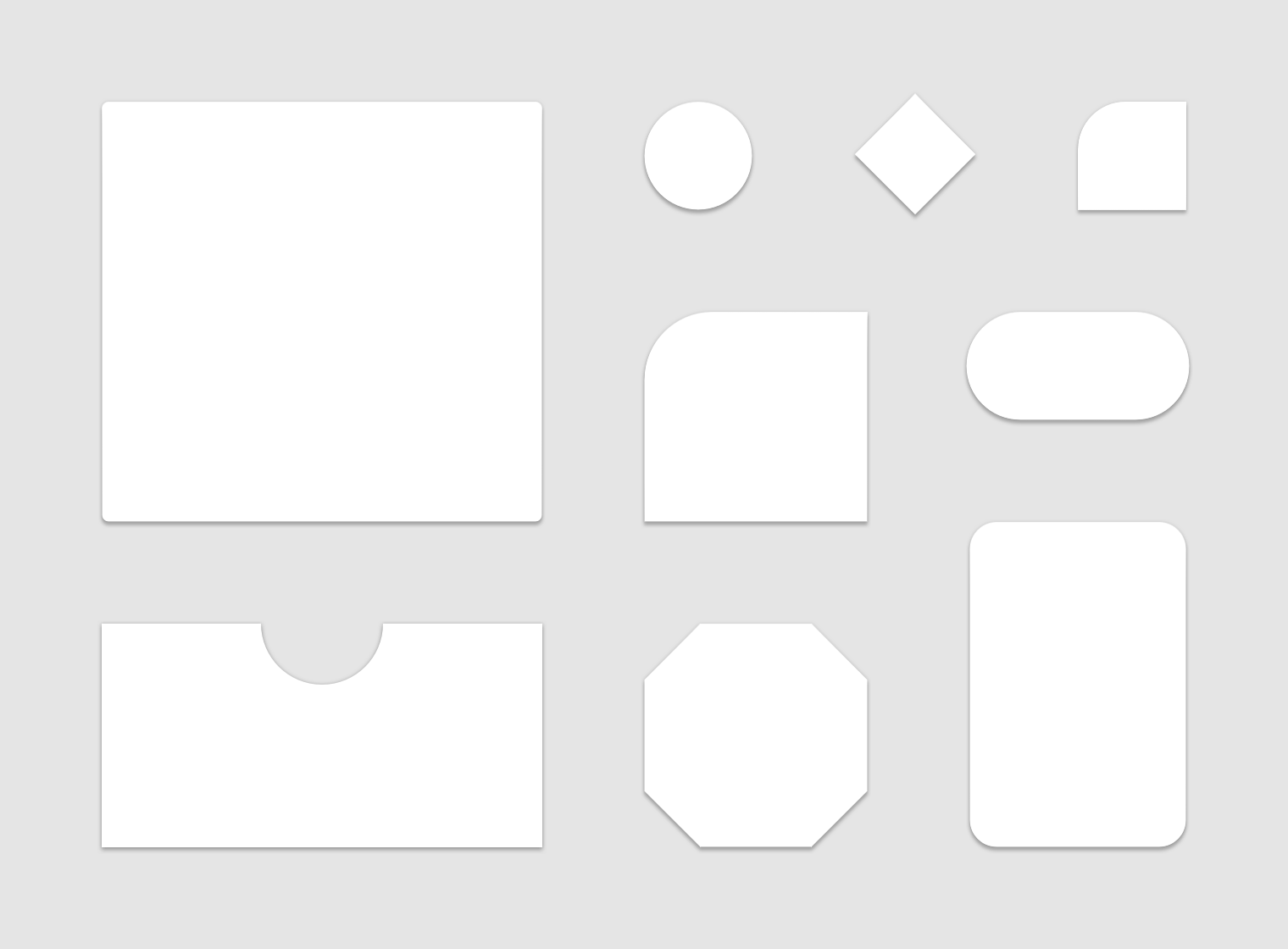
The other cool thing about shape in Material Components is that you don’t have to have the same shape on each corner, or even the same component at different sizes. There are small, medium, and large components in Material, and you can apply different styles for these different component types, and you can mix it up and specify each corner, one-by-one, in a space-separated list of values just as you would with border-radius.
MDC Web does not currently support cut corners like the other platforms do since it is a non-trivial operation with current web standards. This is another reason I personally love Houdini and see a lot of impact for it in future CSS development!
In the example we’re working with, we have both large and small components. The large components are the text field inputs, and the small component is the “login” button. We can apply different shapes to these with:
$mdc-shape-small-component-radius: 12px 4px;
$mdc-shape-large-component-radius: 8px;And voilà! We have transformed our application in 12 lines of code.
Themes, themes, everywhere!
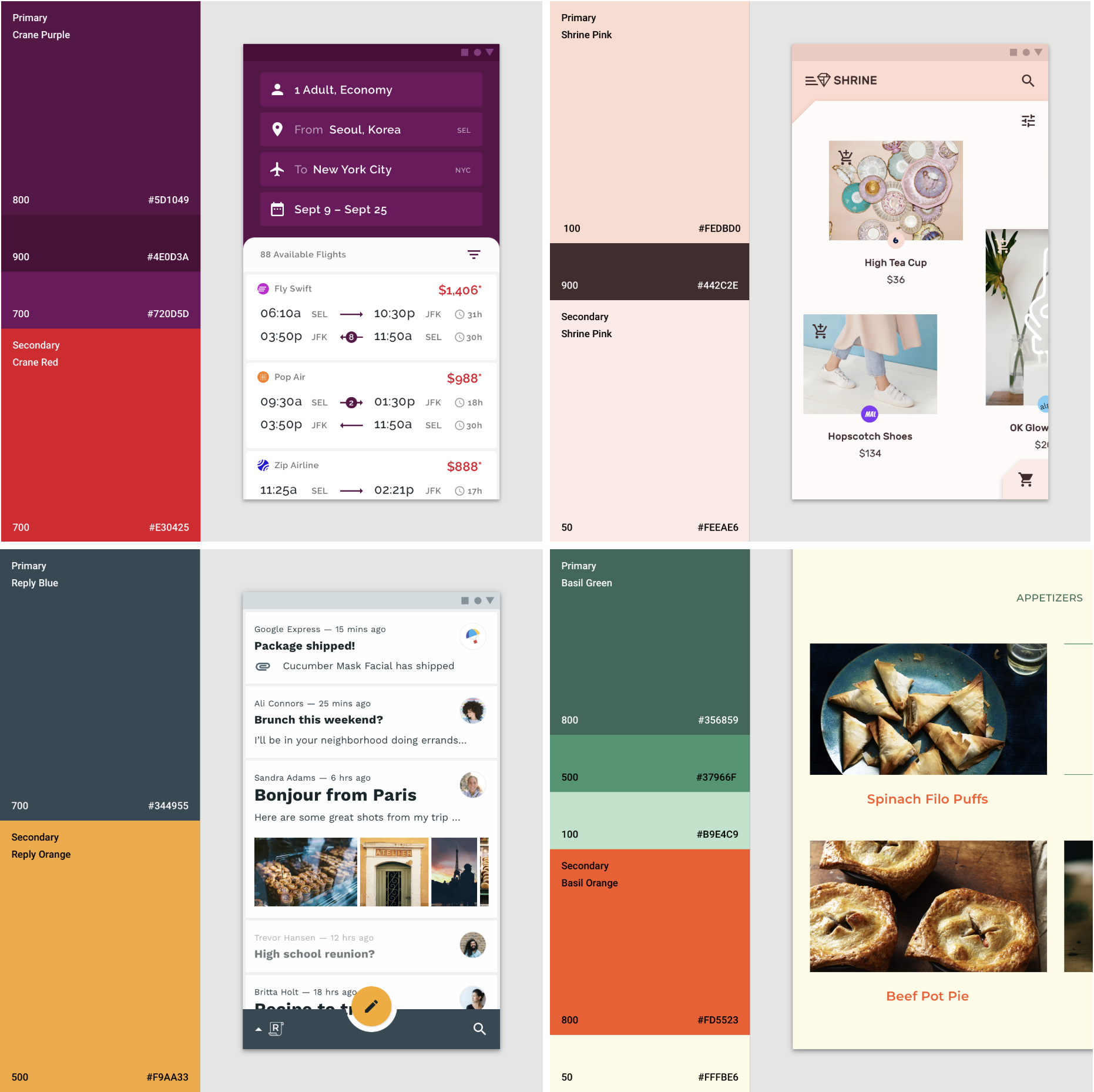
Now here’s the part where you get creative. There are so many ways to mix and match the elements of color, typography, and shape to really make your brand stand out. Here are four very distinct example apps that use color theory, typography, and shape to differentiate their products, each based on the baseline Material Components:
Themes IRL
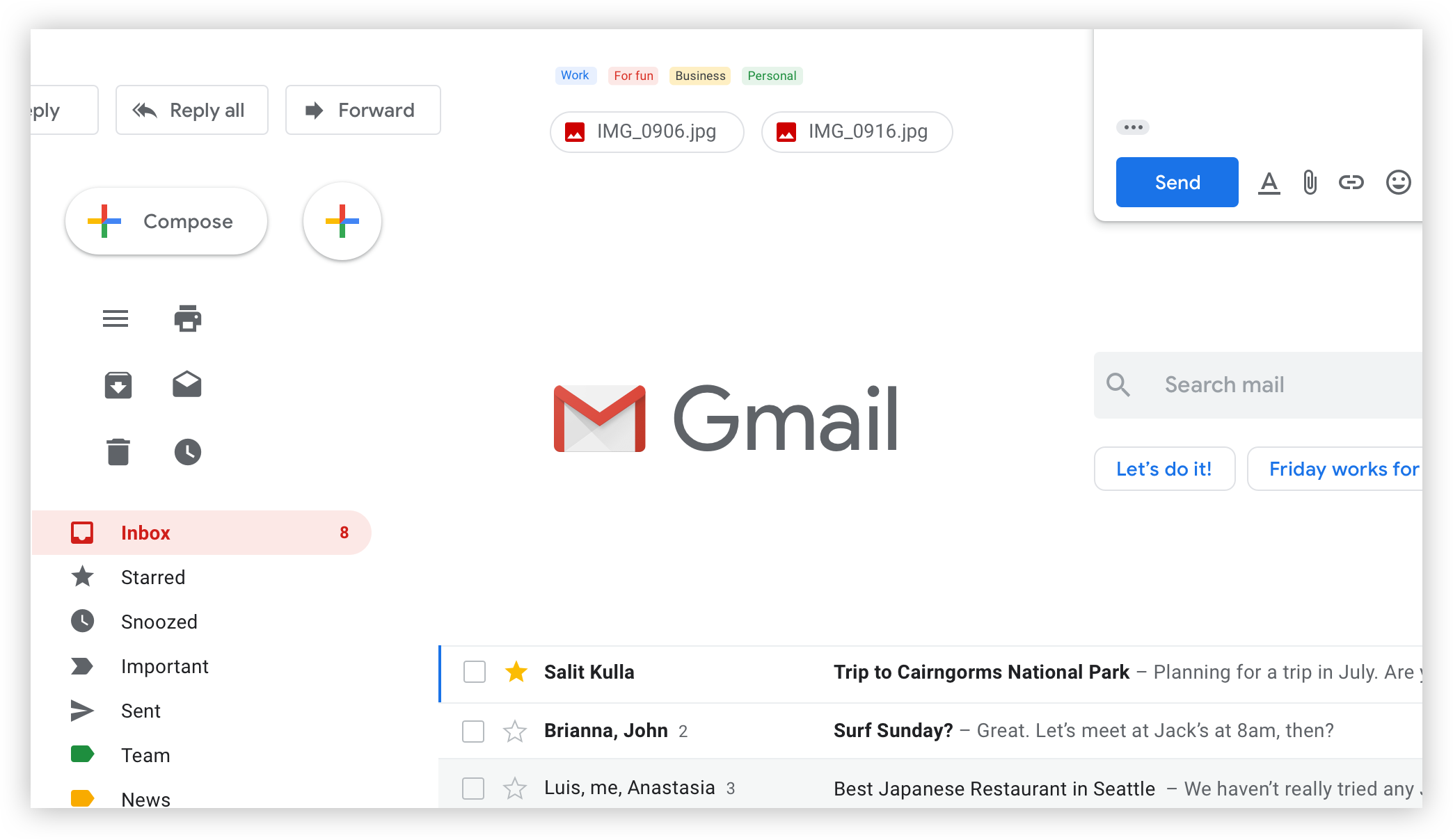
Google itself customizes and extends upon the baseline Material Components with its own products. This is called the Google Material Theme, and it was defined by a number of product teams, including Gmail, Google News, Google Play, and Google Home:
But they are not the only company to use Material Design and its principles. A few companies have also extended Material Components in their own large-scale products.
Lyft, a ridesharing service, is just one example. They used an extended FAB component to highlight key actions, and designed it with a gradient to give it a unique feel that users were still familiar with. Lyft also leveraged Material’s elevation system in their own product.

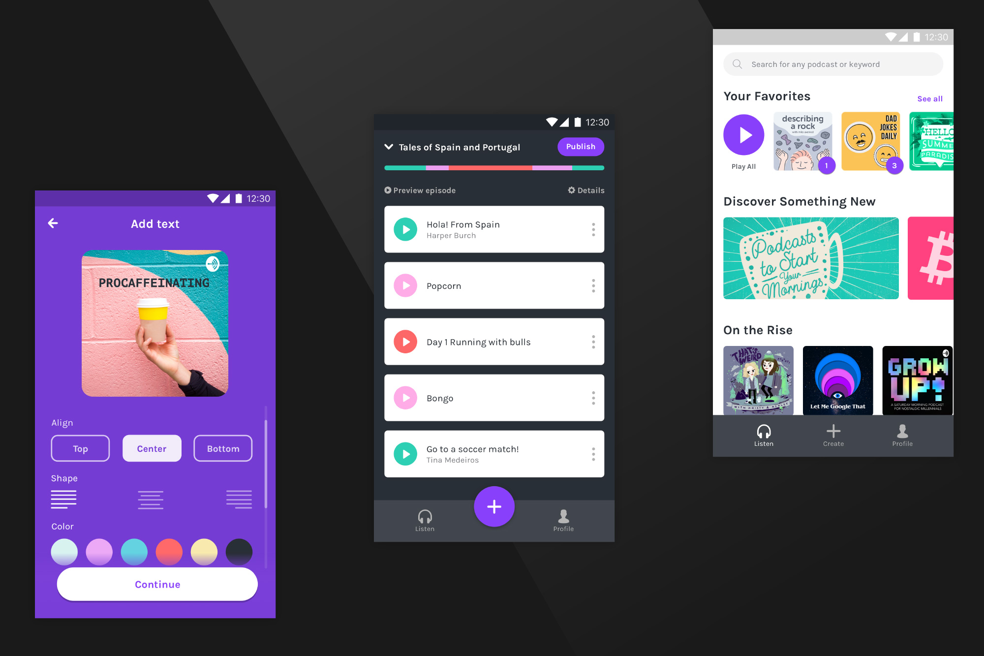
Anchor, a free app that helps people record, distribute, and host podcasts, is another great example of making Material your own. They showcase their bold color palette, and integrate it with choice chips to delineate display options, a list of cards for content selection, and an extended FAB anchored to the bottom to remain persistently available for user actions.
Get started
Now you have everything you need to make own Material Theme with Material Components for the web. It’s easy to start building your web project with our Material Starter Kit, and exploring theming with the Build a Material theme Glitch project we’ve just released. Change around the variables in my-theme.scss to explore how they can customize the individual components. Then, you can open any template, paste those variables into the my-theme.scss, and start building.
TL;DR: If you thought that Material Design wasn’t for you in the past, it’s a great time to start exploring. Happy theming!
The post Material Theming: Making Material Your Own! appeared first on CSS-Tricks.