New Year, New Job? Let’s Make a Grid-Powered Resume!
Publikováno: 1.1.2020
Many popular resume designs are making the most of the available page space by laying sections out in a grid shape. Let’s use CSS Grid to create a layout that looks great when printed and at different screen sizes. That way, we can use the resume online and offline, which might come in handy during the new year!
First, we will create a resume container, and our resume sections.
<article class="resume">
  <section class="name"></section>
  <section class="photo"></section>
  <section class="about"></section>
  <section class="work"></section>
<section The post New Year, New Job? Let’s Make a Grid-Powered Resume! appeared first on CSS-Tricks.
Many popular resume designs are making the most of the available page space by laying sections out in a grid shape. Let’s use CSS Grid to create a layout that looks great when printed and at different screen sizes. That way, we can use the resume online and offline, which might come in handy during the new year!
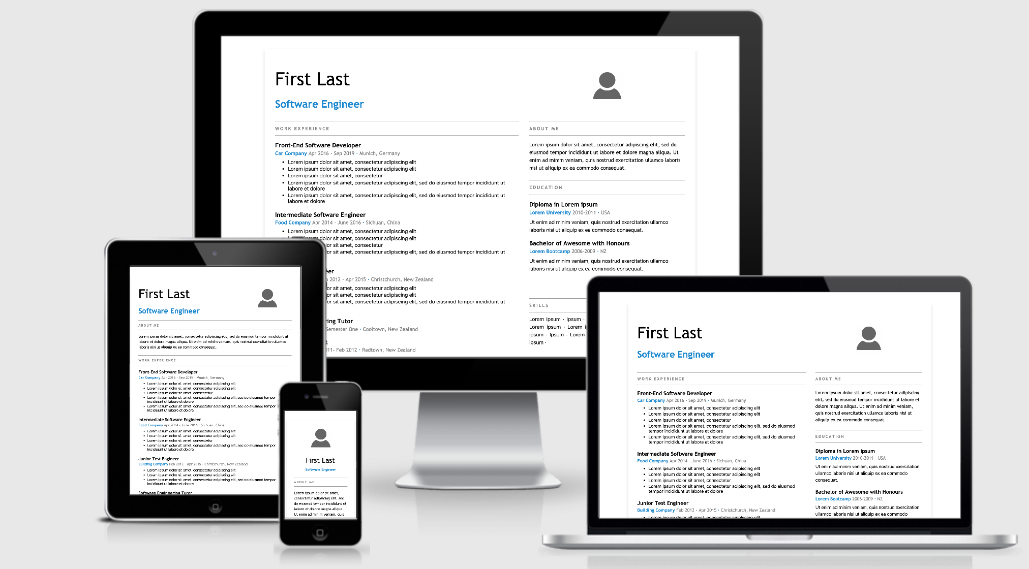
First, we will create a resume container, and our resume sections.
<article class="resume">
  <section class="name"></section>
  <section class="photo"></section>
  <section class="about"></section>
  <section class="work"></section>
  <section class="education"></section>
  <section class="community"></section>
  <section class="skills"></section>
</article>
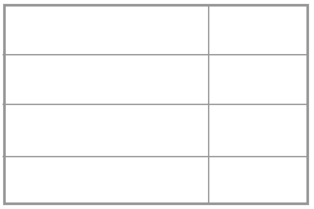
To start using Grid, we add display: grid to our outer resume element. Next, we describe how things should be placed on the grid. In this case, we will specify two columns and four rows.
We are using the CSS Grid’s fr unit to specify how many fractions on the available space to give. We will give the rows equal space (1fr each), and make the first column two times wider than the second (2fr).
.resume {
  display: grid;
  grid-template-columns: 2fr 1fr;
  grid-template-rows: 1fr 1fr 1fr 1fr;
}
Next we will describe how these elements should be placed on the grid by using the grid-template-area property. First we need to define a named grid-area for each of our sections. You can use any name but here we will use the same name as our sections:
.name {
  grid-area : name;
}

.photo {
  grid-area : photo;
}

/* define a grid-area for every section */
Now comes the fun part, and one that makes changing the design a breeze. Place the grid areas in the grid-template-areas property how you want them to be laid out. For example, here we will add the name section at the top left of the the grid-template-area to place our name at the top left of the resume. Our work section has a lot of content so we add it twice, meaning that it will stretch over two of the grid cells.
.resume {
  grid-template-areas:
    "name photo"
    "work about"
    "work education"
    "community skills";
}
Here’s what we have so far:
See the Pen
grid resume lines by Ali C (@alichur)
on CodePen.
The CSS Grid specification provides many useful properties for sizing and laying things out on the grid and well as some shorthand properties. We are keeping things simple in this example by showing one possible method. Be sure to check out some of the great resources out there to learn how best to incorporate CSS Grid in your project.
Adjusting layout
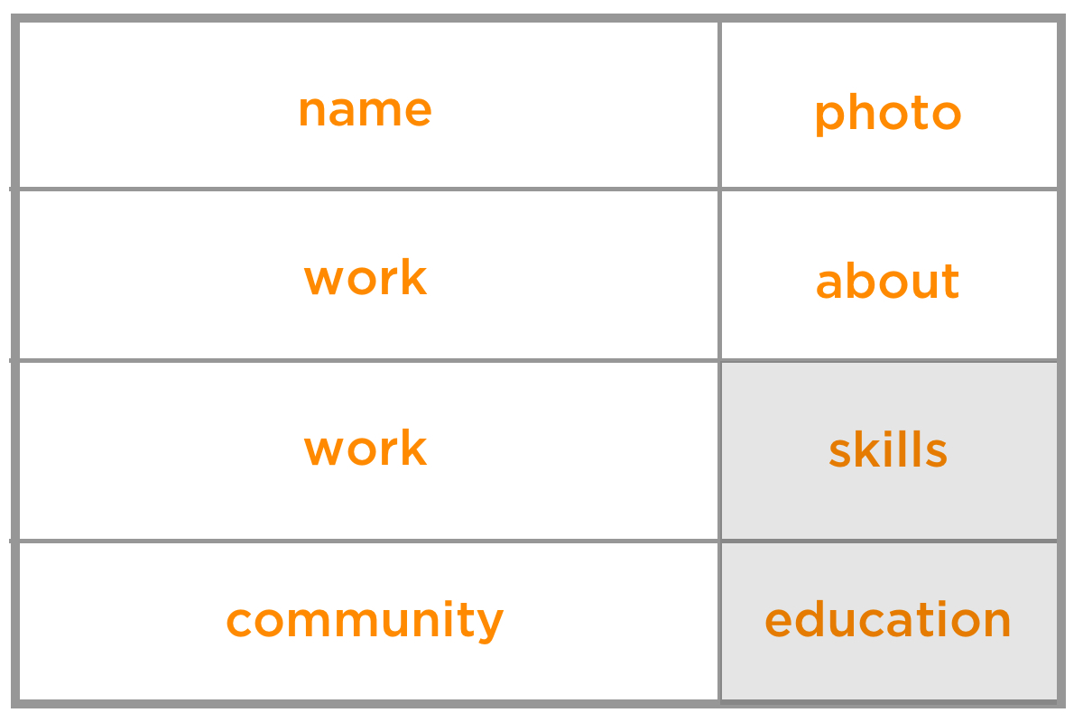
grid-template-areas make it very easy to change your layout. For example, if you think an employer will be more interested in your skills section than your education you can switch the names in grid-template-areas and they will swap places in your layout, with no other changes required.
.resume {
  grid-template-areas:
    "name photo"
    "work about"
    "work skills"  /* skills now moved above education */
    "community education";
}
See the Pen
grid resume swapping sections by Ali C (@alichur)
on CodePen.
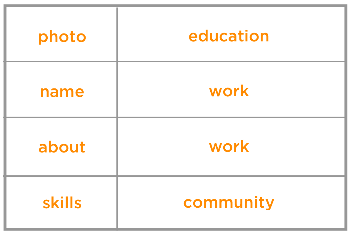
We can achieve a popular resume design where the thin column is on the left with minimal CSS changes. That’s one of the nice things about grid: We can rearrange the named grid areas to shift things around while leaving the source order exactly where it is!
.resume {
  grid-template-columns: 1fr 2fr;
  grid-template-areas:
    "photo education"
    "name work"
    "about work"
    "skills community";
}
See the Pen
grid resume left design by Ali C (@alichur)
on CodePen.
Dividing columns
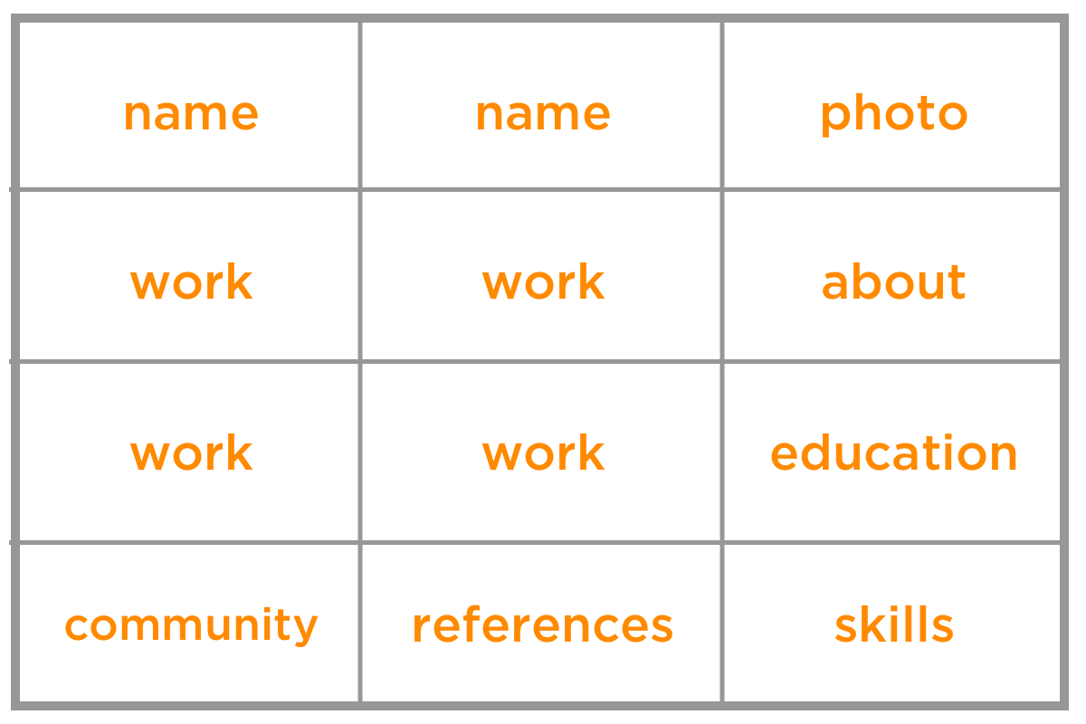
Perhaps you want to add personal references to the mix. We can add a third column to the grid template and slip those into the bottom row. Note that we also need to change the column units to equal fractions then update the template areas so that certain elements span two columns in order to keep our layout in place.
.resume {
  grid-template-columns: 1fr 1fr 1fr;
  grid-template-areas:
    "name name photo"
    "work work about"
    "work work education"
    "community references skills";
}
See the Pen
grid resume split columns by Ali C (@alichur)
on CodePen.
The gap between sections can be controlled with the grid-gap property.
Making it responsive
For small screens, such as a mobile device, we can display the resume sections in a single full-width column.
grid-template-columns: 1fr;
grid-template-areas:
  "photo"
  "name"
  "about"
  "work"
  "education"
  "skills"
  "community"
  "references"
}
Then we can use a media query to change the layout for wider screens.
@media (min-width: 1200px) {
  .resume {
    grid-template-areas:
      "name photo"
      "work about"
      "work education"
      "community skills";
  }
}
Additional breakpoints can be added in between. For example, on medium screens like a tablet, we might want everything in a single column, but the personal and image sections to sit side-by-side at the top.
@media (min-width: 900px) {
  .resume {
      grid-template-columns: 2fr 1fr;
      grid-template-areas:
        "name image"
        "about about"
        "work work"
        "education education"
        "skills skills"
        "community community"
        "references references"
  }
}
Planning for single-page printing
If you want your resume to print nicely to a single piece of physical paper, there are a few things to keep in mind. The hardest challenge is often cutting down the number of words so that it fits on one page.
Avoid reducing the font size to squeeze more information, as it may become hard to read. One trick is to add a temporary size constraint to your resume element just while while you are developing.
.resume {
  /* for development only */
  width : 210mm;
  height: 297mm;
  border: 1px solid black;
}
By making this A4 paper-sized border it will be clearer to see if the sizes are too small, or the content spills out of the border, indicating it would print onto a second page.
You can provide printing CSS to hide things, like the date and page numbers, that the browser may insert.
@media print {
  /* remove any screen only styles, for example link underline */
}

@page {
  padding: 0;
  margin: 0cm;
  size: A4 portrait;
}
One thing to note is that different browsers may render your resume with different fonts that can vary slightly in size. If you want a very precise printed resume, another option is to save it as a PDF and provide a download link on your site.
Browser support
CSS Grid has good support in modern browsers.
Internet Explorer (IE) supports an older version of the CSS Grid specification using prefixes. For example grid-template-columns is written as -ms-grid-columns. Running the code through an Autoprefixer can help with adding these prefixes, but manual changes and thorough testing will be required because in the old specification some properties behave differently and some do not exist. It’s worth checking out Daniel Tonon’s article on how Autoprefixer can be configured to make things work as well as possible.
An alternative approach to autoprefixer is to provide a fallback, for example by using a float layout. Browsers that don't recognize CSS Grid properties will display using this fallback. Regardless of whether you need to support IE, a fallback is sensible for ensuring (potentially unknown) browsers that don't support CSS Grid still display your content.
Even if you’re not ready to host an online resume, it is still fun to play around with CSS Grid, explore different layouts, generate a great looking PDF, and learn an awesome part of CSS at the same time.
Happy job hunting!
The post New Year, New Job? Let’s Make a Grid-Powered Resume! appeared first on CSS-Tricks.