Planning for Responsive Images
Publikováno: 13.3.2019
The first time I made an image responsive, it was as simple as coding these four lines:
img {
  max-width: 100%;
  height auto; /* default */
}
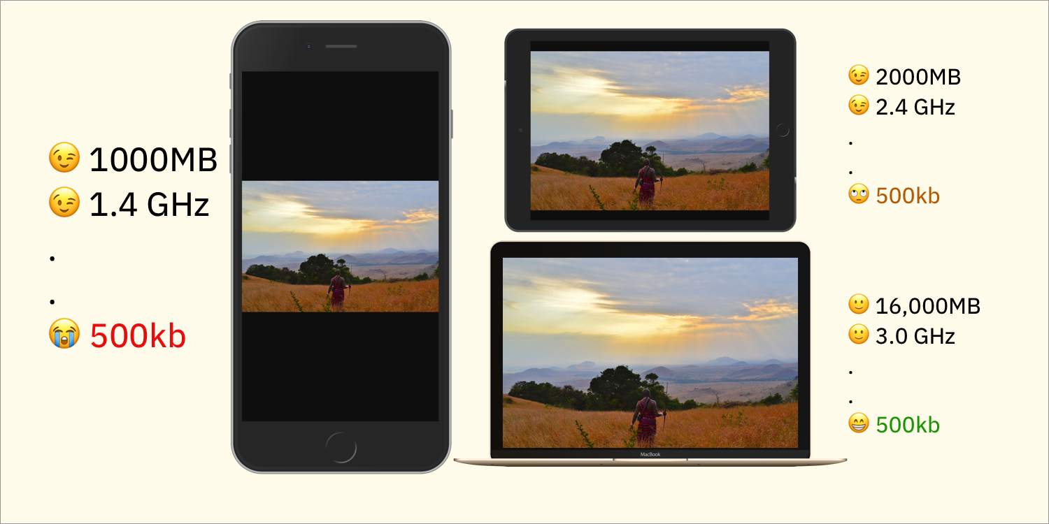
Though that worked for me as a developer, it wasn’t the best for the audience. What happens if the the image in the src attribute is heavy? On high-end developer devices (like mine with 16GB RAM), few or no performance problems occur. But on low-end devices? It’s another story.
The above illustration isn’t … Read article
The post Planning for Responsive Images appeared first on CSS-Tricks.
The first time I made an image responsive, it was as simple as coding these four lines:
img {
  max-width: 100%;
  height auto; /* default */
}
Though that worked for me as a developer, it wasn’t the best for the audience. What happens if the the image in the src attribute is heavy? On high-end developer devices (like mine with 16GB RAM), few or no performance problems occur. But on low-end devices? It’s another story.

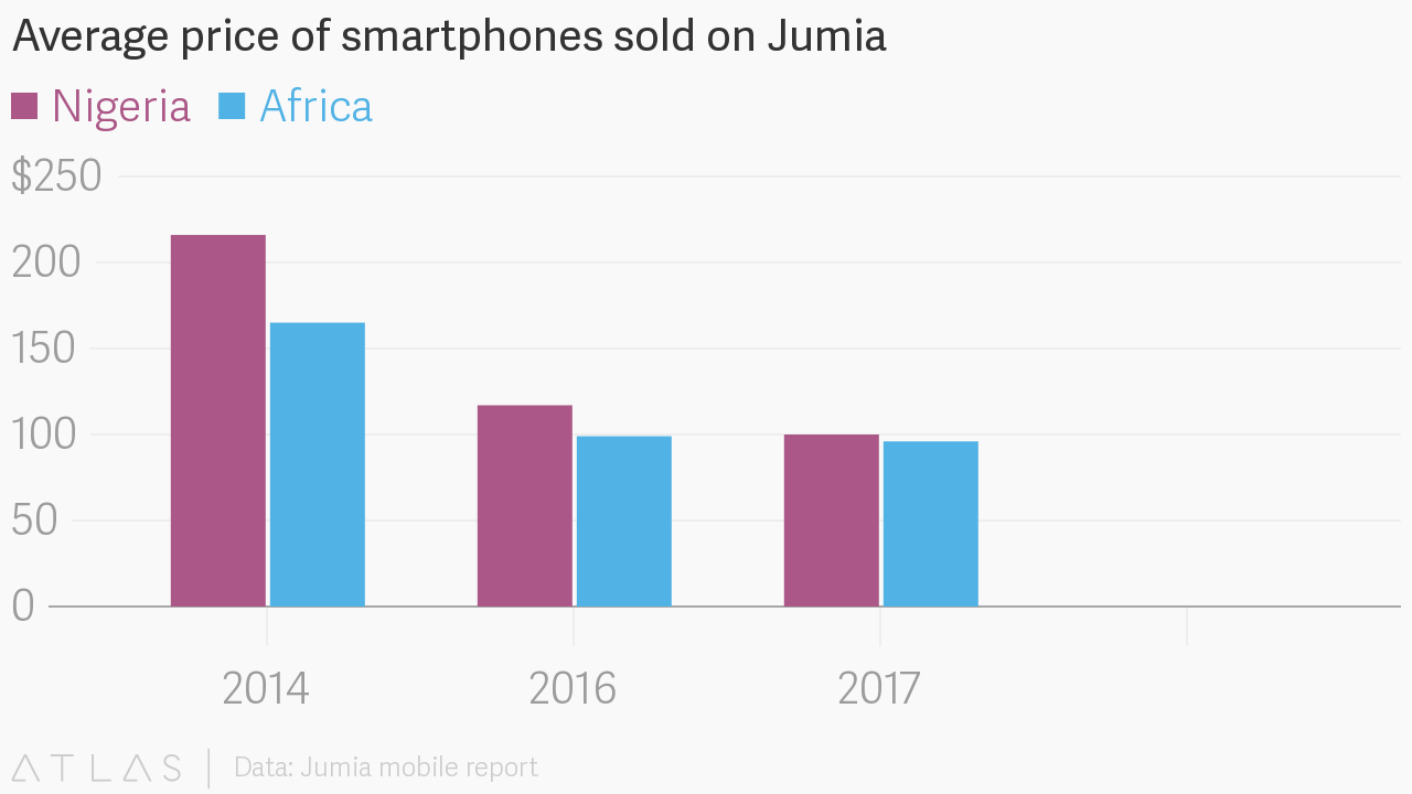
The above illustration isn’t detailed enough. I’m from Nigeria and, if your product works in Africa, then you shouldn’t be looking at that. Look at this graph instead:

Nowadays, the lowest-priced iPhone sells for an average of $300. The average African can’t afford it even though iPhone is a threshold for measuring fast devices.
That’s all the business analysis you need to understand that CSS width doesn’t cut it for responsive images. What would, you ask? Let me first explain what images are about.
Nuances of images
Images are appealing to users but are a painstaking challenge for us developers who must consider the following factors:
- Format
- Disk size
- Render dimension (layout width and height in the browser)
- Original dimension (original width and height)
- Aspect ratio
So, how do we pick the right parameters and deftly mix and match them to deliver an optimal experience for your audience? The answer, in turn, depends on the answers to these questions:
- Are the images created dynamically by the user or statically by a design team?
- If the width and height of the image are changed disproportionately, would that affect the quality?
- Are all the images rendered at the same width and height? When rendered, must they have a specific aspect ratio or one that’s entirely different?
- What must be considered when presenting the images on different viewports?
Jot down your answers. They will not only help you understand your images — their sources, technical requirements and such — but also enable you to make the right choices in delivery.
Provisional strategies for image delivery
Image delivery has evolved from a simple addition of URLs to the src attribute to complex scenarios. Before delving into them, let’s talk about the multiple options for presenting images so that you can devise a strategy on how and when to deliver and render yours.
First, identify the sources of the images. That way, the number of obscure edge cases can be reduced and the images can be handled as efficiently as possible.
In general, images are either:
- Dynamic: Dynamic images are uploaded by the audience, having been generated by other events in the system.
- Static: A photographer, designer, or you (the developer) create the images for the website.
Let's dig into strategy for each of this types of images.
Strategy for dynamic images
Static images are fairly easy to work with. On the other hand, dynamic images are tricky and prone to problems. What can be done to mitigate their dynamic nature and make them more predictable like static images? Two things: validation and intelligent cropping.
Validation
Set out a few rules for the audience on what is acceptable and what is not. Nowadays, we can validate all the properties of an image, namely:
- Format
- Disk size
- Dimension
- Aspect ratio
Note: An image’s render size is determined during rendering, hence no validation on our part.
After validation, a predictable set of images would emerge, which are easier to consume.
Intelligent Cropping
Another strategy for handling dynamic images is to crop them intelligently to avoid deleting important content and refocus on (or re-center) the primary content. That’s hard to do. However, you can take advantage of the artificial intelligence offered by open-source tools or SaaS companies that specialize in image management. An example is in the upcoming sections.
Once a strategy has been nailed down for dynamic images, create a rule table with all the layout options for the images. Below is an example. It's even worth looking into analytics to determine the most important devices and viewport sizes.
| Browser Viewport | HP Laptop | PS4 Slim | Camera Lens / Aspect Ratio |
|---|---|---|---|
| < 300 | 100 vw | 100 vw | 100 vw/1:2 |
| 300 - 699 | 100 vw | 100 vw | 100 vw/1:1 |
| 700 - 999 | 50 vw | 50 vw | 50 vw/1:1 |
| > 999 | 33 vw | 33 vw | 100 vw/1:2 |
The bare (sub-optimal) minimum
Now set aside the complexities of responsiveness and just do what we do best — simple HTML markup with maximum-width CSS.
The following code renders a few images:
<main>
  <figure>
    <img src="https://res.cloudinary.com/...w700/ps4-slim.jpg" alt="PS4 Slim">
  </figure>

  <figure>
    <img src="https://res.cloudinary.com/...w700/x-box-one-s.jpg" alt="X Box One S">
  </figure>

  <!-- More images -->

  <figure>
    <img src="https://res.cloudinary.com/...w700/tv.jpg" alt="Tv">
  </figure>
</main>
Note: The ellipsis (...) in the image URL specifies the folder, dimension, and cropping strategy, which are too much detail to include, hence the truncation to focus on what matters now. For the complete version, see the CodePen example down below.
This is the shortest CSS example on the Internet that makes images responsive:
/* The parent container */
main {
  display: grid;
  grid-template-columns: repeat(auto-fill, minmax(300px, 1fr));
}

img {
  max-width: 100%;
}
If the images do not have a uniform width and height, replace max-width with object-fit and set the value to cover.

Jo Franchetti’s blog post on common responsive layouts with CSS Grid explains how the value of grid-template-columns makes the entire layout adaptive (responsive).
See the Pen
Grid Gallery by Chris Nwamba (@codebeast)
on CodePen.
The above is not what we are looking for, however, because...
- the image size and weight are the same on both high-end and low-end devices, and
- we might want to be stricter with the image width instead of setting it to 250 and letting it grow.
Well, this section covers "the bare minimum" so that’s it.
Layout variations
The worst thing that can happen to an image layout is mismanagement of expectations. Because images might have varying dimensions (width and height), we must specify how to render the images.
Should we intelligently crop all the images to a uniform dimension? Should we retain the aspect ratio for a viewport and alter the ratio for a different one? The ball is in our court.
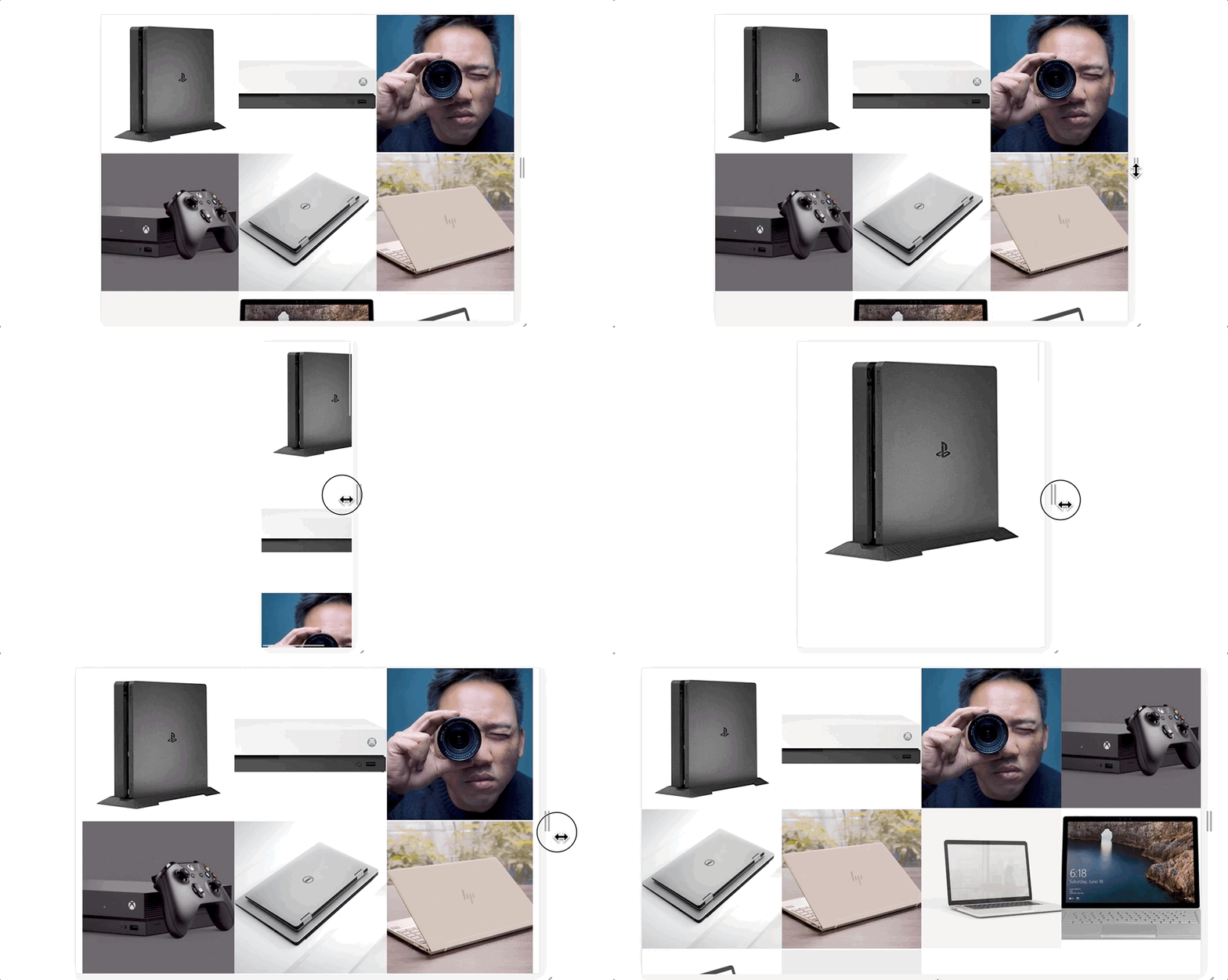
In case of images in a grid, such as those in the example above with different aspect ratios, we can apply the technique of art direction to render the images. Art direction can help achieve something like this:

For details on resolution switching and art direction in responsive images, read Jason Grigsby’s series. Another informative reference is Eric Portis’s Responsive Images Guide, parts 1, 2, and 3.
See the code example below.
<main>
  <figure>
    <picture>
      <source media="(min-width: 900px)" srcset="https://res.cloudinary.com/.../c_fill,g_auto,h_1400,w_700/camera-lens.jpg">

      <img src="https://res.cloudinary.com/.../c_fill,g_auto,h_700,w_700/camera-lens.jpg" alt="Camera lens">
    </picture>
  </figure>

  <figure>
    <picture>
      <source media="(min-width: 700px)" srcset="https://res.cloudinary.com/.../c_fill,g_auto,h_1000,w_1000/ps4-pro.jpg"></source>
    </picture>
    <img src="https://res.cloudinary.com/.../c_fill,g_auto,h_700,w_700/ps4-pro.jpg" alt="PS4 Pro">
  </figure>
</main>
Instead of rendering only one 700px wide image, we render 700px x 700px only if the viewport width exceeds 700px. If the viewport is larger, then the following rendering occurs:
- Camera lens images are rendered as a portrait image of 700px in width and 1000px. in height (700px x 1000px).
- PS4 Pro images are rendered at 1000px x 1000px.
Art direction
By cropping images to make them responsive, we might inadvertently delete the primary content, like the face of the subject. As mentioned previously, AI open-source tools can help crop intelligently and refocus on the primary objects of images. In addition, Nadav Soferman’s post on smart cropping is a useful start guide.
Strict grid and spanning
The first example on responsive images in this post is a flexible one. At a minimum of 300px width, grid items automagically flow into place according to the viewport width. Terrific.
On the other hand, we might want to apply a stricter rule to the grid items based on the design specifications. In that case, media queries come in handy.
Alternatively, we can leverage the grid-span capability to create grid items of varied widths and lengths:
@media(min-width: 700px) {
  main {
    display: grid;
    grid-template-columns: repeat(2, 1fr);
  }
}

@media(min-width: 900px) {
  main {
    display: grid;
    grid-template-columns: repeat(3, 1fr)
  }
  figure:nth-child(3) {
    grid-row: span 2;
  }
  figure:nth-child(4) {
    grid-column: span 2;
    grid-row: span 2;
  }
}
For an image that is 1000px x 1000px square on a wide viewport, we can span it to take two grid cells on both row and column. The image that changes to a portrait orientation (700px x 1000px) on a wider viewport can take two cells on a row.
See the Pen
Grid Gallery [Art Direction] by Chris Nwamba (@codebeast)
on CodePen.
Progressive optimization
Blind optimization is as lame as no optimization. Don’t focus on optimization without predefining the appropriate measurements. And don’t optimize if the optimization is not backed by data.
Nonetheless, ample room exists for optimization in the above examples. We started with the bare minimum, showed you some cool tricks, and now we have a working, responsive grid. The next question to ask is, "If the page contains 20-100 images, how good will the user experience be?"
Here’s the answer: We must ensure that in the case of numerous images for rendering, their size fits the device that renders them. To accomplish that, we need to specify the URLs of several images instead of one. The browser would pick the right (most optimal) one according to the criteria. This technique is called resolution switching in responsive images. See this code example:
<img
  srcset="https://res.cloudinary.com/.../h_300,w_300/v1548054527/ps4.jpg 300w,
          https://res.cloudinary.com/.../h_700,w_700/v1548054527/ps4.jpg 700w,
          https://res.cloudinary.com/.../h_1000,w_1000/v1548054527/ps4.jpg 1000w"

  sizes="(max-width: 700px) 100vw, (max-width: 900px) 50vw, 33vw"
  src="https://res.cloudinary.com/.../h_700,w_700/v1548054527/ps4.jpg 700w"
  alt="PS4 Slim">
Harry Roberts’s tweet intuitively explains what happens:
The simplest way I’ve found (so far) to distill/explain `srcset` and `sizes`: pic.twitter.com/I6YW0AqKfM
— Harry Roberts (@csswizardry) March 1, 2017
When I first tried resolution switching, I got confused and tweeted:
I know that width descriptors in the img srcset attributes represents the image source width (original file width).
What I do not know is, why is it needed? What does the browser do with that value? cc @grigs 🤓
— Christian Nwamba (@codebeast) October 5, 2018
Hats off to Jason Grigsby for the clarification in his replies.
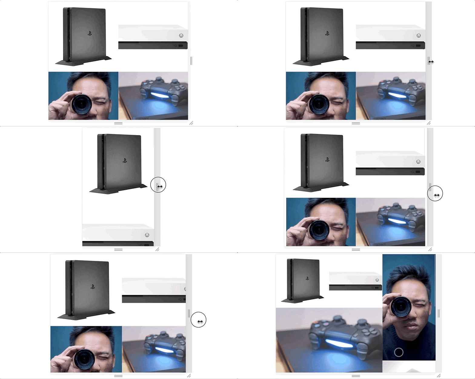
Thanks to resolution switching, if the browser is resized, then it downloads the right image for the right viewport; hence small images for small phones (good on CPU and RAM) and larger images for larger viewports.

The above table shows that the browser downloads the same image (blue rectangle) with different disk sizes (red rectangle).
See the Pen
Grid Gallery [Optimized] by Chris Nwamba (@codebeast)
on CodePen.
Cloudinary’s open-source and free Responsive Image Breakpoints Generator is extremely useful for adapting website images to multiple screen sizes. However, in many cases, setting srcset and sizes alone would suffice.
Conclusion
This article aims at affording simple yet effective guidelines for setting up responsive images and layouts in light of the many—and potentially confusing—options available. Do familiarize yourself with CSS grid, art direction, and resolution switching and you’ll be a ninja in short order. Keep practicing!
The post Planning for Responsive Images appeared first on CSS-Tricks.