Recreating Netlify’s Neat-o Sliding Button Effect
Publikováno: 3.9.2019
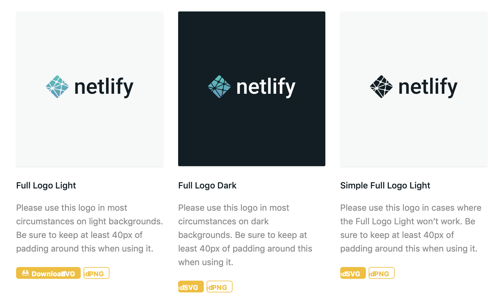
Have you seen Netlify's press page? It's one of those places where you can snag a download of the company's logo. I was looking for it this morning because I needed the logo to use as a featured image for a post here on CSS-Tricks.
Well, I noticed they have these pretty looking buttons to download the logo. They're small and sharp. They grab attention but aren't in the way.
They're also interactive! Look at the way they expand and … Read article
The post Recreating Netlify’s Neat-o Sliding Button Effect appeared first on CSS-Tricks.
Have you seen Netlify's press page? It's one of those places where you can snag a download of the company's logo. I was looking for it this morning because I needed the logo to use as a featured image for a post here on CSS-Tricks.
Well, I noticed they have these pretty looking buttons to download the logo. They're small and sharp. They grab attention but aren't in the way.
They're also interactive! Look at the way they expand and reveal the word "Download" on hover.
Nice, right?! I actually noticed that they looked a little off in Safari.

That made me curious about how they're made. So, I recreated them here as a demo while cleaning up some of the spacing stuff:
See the Pen
Netlify Sliding Buttons by Geoff Graham (@geoffgraham)
on CodePen.
How'd they do it? The recipe really comes down to four ingredients:
- Using the
leftproperty to slide the "Download" label in and out of view - Using
paddingon the button's hover state to create additional room for showing the "Download" label on hover - Declaring a 1:1
scale()on the button's hover state so all the content stays contained when things move around. - Specifiying a
transitionon the button'spadding, thebackground-positionof the button icon and thetransformproperty to make for a smooth animation between the button's default and hover states.
Here's what that looks like without all the presentation styles:
See the Pen
Style-less Netlify Sliding Buttons by Geoff Graham (@geoffgraham)
on CodePen.
If you're having a tough time visualizing what's happening, here's an illustration showing how the "Download" label is hidden outside of the button (thanks to overflow: hidden) and where it's pushed into view on hover.

So, by putting negative left values on the icon and the "Download" label, we're pushing them out of view and then resetting those to positive values when the entire button is hovered.
/* Natural State */
.button {
    background:
      #f6bc00
      url(data:image/svg+xml;base64,...)
      no-repeat -12px center;
    overflow: hidden;
}

.button span:nth-child(1) {
  position: absolute;
  left: -70px;
}

/* Hovered State */
.button:hover {
  padding-left: 95px;
  background-position: 5px center;
}

.button span:nth-child(1) {
  position: absolute;
  left: -70px;
}
Notice that leaving things in this state would let the button icon slide into view and create enough room for the "Download" label, but the label would actually float off the button on hover.
See the Pen
Style-less Netlify Sliding Buttons by Geoff Graham (@geoffgraham)
on CodePen.
That's where adding a 1:1 scale on the button helps keep things in tact.
* Hovered State */
.button:hover {
  padding-left: 95px;
  background-position: 5px center;
  transform: scale(1, 1);
}
Those padding values are magic numbers. They'll be different for you based on the font, font-size, and other factors, so your mileage may vary.
The last core ingredient is the transition property, which makes everything slide smoothly into place rather than letting them snap. It's provides a much nicer experience.
/* Natural State */
.button {
    background:
      #f6bc00
      url(data:image/svg+xml;base64,...)
      no-repeat -12px center;
    overflow: hidden;
    transition: padding .2s ease, background-position .2s ease, transform .5s ease;
}
Toss in some little flourishes, like rounded corners and such, and you've got a pretty slick button.
See the Pen
Netlify Sliding Buttons by Geoff Graham (@geoffgraham)
on CodePen.
The post Recreating Netlify’s Neat-o Sliding Button Effect appeared first on CSS-Tricks.