Solved with CSS! Logical Styling Based on the Number of Given Elements
Publikováno: 26.7.2018
This post is the third in a series about the power of CSS.
Article Series:
- Colorizing SVG Backgrounds
- Dropdown Menus
- Logical Styling Based On the Number of Given Elements (this post)
Did you know that CSS is Turing complete? Did you know that you can use it to do some pretty serious logical styling? Well you can! You don’t have to set all of your logic-based styling rules in JavaScript, or even have to use JavaScript to set …
The post Solved with CSS! Logical Styling Based on the Number of Given Elements appeared first on CSS-Tricks.
This post is the third in a series about the power of CSS.
Article Series:
- Colorizing SVG Backgrounds
- Dropdown Menus
- Logical Styling Based On the Number of Given Elements (this post)
Did you know that CSS is Turing complete? Did you know that you can use it to do some pretty serious logical styling? Well you can! You don’t have to set all of your logic-based styling rules in JavaScript, or even have to use JavaScript to set classes you are styling against. In many cases, CSS can handle that itself. I’m still discovering new CSS tricks everyday, and it just makes me love it even more.
This year, I started working at Bustle Digital Group. In media, as with a lot of products, the engineering team builds a platform that should support all use cases. Our CMS provides capabilities for authors and editors to create articles as well as curate pages, and control ad injection.
Unlike working with a static site, the engineering team doesn’t have full control over what data comes in from the user, so design decisions and governing rules must be made for a good user experience. Some of these scenarios we’ve faced in the digital media space have really inspired me to look into ways of using CSS to solve those UI challenges, and that’s when solutions involving this idea really came into my periphery.
So let’s take a look at some examples!
Example 1: Binary States
An often forgotten and very useful selector is the :empty pseudo selector. It allows you to style elements based on if they contain any content, or if they don’t. Hello empty states! Empty states are a great way to reach out to your users and show personality in your app, and you can inject that personality right from your CSS.
In this example, we have any list from a user. This could be posts the user has published (as an author), or bookmarked articles a user has saved (as an editor). The use cases are really endless here. Instead of injecting JavaScript, we can use pseudo elements to inject images, styles, and text:

Our solution here is a mere three lines of code:
div:empty:after {
  content: 'oh no...';
}
You can also add a :before pseudo element to inject images or any other content you may want. Alternatively, the :not pseudo selector may be used in combination with :empty to create a :not(:empty) rule and style all elements which are not empty, and therefore do contain children.
See the Pen Empty States by Una Kravets (@una) on CodePen.
Note: This demo is for display purposes only. It is not advised to put content in pseudo elements for accessibility purposes. You can use the same technique of targeting :empty or :not(:empty) elements to apply styles to child elements that are more accessible to screen readers.
Advanced Numeric Selection
That was a nice soft ball example, but we can get much more complex than this binary choice of child elements in CSS, and to do this, we will use the :nth-child pseudo selector! CSS-Tricks has a great tool to help you test and play around with the :nth-child selection, and it can really come in handy as some of the examples will show you.
But before we get into those, how exactly does this work?
The meat of the code is this, with div standing in for any given sibling element, and x standing in for the number we are using to determine style breaks:
div:first-child:nth-last-child(n + x),
div:first-child:nth-last-child(n + x) ~ div
Using :nth-last-child instead of using :nth-child for selection allows us to start from the end of a series instead of from the beginning. When we select :nth-last-child(n + x), we are selecting the x value starting from the end. If x = 3 that would look like this:
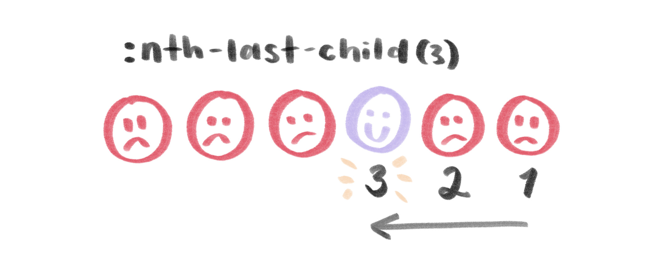
:nth-last-child(3) selects the third item from the end of the list.Now, if we want to count values of n + 3, we are selecting all items that match more than 3 from the end. That would start with the fourth from the end, starting with n = 1 (which would mean 1 + 3 and that is 4). It looks like this:
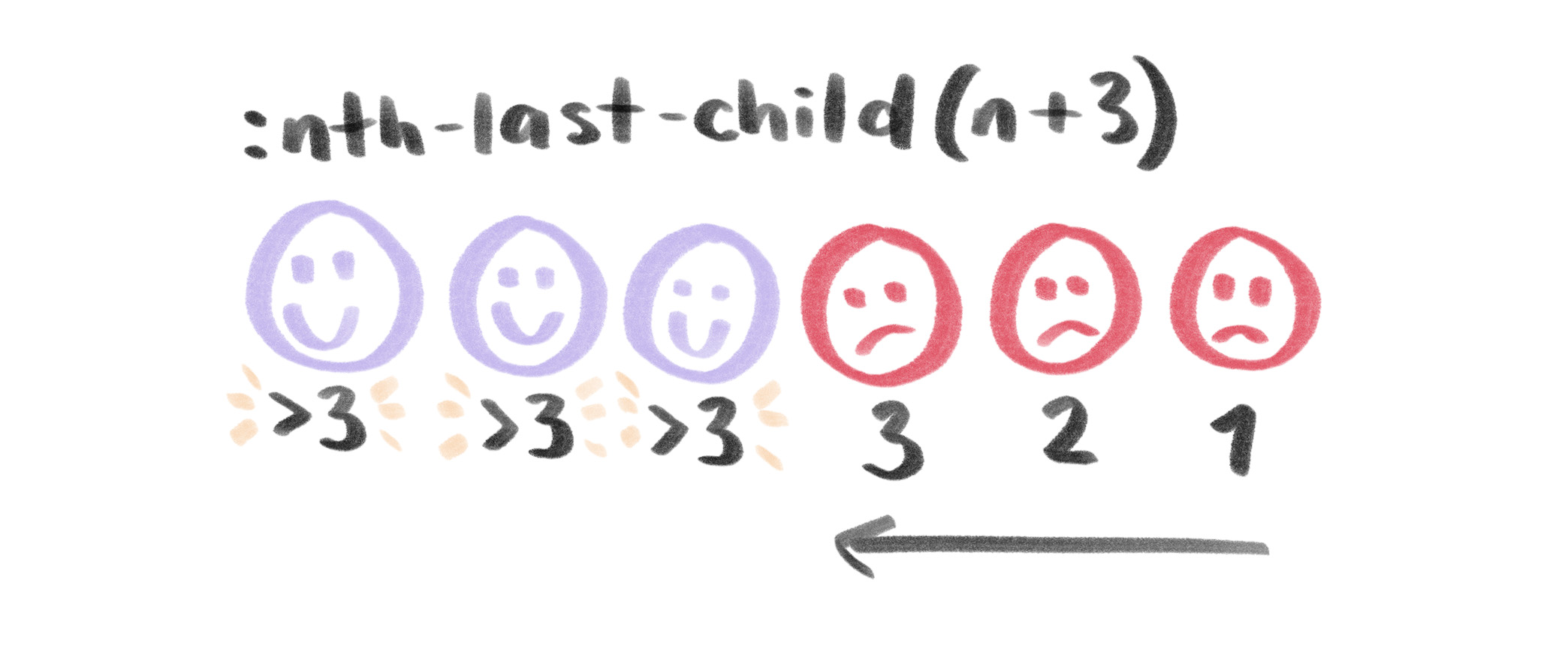
:nth-last-child(n + 3) selects items that match the condition of being the third item from the end or greater.This is a great start, but the idea here is to conditionally style all of the items based on how many exist. So we need to work with these conditions but select all of the items. Let’s start with selecting the first item. We need to make a condition to see if the entire selection qualifies for the styling, and then start with that first sibling:
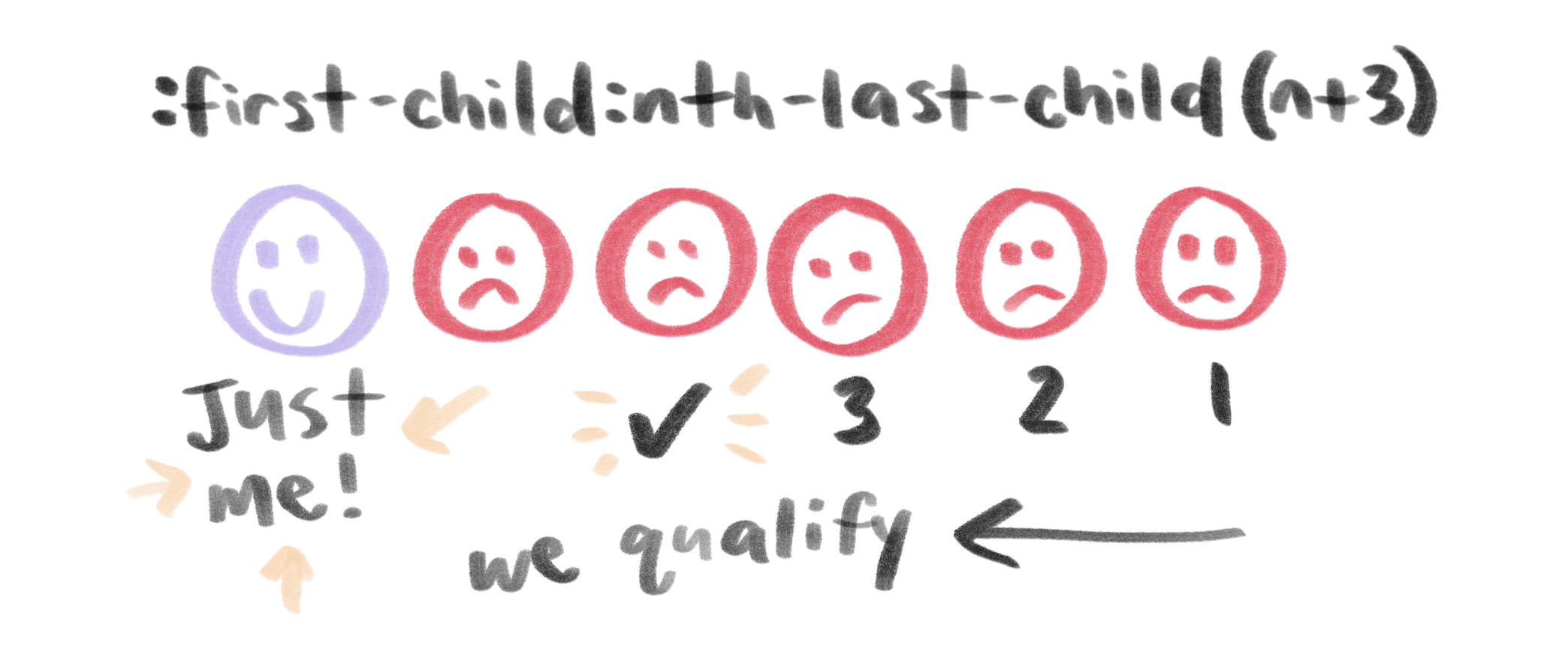
Uh oh. We only have the first item selected at this point, and we want to select all of the items. Luckily, we can use the super handy adjacent sibling selector (~) for that!
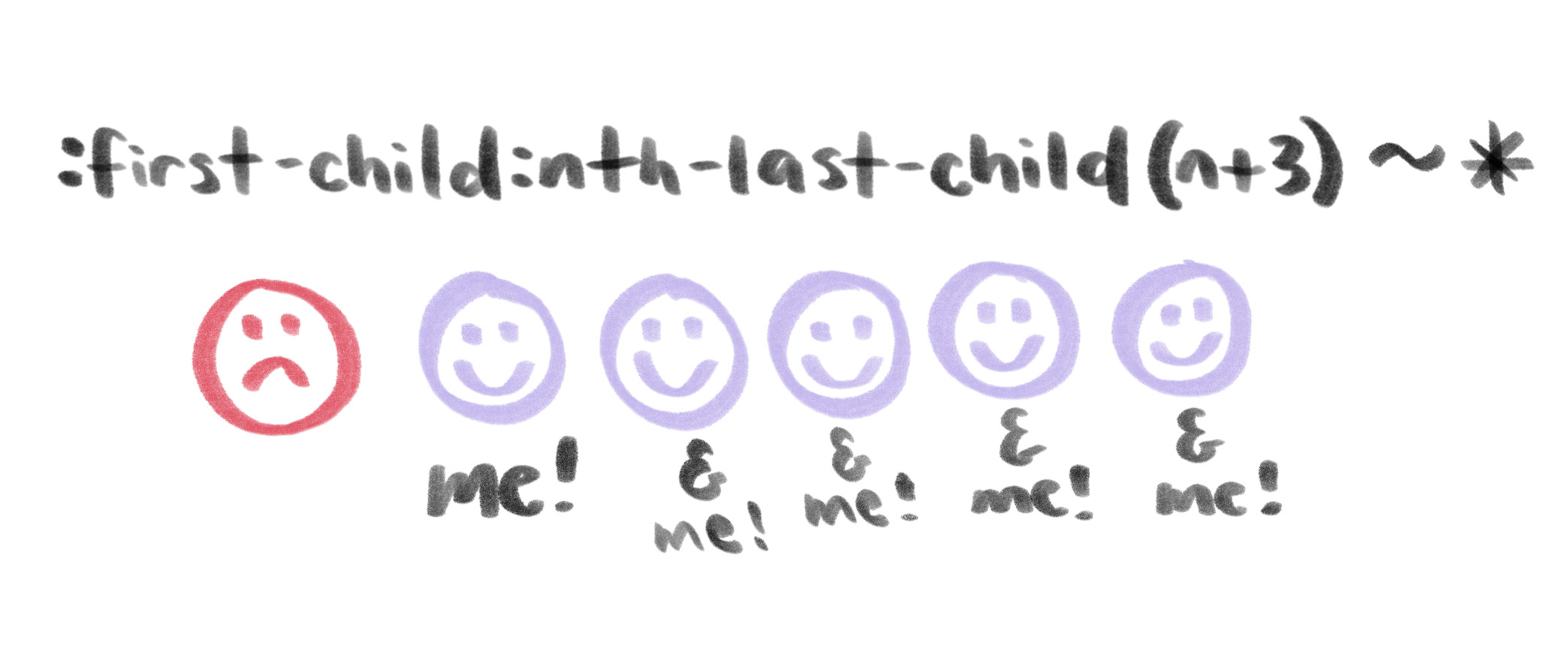
:first-child:last-child(n + 3) ~ * selects all items excluding the first like we want.Well, now you can see all of the items that follow the first item are selected, but we’re missing the first one, so we need to use two selectors, and thus the final answer becomes:
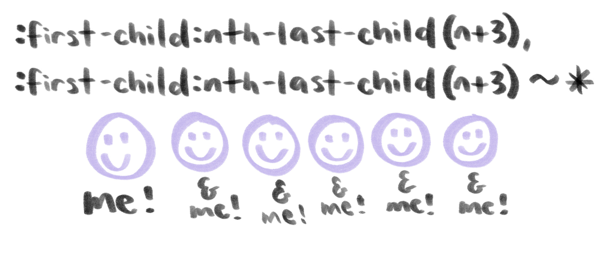
Example 2: List Formatting
Say you want to list some credits at the end of an article. You’ve got some space to fill, and most articles have a small number of credits, but there are those exceptions that have a high production value and a lot of people involved in the making of them. We want to make sure both of these are good visual experiences, and can do that with CSS alone.
Here’s the plan: if there are four or fewer credits, list them in bullet format. Let them take up vertical space to fill the block appropriately. Once we have five or more credits listed, let’s turn that list into a horizontal format to not get too overwhelming for a reader. This is a small credits box after all!

We can check out the number of elements we have available and style them as block elements until we hit our cap. At that point, we’ll switch to inline styling, and add a pseudo element to visually break up the data.
/* 5 or more items display next to each other */
li:first-child:nth-last-child(n + 5),
li:first-child:nth-last-child(n + 5) ~ li {
  display: inline;
}

/* Adds semicolon after each item except the last item */
li:first-child:nth-last-child(n + 5) ~ li::before {
  content: ';';
  margin: 0 0.5em 0 -0.75em;
}
:nth-first-child:nth-last-child(n + 5) allows us to state: "start with the first child and apply styling to that child and every sibling after it if the original child matches having five or more siblings."" Is that confusing? Well, it works.
li:first-child:nth-last-child(n + 5) selects the first list item, and li:first-child:nth-last-child(n + 5) ~ li selects each list item following the initial one.
See the Pen vrQBMv by Una Kravets (@una) on CodePen.
Example 3: Conditional Carousel
Using this technique, let’s style a carousel to be responsive. At a large size, you want it to be centered in the middle of page when it has three items within it. But when it has enough items to fill the screen horizontally, let it be left-aligned for the user to swipe through it.
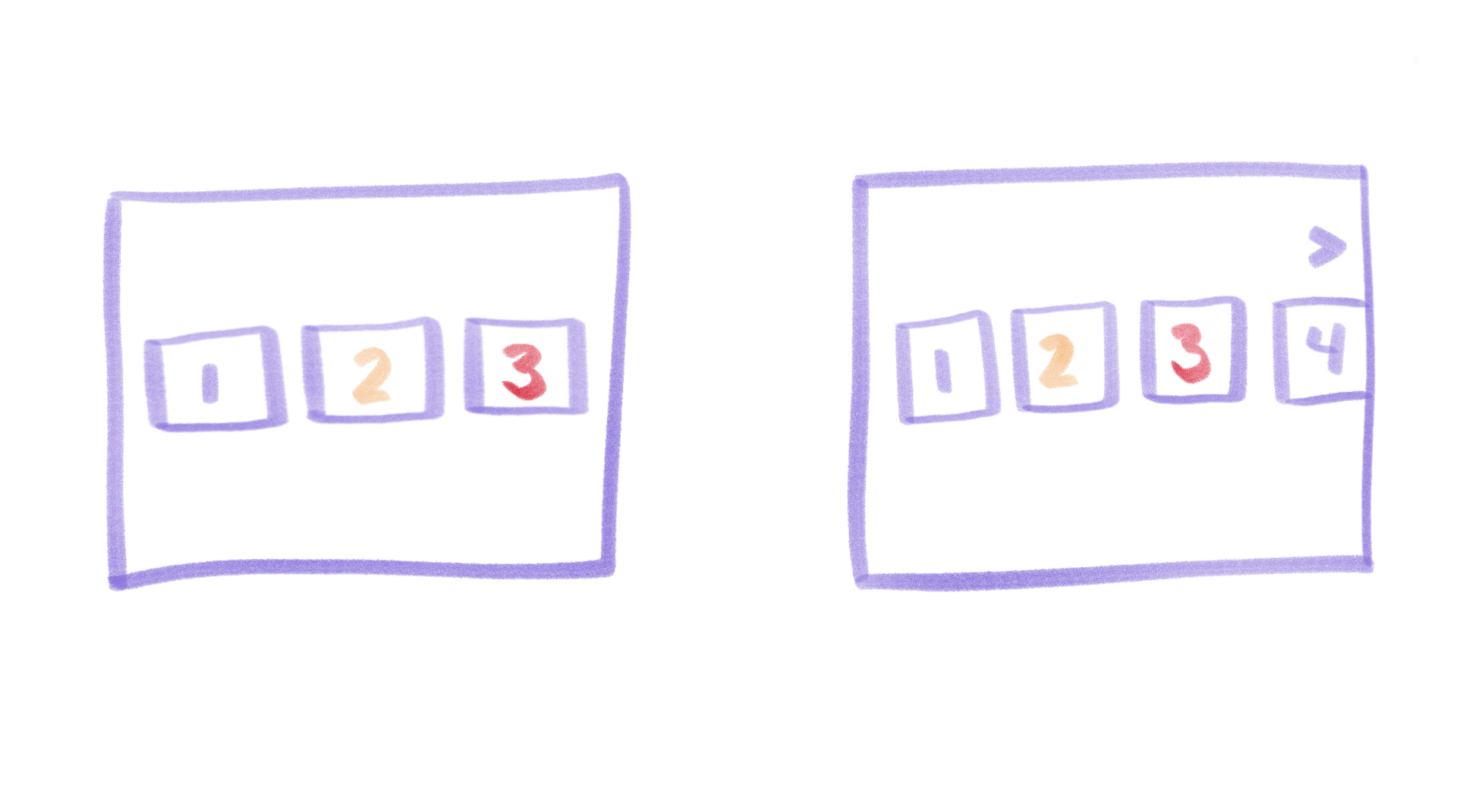
What we can do here is stretch the elements to fit the screen unless we have too many elements and they would require an overflow. At that point, let’s go all-in on this overflow and really showcase the carousel capabilities by signaling scroll-ability with arrows and by increasing the margin between items. On top of that, let’s add a sticky arrow button to show that we can scroll through the elements and can tie JavaScript events to make the carousel scroll.
We can do the same thing as above in terms of the technique, but we will also use only the first-child to detect an arrow div and display it in the UI. The HTML would look like this:
<ul>
  <li>
    <div class="box">1</div>
  </li>
  <li>
    <div class="box">2</div>
  </li>
  ...
  <button class="arrow">——></button>
</ul>
It’s not ideal to have empty elements in the DOM, but work with me. It’s still a clever hack. We’ll style the .arrow button to be invisible to the DOM and to screen readers with visibility: hidden unless the conditions apply (in this case, if four or more items are present). At that point we’ll give it a visible display (display: block), style, and position it appropriately:
li:first-child:nth-last-child(n + 5) ~ .arrow {
  display: block;
  position: sticky;
  ...
}
See the Pen Box Alignment by Una Kravets (@una) on CodePen.
More Information!
In my research for this post, I discovered an excellent post by Heydon Pickering about this technique, called Quantity Queries, and another example by Lea Verou! In the comment thread of Heydon’s post, Paul Irish notes that this is a slower way of selecting elements, so maybe use it with caution.
The post Solved with CSS! Logical Styling Based on the Number of Given Elements appeared first on CSS-Tricks.