Some Things You Oughta Know When Working with Viewport Units
Publikováno: 6.11.2019
David Chanin has a quickie article summarizing a problem with setting an element's height to 100vh in mobile browsers and then also positioning something on the bottom of that.
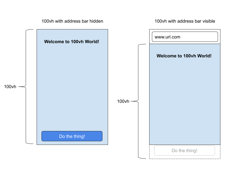
Summarized in this graphic:
The trouble is that Chrome isn't taking the address bar (browser chrome) into account when it's revealed which cuts off the element short, forcing the bottom of the element past the bottom of the actual viewport.
<div class="full-page-element">
  <button>Button</button>
</div>
.full-page-element {
height: 100vh;
position: relative;
The post Some Things You Oughta Know When Working with Viewport Units appeared first on CSS-Tricks.
David Chanin has a quickie article summarizing a problem with setting an element's height to 100vh in mobile browsers and then also positioning something on the bottom of that.
Summarized in this graphic:

The trouble is that Chrome isn't taking the address bar (browser chrome) into account when it's revealed which cuts off the element short, forcing the bottom of the element past the bottom of the actual viewport.
<div class="full-page-element">
  <button>Button</button>
</div>
.full-page-element {
height: 100vh;
position: relative;
}
.full-page-element button {
position: absolute;
bottom: 10px;
left: 10px;
}You'd expect that button in the graphic to be visible (assuming this element is at the top of the page and you haven't scrolled) since it's along the bottom edge of a 100vh element. But it's actually hidden behind the browser chrome in mobile browsers, including iOS Safari or Android Chrome.
I use this a lot:
body {
  height: 100vh; /* Nice to not have to think about the HTML element parent
  margin: 0;
}
It's just a quick way to make sure the body is full height without involving any other elements. I'm usually doing that on pretty low-stakes demo type stuff, but I'm told even that is a little problematic because you might experience jumpiness as browser chrome appears and disappears, or things may not be quite as centered as you'd expect.
You'd think you could do body { height: 100% }, but there's a gotcha there as well. The body is a child of <html> which is only as tall as the content it contains, just like any other element.
If you need the body to be full height, you have to deal with the HTML element as well:
html, body {
  height: 100%;
}
...which isn't that big of a deal and has reliable cross-browser consistency.
It's the positioning things along the bottom edge that is tricky. It is problematic because of position: absolute; within the "full height" (often taller-than-visible) container.
If you are trying to place something like a fixed navigation bar at the bottom of the screen, you'd probably do that with position: fixed; bottom: 0; and that seems to work fine. The browser chrome pushes it up and down as you'd expect (video).
Horizontal viewport units are just as weird and problematic due to another bit of browser UI: scrollbars. If a browser window has a visible scrollbar, that scrollbar will usually eat into the visual space although a value of 100vw is calculated as if the scrollbar wasn't there. In other words, 100vw will cause horizontal scrolling in a way you probably wouldn't expect.
See the Pen
CSS Vars for viewport width minus scrollbar by Shaw (@shshaw)
on CodePen.
Our last CSS wishlist roundup mentioned better viewport unit handling a number of times, so developers are clearly pretty interested in having better solutions for these things. I'm not sure what that would mean for web compatibility though, because changing the way they work might break all the workarounds we've used that are surely still out in the wild.
The post Some Things You Oughta Know When Working with Viewport Units appeared first on CSS-Tricks.