Sometimes `sizes` is quite important.
Publikováno: 27.7.2018
Paraphrased question from email:
I just read your article Responsive Images: If you’re just changing resolutions, use srcset. In the age of "responsive websites," srcset does not help in certain situations. For example, I have a popular products slider. On mobile, I have one image per slide where the images are 320px wide. On desktop, I have six images per slide where each is 160px wide. So the desktop images are smaller on desktop, not bigger.
How do I …
The post Sometimes `sizes` is quite important. appeared first on CSS-Tricks.
Paraphrased question from email:
I just read your article Responsive Images: If you’re just changing resolutions, use srcset. In the age of "responsive websites,"
srcsetdoes not help in certain situations. For example, I have a popular products slider. On mobile, I have one image per slide where the images are 320px wide. On desktop, I have six images per slide where each is 160px wide. So the desktop images are smaller on desktop, not bigger.How do I handle this situation with
srcset?
I tried to be careful with that post title: "If you’re just changing resolutions, use srcset." In this case, we're changing the size of the images not just at certain resolutions, but at specific breakpoints as well, which means we're also going to need to use the sizes attribute to get the most out of responsive images. The entire job of the sizes attribute is to tell the browser what size the image will be shown at, as per our CSS.
A demo! Resize the width to see it alternate between the "Desktop" and "Mobile" views.
See the Pen Responsive Images Slider by Chris Coyier (@chriscoyier) on CodePen.
As the email mentioned, the "Desktop" version actually renders the images smaller (160px) than the "Mobile" version (320px).
Let's also account for 2x displays. To prepare ourselves, let's have three versions of each image:
- 160px (for 1x desktop displays)
- 320px (for 2x desktop displays, or 1x mobile displays)
- 640px (for 2x mobile displays)
With srcset, that looks like this:
<img srcset="
  food-big.jpg 640w,
  foot-medium.jpg 320w,
  food-small.jpg 160w"
/>
Notice we're not yet using the sizes attribute. Browsers will assume you're probably going to render this image at 100vw wide. That's unfortunate because the browser may download a larger image than it needs, which is what we're trying to fight against with responsive images in the first place.

It's our CSS that controls how big these images render. In fact, we have a media query in this demo that says, "Hey browser, only render the images at 160px wide on Desktop displays."
@media (min-width: 600px) {
  .slider img {
    width: 160px;
  }
}
You'd think the browser would know that, and it does — it just needs to download and parse the CSS first. The browser wants to make a decision about what to download faster than that. So, let's tell it with the sizes attribute.
<img srcset="
  food-big.jpg 640w,
  foot-medium.jpg 320w,
  food-small.jpg 160w"

  sizes="(min-width: 600px) 160px, 320px"
/>
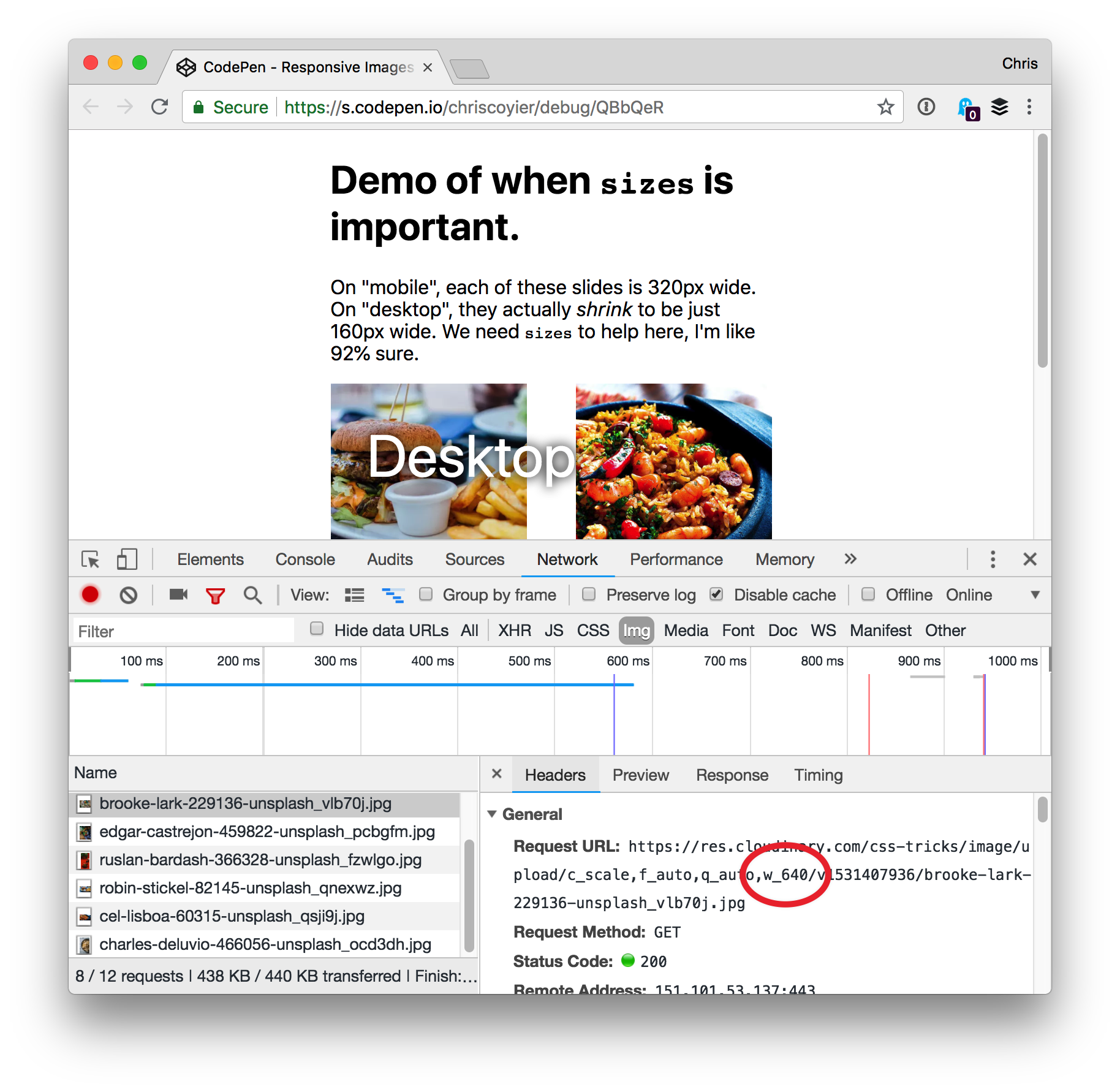
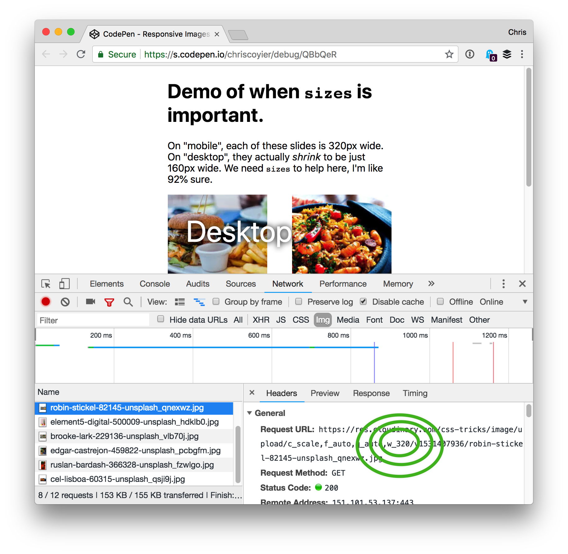
That's saying, "OK, we'll be rendering this image 160px wide on Desktop. Otherwise, let's go with 320px wide." With that in place, we can see the browser is making the right choice:

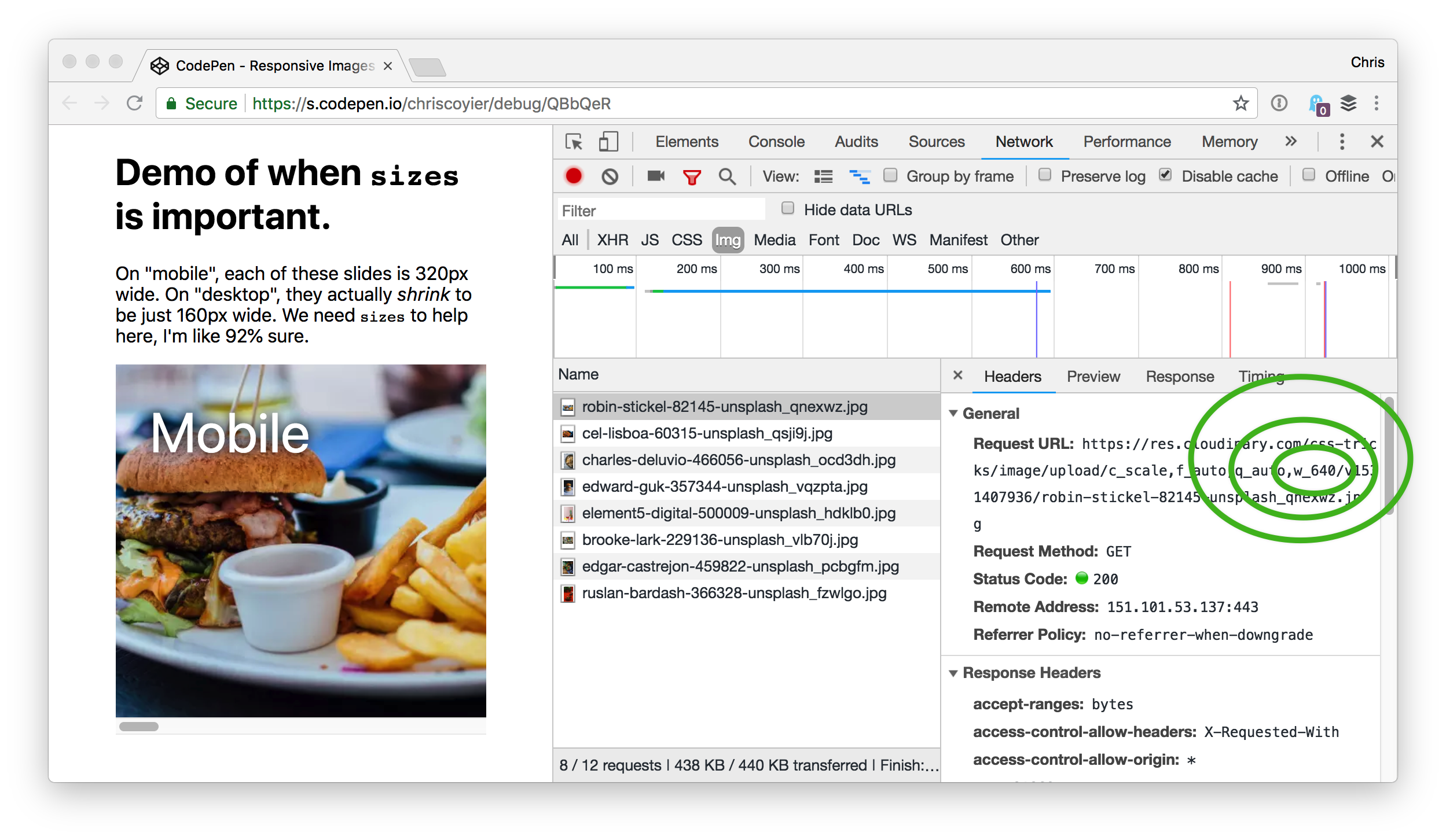
And just to be sure, here's a narrow viewport (like "mobile" would be):

sizes attribute is telling the browser we intend to render at 320px and we're on a 2x display.There is even more nuance here
I showed this demo to Eric "Sizes Master" Portis, who confirmed all this, but had some browser-specific things to add. I'll summarize (but note the date of this blog post because these things tend to change):
- Firefox does exactly as described above.
- Chrome does too, except that it will always use the larger version if it has that version in cache. So, if it has a 640px version in cache, it knows it really only needs a 320px version, but since it doesn't have a 320px version in cache, it'll use the 640px version instead.
- Safari does too, except that after it has made its choice, it never changes (like if you resize the browser window).
- An interesting part about
srcsetis that the spec allows it to make choices however it wants, perhaps using stuff like network conditions to decide. Most browsers don't do anything like this yet, except Chrome which downloads the smallest resource should it get aSave-Dataheader on the HTML document. - Joe McGill also noted: "For older iOS devices that don’t support
wdescriptors insrcset, the first source item in the list will be used, so you may want to lead with your preferred default size if you're supporting legacy iOS devices." In other words, those older iOS devices may have supported earlier syntaxes of responsive images, but only withxdescriptor (likebig-image.jpg 2x), so perhaps specify a good default image as the first in yoursrcset.
It might be helpful to look at Eric's fork to more easily see what gets downloaded:
See the Pen Responsive Images Slider by Eric Portis (@eeeps) on CodePen.
Random notes
- I snagged those food photos from Unsplash.
- I uploaded them to Cloudinary so that I could use URL params to resize them instead of having to deal with that myself.
- They are all squares, not because I downloaded them like that, but because I sized them that way in CSS and prevented squishing with
object-fit. That means image data is being downloaded that isn't needed, so I either should have cropped them myself or used Cloudinary URL params to do that. - I used the Pug HTML preprocessor for my demo just to reduce code repetition.
This is easier to look at:
img(srcset=`
  ${img_base}w_640${img_1} 640w,
  ${img_base}w_320${img_1} 320w,
  ${img_base}w_160${img_1} 160w,
` sizes=sizes)
...than the output:
<img srcset="
    https://res.cloudinary.com/css-tricks/image/upload/c_scale,f_auto,q_auto,w_640/v1531407936/robin-stickel-82145-unsplash_qnexwz.jpg 640w,
    https://res.cloudinary.com/css-tricks/image/upload/c_scale,f_auto,q_auto,w_320/v1531407936/robin-stickel-82145-unsplash_qnexwz.jpg 320w,
    https://res.cloudinary.com/css-tricks/image/upload/c_scale,f_auto,q_auto,w_160/v1531407936/robin-stickel-82145-unsplash_qnexwz.jpg 160w,
  " sizes="(min-width: 600px) 160px, 320px"/><img srcset="
    https://res.cloudinary.com/css-tricks/image/upload/c_scale,f_auto,q_auto,w_640/v1531407936/cel-lisboa-60315-unsplash_qsji9j.jpg 640w,
    https://res.cloudinary.com/css-tricks/image/upload/c_scale,f_auto,q_auto,w_320/v1531407936/cel-lisboa-60315-unsplash_qsji9j.jpg 320w,
    https://res.cloudinary.com/css-tricks/image/upload/c_scale,f_auto,q_auto,w_160/v1531407936/cel-lisboa-60315-unsplash_qsji9j.jpg.jpg 160w,
  " sizes="(min-width: 600px) 160px, 320px"/><img srcset="
    https://res.cloudinary.com/css-tricks/image/upload/c_scale,f_auto,q_auto,w_640/v1531407936/charles-deluvio-466056-unsplash_ocd3dh.jpg 640w,
    https://res.cloudinary.com/css-tricks/image/upload/c_scale,f_auto,q_auto,w_320/v1531407936/charles-deluvio-466056-unsplash_ocd3dh.jpg 320w,
    https://res.cloudinary.com/css-tricks/image/upload/c_scale,f_auto,q_auto,w_160/v1531407936/charles-deluvio-466056-unsplash_ocd3dh.jpg.jpg 160w,
  " sizes="(min-width: 600px) 160px, 320px"/>
The post Sometimes `sizes` is quite important. appeared first on CSS-Tricks.