The Current State of Styling Selects in 2019
Publikováno: 28.10.2019
Best I could tell from the last time I compiled the most wished-for features of CSS, styling form controls was a major ask. Top 5, I'd say. And of the native form elements that people want to style, Greg Whitworth has some data that the <select> element is more requested than any other element — more than double the next element — and it's the one developers most often customize in some way.
Developers clearly want to style select … Read article
The post The Current State of Styling Selects in 2019 appeared first on CSS-Tricks.
Best I could tell from the last time I compiled the most wished-for features of CSS, styling form controls was a major ask. Top 5, I'd say. And of the native form elements that people want to style, Greg Whitworth has some data that the <select> element is more requested than any other element — more than double the next element — and it's the one developers most often customize in some way.
Developers clearly want to style select dropdowns.
You actually do a little. Perhaps more than you realize.
The best crack at this out there comes from Scott Jehl over on the Filament Group blog. I'll embed a copy here so it's easy to see:
See the Pen
select-css by Scott/Filament Group by Chris Coyier (@chriscoyier)
on CodePen.
Notably, this is an entirely cross-browser solution. It's not something limited to only the most progressive desktop browsers. There are some visual differences across browsers and platforms, but overall it's pretty consistent and gives you a baseline from which to further customize it.
That's just the "outside"
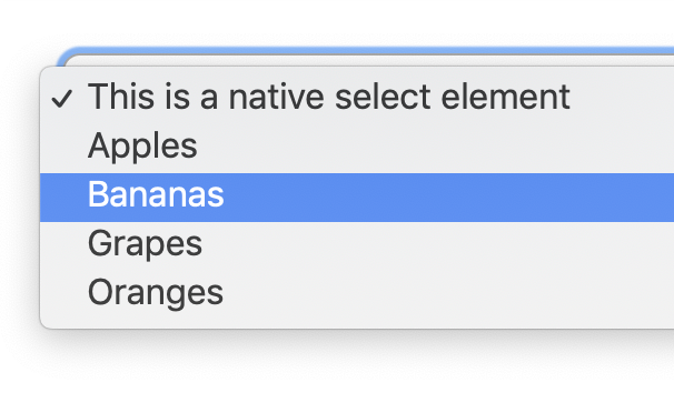
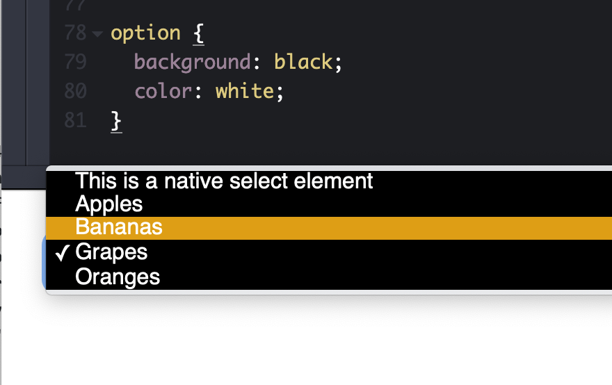
Open the select. Hmm, it looks and behaves like you did nothing to it at all.

<select> doesn't do anything to the opened dropdown of items. (Screenshot from macOS Chrome)Some browsers do let you style the inside, but it's very limited. Any time I've gone down this road, I've had a bad time getting things cross-browser compliant.

Greg's data shows that only 14% (third place) of developers found styling the outside to be the most painful part of select elements. I'm gonna steal his chart because it's absolutely fascinating:
| Frustration | % | Count |
|---|---|---|
| Not being able to create a good user experience for searching within the list | 27.43% | 186 |
| Not being able to style the <option> element to the extent that you needed to | 17.85% | 121 |
| Not being able to style the default state (dropdown arrow, etc.) | 14.01% | 95 |
| Not being able to style the pop-up window on desktop (e.g. the border, drop shadows, etc.) | 11.36% | 77 |
| Insertion of content beyond simple text in the <select> control or its <option>s | 11.21% | 76 |
| Insertion of arbitrary HTML content in an <option> element | 7.82% | 53 |
| Not being able to create distinctive unselected/placeholder style and behavior | 3.39% | 23 |
| Being able to generate new options from a large dataset while the popup is open | 3.10% | 21 |
| Not being able to style the currently selected <option>(s) to the extent you needed to | 1.77% | 12 |
| Not being able to style the pop-up window on mobile | 1.03% | 7 |
| Being able to have the options automatically repeat on scroll (i.e., if you have an list of options 1 – 100, as you reach 100 rather than having the user scroll back to the top, have 1 show up below 100) | 1.03% | 7 |
Boiled down, the most painful parts of styling selects are:
- Search
- Styling the open dropdown, including the individual options, including more than just text
- Updating the element without closing it
- Styling for cases where "nothing" is selected and when an item is selected
I'm surprised multi-select didn't make the cut. Maybe it's not on the table for <select> since it wouldn't be backwards-compatible?
Browser evolution
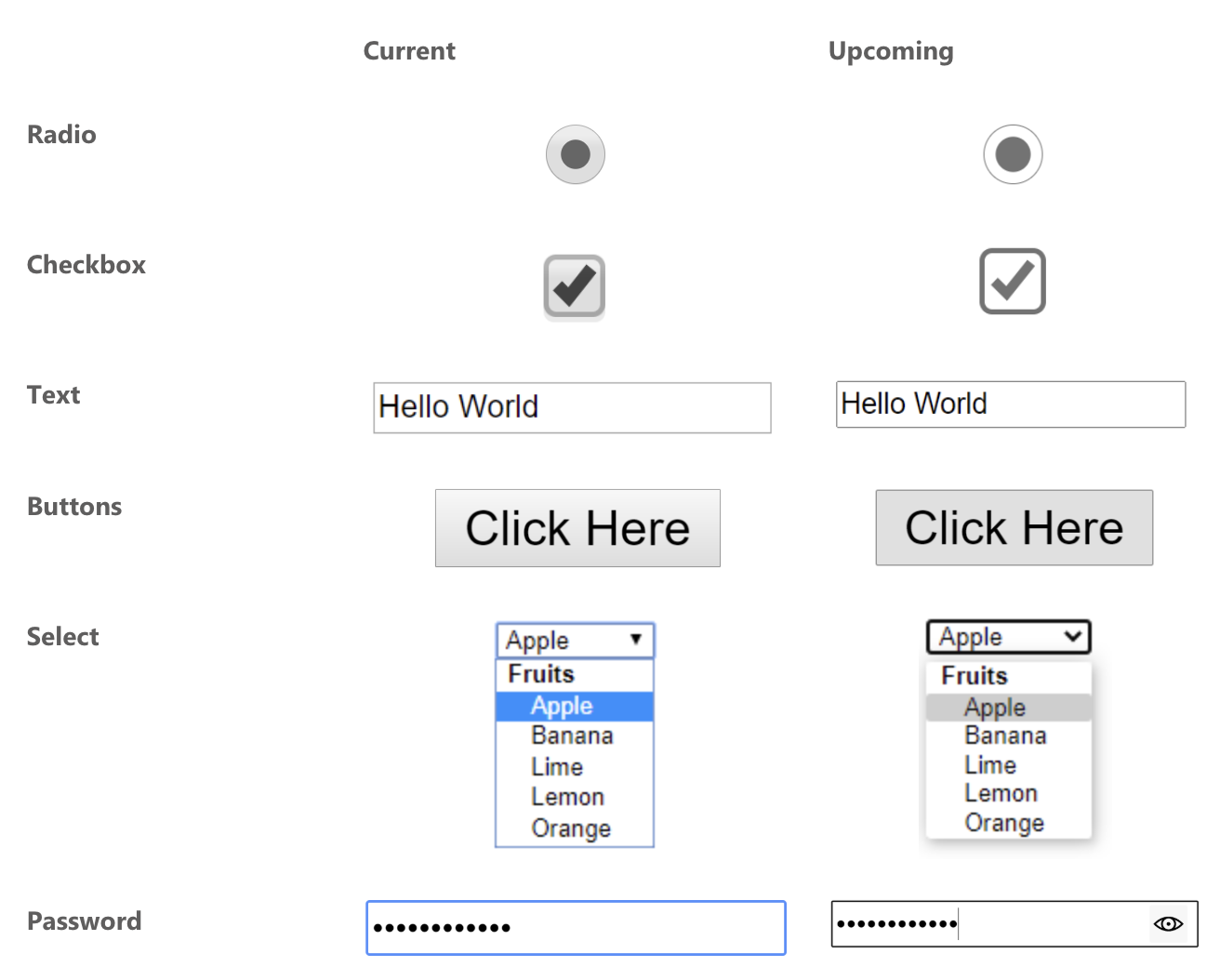
Edge recently announced they are improving the look of form controls, but no word just yet on standards or how to customize them.

It seems like there is good momentum, though. If you want more information and to follow along with all this progress (I know I will!):
- Listen to Nicole Sullivan talk about it (starts at about the 16 minute mark).
- Read Greg Whitworth's "Can we please style the
<select>control?!" It goes deep into all this.
The post The Current State of Styling Selects in 2019 appeared first on CSS-Tricks.