The Many Ways to Change an SVG Fill on Hover (and When to Use Them)
Publikováno: 31.1.2019
SVG is a great format for icons. Vector formats look crisp and razor sharp, no matter the size or device — and we get tons of design control when using them inline.
SVG also gives us another powerful feature: the ability to manipulate their properties with CSS. As a result, we can make quick and simple interactions where it used to take crafty CSS tricks or swapping out entire image files.
Those interactions include changing color on hover states. It … Read article
The post The Many Ways to Change an SVG Fill on Hover (and When to Use Them) appeared first on CSS-Tricks.
SVG is a great format for icons. Vector formats look crisp and razor sharp, no matter the size or device — and we get tons of design control when using them inline.
SVG also gives us another powerful feature: the ability to manipulate their properties with CSS. As a result, we can make quick and simple interactions where it used to take crafty CSS tricks or swapping out entire image files.
Those interactions include changing color on hover states. It sounds like such a straightforward thing here in 2019, but there are actually a few totally valid ways to go about it — which only demonstrates the awesome powers of SVG more.
First off, let’s begin with a little abbreviated SVG markup:
<svg class="icon">
  <path .../>
</svg>
Target the .icon class in CSS and set the SVG fill property on the hover state to swap colors.
.icon:hover {
  fill: #DA4567;
}
This is by far the easiest way to apply a colored hover state to an SVG. Three lines of code!
SVGs can also be referenced using an <img> tag or as a background image. This allows the images to be cached and we can avoid bloating your HTML with chunks of SVG code. But the downside is a big one: we no longer have the ability to manipulate those properties using CSS. Whenever I come across non-inline icons, my first port of call is to inline them, but sometimes that's not an option.
I was recently working on a project where the social icons were a component in a pattern library that everyone was happy with. In this case, the icons were being referenced from an <img> element. I was tasked with applying colored :focus and :hover styles, without adjusting the markup.
So, how do you go about adding a colored hover effect to an icon if it's not an inline SVG?
CSS Filters
CSS filters allow us to apply a whole bunch of cool, Photoshop-esque effects right in the browser. Filters are applied to the element after the browser renders layout and initial paint, which means they fall back gracefully. They apply to the whole element, including children. Think of a filter as a lens laid over the top of the element it's applied to.
These are the CSS filters available to us:
brightness(<number-percentage>);contrast(<number-percentage>);grayscale(<number-percentage>);invert(<number-percentage>);opacity(<number-percentage>);saturate(<number-percentage>);sepia(<number-percentage>);hue-rotate(<angle>);blur(<length>);drop-shadow(<length><color>);
All filters take a value which can be changed to adjust the effect. In most cases, this value can be expressed in either a decimal or percent units (e.g. brightness(0.5) or brightness(50%)).
Straight out of the box, there's no CSS filter that allows us to add our own specific color.
We have hue-rotate(), but that only adjusts an existing color; it doesn't add a color, which is no good since we're starting with a monochromatic icon.
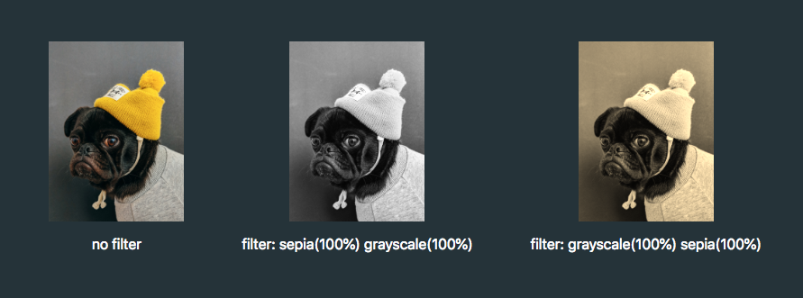
The game-changing bit about CSS filters is that we don't have to use them in isolation. Multiple filters can be applied to an element by space-separating the filter functions like this:
.icon:hover {
  filter: grayscale(100%) sepia(100%);
}
If one of the filter functions doesn't exist, or has an incorrect value, the whole list is ignored and no filter will be applied to the element.
When applying multiple filter functions to an element, their order is important and will affect the final output. Each filter function will be applied to the result of the previous operation.

So, in order to colorize our icons, we have to find the right combination.
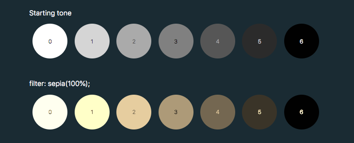
To make use of hue-rotate(), we need to start off with a colored icon. The sepia() filter is the only filter function that allows us to add a color, giving the filtered element a yellow-brown-y tinge, like an old photo.
The output color is dependent on the starting tonal value:

In order to add enough color with sepia(), we first need to use invert() to convert our icon to a medium grey:
.icon:hover {
  filter: invert(0.5)
}
We can then add the yellow/brown tone with sepia():
.icon:hover {
  filter: invert(0.5) sepia(1);
}
...then change the hue with hue-rotate():
.icon:hover {
  filter: invert(0.5) sepia(1) hue-rotate(200deg);
}
Once we have the rough color we want, we can tweak it with saturation() and brightness():
.icon:hover {
  filter:
    invert(0.5)
    sepia(1)
    hue-rotate(200deg)
    saturate(4)
    brightness(1);
}
I've made a little tool for this to make your life a little easier, as this is a pretty confusing process to guesstimate.
See the Pen CSS filter example by Cassie Evans (@cassie-codes)
on CodePen.
Even with the tool, it's still a little fiddly, not supported by Internet Explorer, and most importantly, you're unable to specify a precise color.
This browser support data is from Caniuse, which has more detail. A number indicates that browser supports the feature at that version and up.
Desktop
| Chrome | Opera | Firefox | IE | Edge | Safari |
|---|---|---|---|---|---|
| 18* | 15* | 35 | No | 18 | 6* |
Mobile / Tablet
| iOS Safari | Opera Mobile | Opera Mini | Android | Android Chrome | Android Firefox |
|---|---|---|---|---|---|
| 6.0-6.1* | 46 | No | 4.4* | 71 | 64 |
So, what do we do if we need a specific hex code?
SVG Filters
If we need more precise control (and better browser support) than CSS filters can offer, then it's time to turn to SVG.
Filters originally came from SVG. In fact, under the hood, CSS filters are just shortcuts to SVG filters with a particular set of values baked in.
Unlike CSS, the filter isn't predefined for us, so we have to create it. How do we do this?
This is the syntax to define a filter:
<svg xmlns="<http://www.w3.org/2000/svg>" version="1.1">
  <defs>
    <filter id="id-of-your-filter">
      ...

      ...
    </filter>
    ...
  </defs>
</svg>
Filters are defined by a <filter> element, which goes inside the <defs> section of an SVG.
SVG filters can be applied to SVG content within the same SVG document. Or, the filter can be referenced and applied to HTML content elsewhere.
To apply an SVG filter to HTML content, we reference it the same way as a CSS filter: by using the url() filter function. The URL points to the ID of the SVG filter.
.icon:hover {
  filter: url('#id-of-your-filter');
}
The SVG filter can be placed inline in the document or the filter function can reference an external SVG. I prefer the latter route as it allows me to keep my SVG filters tidied away in an assets folder.
.icon:hover {
  filter: url('assets/your-SVG.svg#id-of-your-filter');
}
Back to the <filter> element itself.
<filter id="id-of-your-filter">
  ...

  ...
</filter>
Right now, this filter is empty and won't do anything as we haven't defined a filter primitive. Filter primitives are what create the filter effects. There are a number of filter primitives available to us, including:
[<feBlend>][<feColorMatrix>][<feComponentTransfer>][<feComposite>][<feConvolveMatrix>][<feDiffuseLighting>][<feDisplacementMap>][<feDropShadow>][<feFlood>][<feGaussianBlur>][<feImage>][<feMerge>][<feMorphology>][<feOffset>][<feSpecularLighting>][<feTile>][<feTurbulence>]
Just like with CSS filters, we can use them on their own or include multiple filter primitives in the <filter> tag for more interesting effects. If more than one filter primitive is used, then each operation will build on top of the previous one.
For our purposes we're just going to use feColorMatrix, but if you want to know more about SVG filters, you can check out the specs on MDN or this (in progress, at the time of this writing) article series that Sara Soueidan has kicked off.
feColourMatrix allows us to change color values on a per-channel basis, much like channel mixing in Photoshop.
This is what the syntax looks like:
<svg xmlns="<http://www.w3.org/2000/svg>" version="1.1">
  <defs>
    <filter id="id-of-your-filter">
      <feColorMatrix
        color-interpolation-filters="sRGB"
        type="matrix"
        values="1 0 0 0 0
                0 1 0 0 0
                0 0 1 0 0
                0 0 0 1 0 "/>
    </filter>
    ...
  </defs>
</svg>
Let’s have a closer look at the color matrix values.

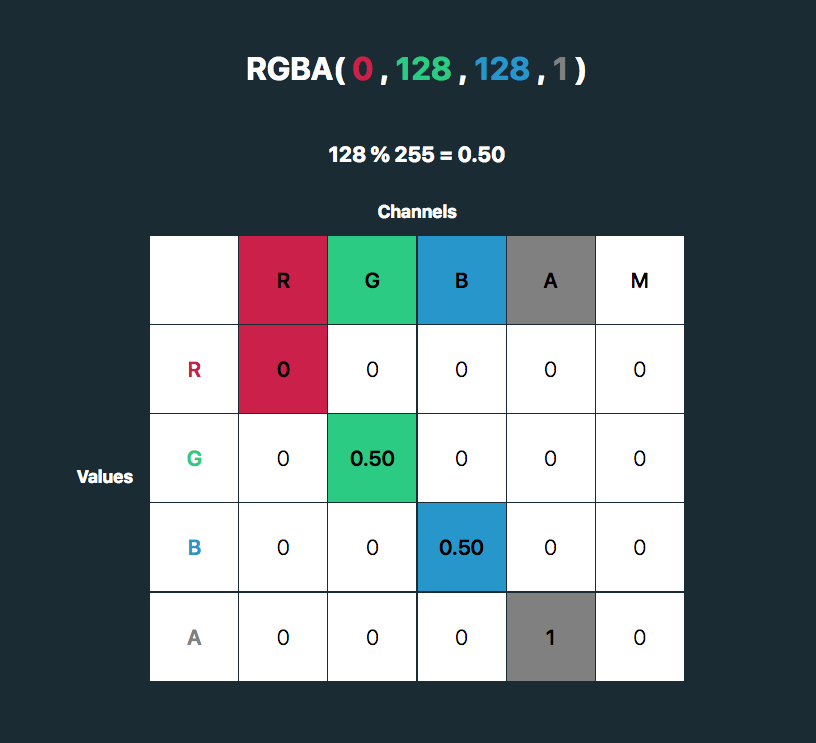
The first four columns represent the red, green and blue channels of color and the alpha (opacity) value. The rows contain the red, green, blue and alpha values in those channels.
The M column is a multiplier — we don’t need to change any of these values for our purposes here. The values for each color channel are represented as floating point numbers in the range 0 to 1.
We could write these values as a CSS RGBA color declaration like this:

The values for each color channel (red, green and blue) are stored as integers in the range 0 to 255. In computers, this is the range that one 8-bit byte can offer.
By dividing these color channel values by 255, the values can be represented as a floating point number which we can use in the feColorMatrix.
And, by doing this, we can create a color filter for any color with an RGB value!
Like teal, for example:

See the Pen
SVG filter - teal hover by Cassie Evans (@cassie-codes)
on CodePen.
This SVG filter will only impart color to icons with a white fill, so If we have an icon with a black fill, we can use invert() to convert it to white before applying the SVG filter.
.icon:hover {
  filter: invert(100%) url('assets/your-SVG.svg#id-of-your-filter');
}
If we just have a hex code, the math is a little trickier, although there are plenty of hex-to-RGBA converters out there. To help out, I've made a HEX to feColorMatrix converter.
See the Pen
HEX to feColorMatrix converterr by Cassie Evans (@cassie-codes)
on CodePen.
Have a play around, and happy filtering!
The post The Many Ways to Change an SVG Fill on Hover (and When to Use Them) appeared first on CSS-Tricks.