The Serif Tax
Publikováno: 9.4.2019
Fonts are vector. Vector art with more points makes for larger files than vector art with fewer points. Custom fonts are downloaded. So, fonts with less points in their vector art are smaller. That's the theory anyway. Shall we see if there is any merit to it?
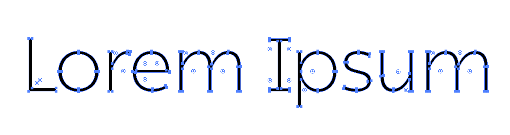
Open Sans (top) and Garamond (bottom)
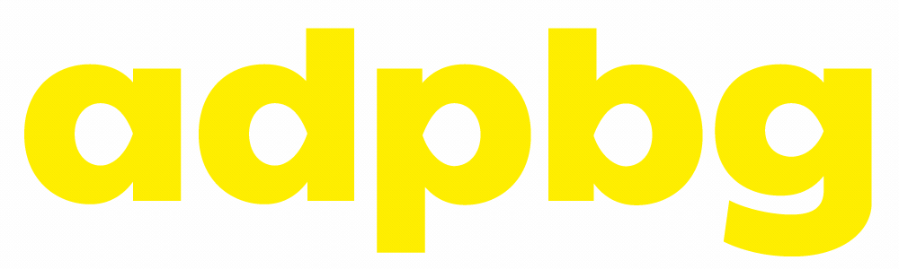
Let's take two fonts off of Google Fonts: Open Sans and EB Garamond. The number of points isn't a dramatic difference, but the seriffed Garamond does … Read article
The post The Serif Tax appeared first on CSS-Tricks.
Fonts are vector. Vector art with more points makes for larger files than vector art with fewer points. Custom fonts are downloaded. So, fonts with less points in their vector art are smaller. That's the theory anyway. Shall we see if there is any merit to it?
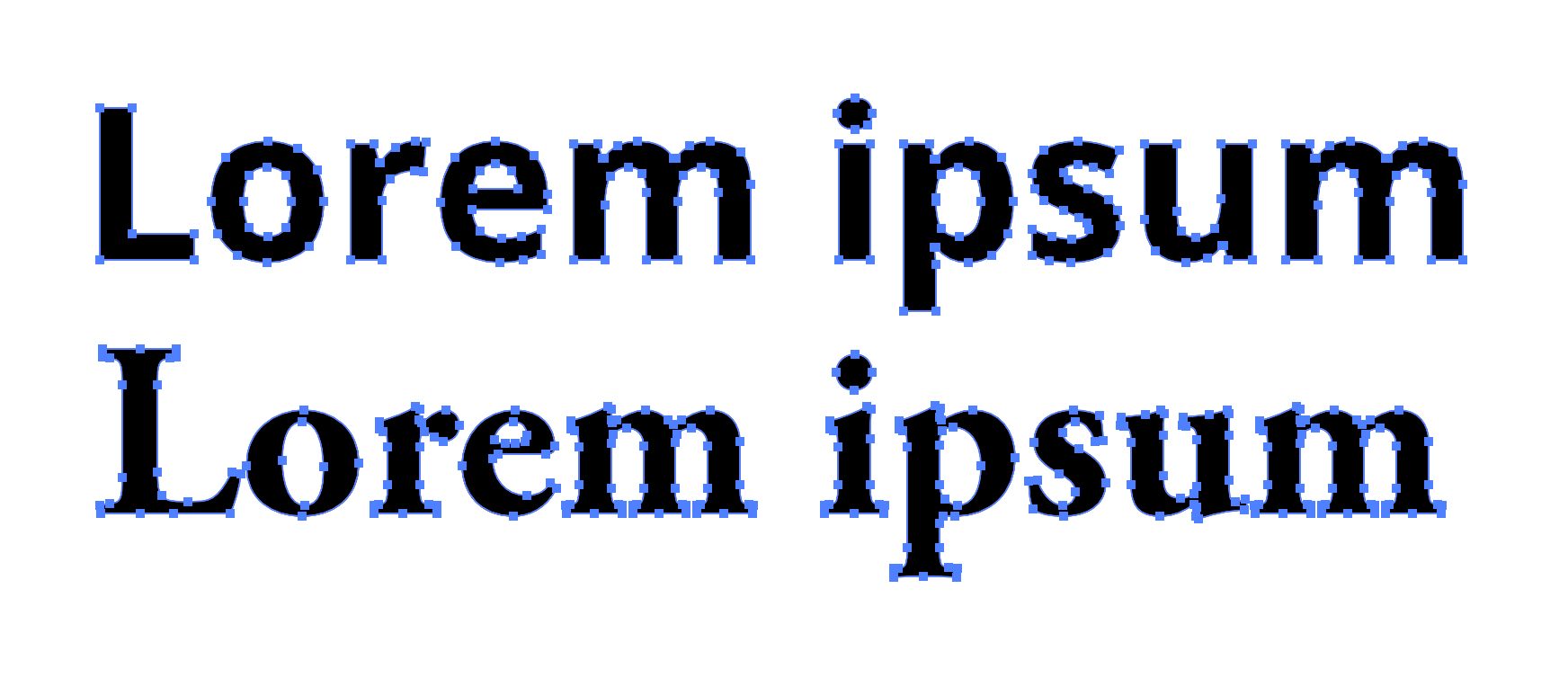
Let's take two fonts off of Google Fonts: Open Sans and EB Garamond. The number of points isn't a dramatic difference, but the seriffed Garamond does have more of them, particularly in looking at the serif areas.
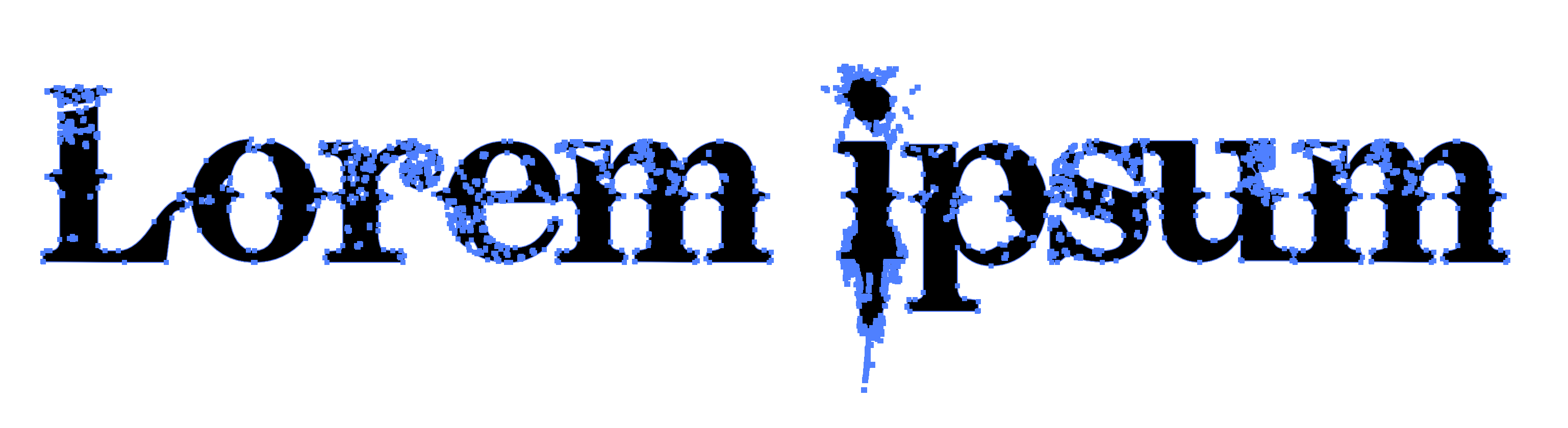
It's not just serifs, but any complication. Consider Bleeding Cowboys, a masterpiece of a font and a favorite of pawn shops and coffee carts alike where I live in the high desert:
Let's stick to our more practical comparison.
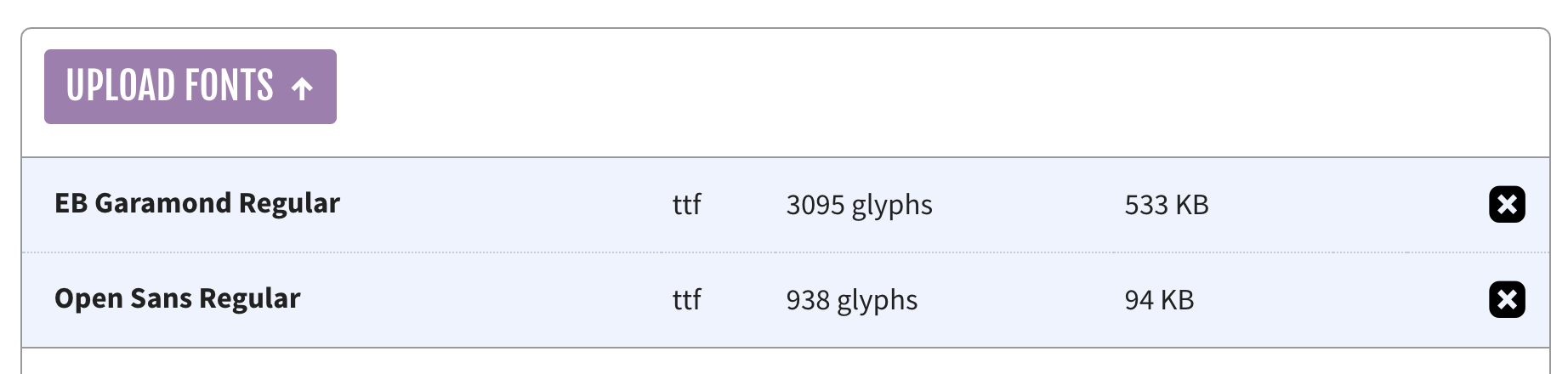
We get some hint at the size cost by downloading the files. If we download the default "Latin" set, and compare the regular weight of both:
| OpenSans-Regular.ttf | 96 KB |
| EBGaramond-Regular.ttf | 545 KB |
I'm not 100% sure if that's apples-to-apples there, as I'm not exactly a font file expert. Maybe EB Garamond has a whole ton of extra characters or something? I dunno. Also, we don't really use .ttf files on the web where file size actually matters, so let's toss them through Font Squirrel's generator. That should tell us whether we're actually dealing with more glyphs here.
It reports slightly different sizes than the Finder did and confirms that, yes, Garamond has way more glyphs than Open Sans.
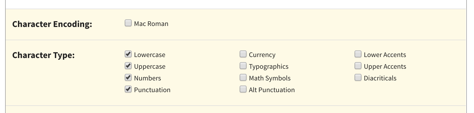
In an attempt to compare sizes with a font file with the same number of available characters, I'm did a custom subset of just upper, lower, punctuation, and numbers (things that both of them will have), before outputting them as .woff2 files instead of .ttf.
After that...
| opensans-regular-webfont.woff2 | 10 KB |
| ebgaramond-regular-webfont.woff2 | 21 KB |
I didn't serve them over a network with GZIP or brotli or anything, but my understanding is that WOFF2 is already compressed, so it's not super relevant.
Roughly two-to-one when comparing the file size of these two pretty popular fonts? Seems somewhat significant to me. I'm not above picking a font, assuming it works with the brand and whatnot because of size.
What made me think of this is a blog post about a font called Ping. Check out this "human hand" drawing principle it's made from:
Whoa! A single stroke? Unfortunately, I don't think actual fonts can be make from strokes, so the number-of-points savings can't come from that. I purchased the "ExtraLight" variation and the points are like this:
The TTF is 244 KB, so not the sub-100 of Open Sans, but again I'm not sure how meaningful that is without a matching subset and all that. Either way, I wasn't able to do that as it's against the terms of Ping to convert it.
The post The Serif Tax appeared first on CSS-Tricks.