Touring New CSS Features in Safari 26
Publikováno: 29.9.2025
Safari 26 adds:75 new features, 3 deprecations, and 171 other improvements. Here's all the CSS goodness you'll want to know about.
Touring New CSS Features in Safari 26 originally published on CSS-Tricks, which is part of the DigitalOcean family. You should get the newsletter.
A couple of days ago, the Apple team released Safari 26.0! Is it a big deal? I mean, browsers release new versions all the time, where they sprinkle in a couple or few new features. They are, of course, all useful, but there aren’t usually a lot of “big leaps” between versions. Safari 26 is different, though. It introduces a lot of new stuff. To be precise, it adds: 75 new features, 3 deprecations, and 171 other improvements.
I’d officially call that a big deal.
The WebKit blog post does an amazing job breaking down each of the new (not only CSS) features. But again, there are so many that the new stuff coming to CSS deserves its own spotlight. So, today I want to check (and also try) what I think are the most interesting features coming to Safari.
If you are like me and don‘t have macOS to test Safari, you can use Playwright instead.
What’s new (to Safari)?
Safari 26 introduces several features you may already know from prior Chrome releases. And… I can’t blame Safari for seemingly lagging behind because Chrome is shipping new CSS at a scarily fast pace. I appreciate that browsers stagger releases so they can refine things against each other. Remember when Chrome initially shipped position-area as inset-area? We got better naming between the two implementations.
I think what you’ll find (as I did) that many of these overlapping features are part of the bigger effort towards Interop 2025, something WebKit is committed to. So, let’s look specifically at what’s new in Safari 26… at least that’s new to Safari.
Anchor positioning
Anchor positioning is one of my favorite features (I wrote the guide on it!), so I am so glad it’s arrived in Safari. We are now one step closer to widely available support which means we’re that much closer to using anchor positioning in our production work.
With CSS Anchor Positioning, we can attach an absolutely-positioned element (that we may call a “target”) to another element (that we may call an “anchor”). This makes creating things like tooltips, modals, and pop-ups trivial in CSS, although it can be used for a variety of layouts.
Using anchor positioning, we can attach any two elements, like these, together. It doesn’t even matter where they are in the markup.
<div class="anchor">anchor</div>
<div class="target">target</div>
Heads up: Even though the source order does not matter for positioning, it does for accessibility, so it’s a good idea to establish a relationship between the anchor and target using ARIA attributes for better experiences that rely on assistive tech.
We register the .anchor element using the anchor-name property, which takes a dashed ident. We then use that ident to attach the .target to the .anchor using the position-anchor property.
.anchor {
  anchor-name: --my-anchor; /* the ident */
}

.target {
  position: absolute;
  position-anchor: --my-anchor; /* attached! */
}
This positions the .target at the center of the .anchor — again, no matter the source order! If we want to position it somewhere else, the simplest way is using the position-area property.
With position-area, we can define a region around the .anchor and place the .target in it. Think of it like drawing a grid of squares that are mapped to the .anchor‘s center, top, right, bottom and left.
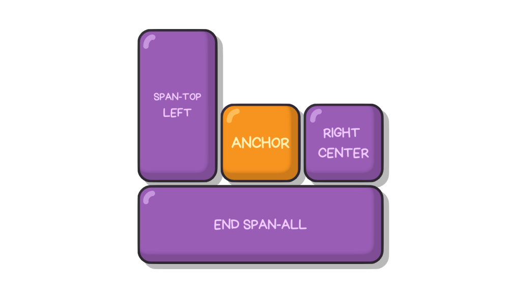
For example, if we wish to place the target at the anchor’s top-right corner, we can write…
.target {
  /* ... */
  position-area: top right;
}This is just a taste since anchor positioning is a world unto itself. I’d encourage you to read our full guide on it.
Scroll-driven animations
Scroll-driven animations link CSS animations (created from @keyframes) to an element’s scroll position. So instead of running an animation for a given time, the animation will depend on where the user scrolls.
We can link an animation to two types of scroll-driven events:
- Linking the animation to a scrollable container using the
scroll()function. - Linking the animation to an element’s position on the viewport using the
view()function.
Both of these functions are used inside the animation-timeline, which links the animation progress to the type of timeline we’re using, be it scroll or view. What’s the difference?
With scroll(), the animation runs as the user scrolls the page. The simplest example is one of those reading bars that you might see grow as you read down the page. First, we define our everyday animation and add it to the bar element:
@keyframes grow {
  from {
    transform: scaleX(0);
  }
  to {
    transform: scaleX(1);
  }
}

.progress {
  transform-origin: left center;
  animation: grow linear;
}
Note: I am setting transform-origin to left so it the animation progresses from the left instead of expanding from the center.
Then, instead of giving the animation a duration, we can plug it into the scroll position like this:
.progress {
  /* ... */
  animation-timeline: scroll();
}
Assuming you’re using Safari 26 or the latest version of Chrome, the bar grows in width from left to right as you scroll down the viewport.
The view() function is similar, but it bases the animation on the element’s position when it is in view of the viewport. That way, an animation can start or stop at specific points on the page. Here’s an example making images “pop” up as they enter view.
@keyframes popup {
  from {
    opacity: 0;
    transform: translateY(100px);
  }
  to {
    opacity: 1;
    transform: translateY(0px);
  }
}

img {
  animation: popup linear;
}
Then, to make the animation progress as the element enters the viewport, we plug the animation-timeline to view().
img {
    animation: popup linear;
    animation-timeline: view();
}
If we leave like this, though, the animation ends just as the element leaves the screen. The user doesn’t see the whole thing! What we want is for the animation to end when the user is in the middle of the viewport so the full timeline runs in view.
This is where we can reach for the animation-range property. It lets us set the animation’s start and end points relative to the viewport. In this specific example, let’s say I want the animation to start when the element enters the screen (i.e., the 0% mark) and finishes a little bit before it reaches the direct center of the viewport (we’ll say 40%):
img {
  animation: popup linear;
  animation-timeline: view();
  animation-range: 0% 40%;
}Once again, scroll-driven animations go way beyond these two basic examples. For a quick intro to all there is to them, I recommend Geoff’s notes.
I feel safer using scroll-drive animations in my production work because it’s more of a progressive enhancement that won’t break an experience even if it is not supported by the browser. Even so, someone may prefer reduced (or no) animation at all, meaning we’d better progressively enhance it anyway with prefers-reduced-motion.
The progress() function
This is another feature we got in Chrome that has made its way to Safari 26. Funny enough, I missed it in Chrome when it released a few months ago, so it makes me twice as happy to see such a handy feature baked into two major browsers.
The progress() function tells you how much a value has progressed in a range between a starting point and an ending point:
progress(<value>, <start>, <end>)If the <value> is less than the <start>, the result is 0. If the <value> reaches the <end>, the result is 1. Anything in between returns a decimal between 0 and 1.
Technically, this is something we can already do in a calc()-ulation:
calc((value - start) / (end - start))But there’s a key difference! With progress(), we can calculate values from mixed data types (like adding px to rem), which isn’t currently possible with calc(). For example, we can get the progress value formatted in viewport units from a numeric range formatted in pixels:
progress(100vw, 400px, 1000px);…and it will return 0 when the viewport is 400px, and as the screen grows to 1000px, it progresses to 1. This means it can typecast different units into a number, and as a consequence, we can transition properties like opacity (which takes a number or percentage) based on the viewport (which is a distance length).
There’s another workaround that accomplishes this using tan() and atan2() functions. I have used that approach before to create smooth viewport transitions. But progress() greatly simplifies the work, making it much more maintainable.
Case in point: We can orchestrate multiple animations as the screen size changes. This next demo takes one of the demos I made for the article about tan() and atan2(), but swaps that out with progress(). Works like a charm!
That’s a pretty wild example. Something more practical might be reducing an image’s opacity as the screen shrinks:
img {
  opacity: clamp(0.25, progress(100vw, 400px, 1000px), 1);
}
Go ahead and resize the demo to update the image’s opacity, assuming you’re looking at it in Safari 26 or the latest version of Chrome.
I’ve clamp()-ed the progress() between 0.25 and 1. But, by default, progress() already clamps the <value> between 0 and 1. According to the WebKit release notes, the current implementation isn’t clamped by default, but upon testing, it does seem to be. So, if you’re wondering why I’m clamping something that’s supposedly clamped already, that’s why.
An unclamped version may come in the future, though.
Self-alignment in absolute positioning
And, hey, check this out! We can align-self and justify-self content inside absolutely-positioned elements. This isn’t as big a deal as the other features we’ve looked at, but it does have a handy use case.
For example, I sometimes want to place an absolutely-positioned element directly in the center of the viewport, but inset-related properties (i.e., top, right, bottom, left, etc.) are relative to the element’s top-left corner. That means we don’t get perfectly centered with something like this as we’d expect:
.absolutely-positioned {
  position: absolute;
  top: 50%;
  left: 50%;
}
From here, we could translate the element by half to get things perfectly centered. But now we have the center keyword supported by align-self and justify-self, meaning fewer moving pieces in the code:
.absolutely-positioned {
  position: absolute;
  justify-self: center;
}
Weirdly enough, I noticed that align-self: center doesn’t seem to center the element relative to the viewport, but instead relative to itself. I found out that can use the anchor-center value to center the element relative to its default anchor, which is the viewport in this specific example:
.absolutely-positioned {
  position: absolute;
  align-self: anchor-center;
  justify-self: center;
}And, of course, place-self is a shorthand for the align-self and justify-self properties, so we could combine those for brevity:
.absolutely-positioned {
  position: absolute;
  place-self: anchor-center center;
}
What’s new (for the web)?
Safari 26 isn’t just about keeping up with Chrome. There’s a lot of exciting new stuff in here that we’re getting our hands on for the first time, or that is refined from other browser implementations. Let’s look at those features.
The constrast-color() function
The constrast-color() isn’t new by any means. It’s actually been in Safari Technology Preview since 2021 where it was originally called color-contrast(). In Safari 26, we get the updated naming as well as some polish.
Given a certain color value, contrast-color() returns either white or black, whichever produces a sharper contrast with that color. So, if we were to provide coral as the color value for a background, we can let the browser decide whether the text color is more contrasted with the background as either white or black:
h1 {
  --bg-color: coral;
  background-color: var(--bg-color);
  color: contrast-color(var(--bg-color));
}Our own Daniel Schwarz recently explored the contrast-color() function and found it’s actually not that great at determining the best contrast between colors:
Undoubtedly, the number one shortcoming is that
contrast-color()only resolves to either black or white. If you don’t want black or white, well… that sucks.
It sucks because there are cases where neither white nor black produces enough contrast with the provided color to meet WCAG color contrast guidelines. There is an intent to extend contrast-color() so it can return additional color values, but there still would be concerns about how exactly contrast-color() arrives at the “best” color, since we would still need to take into consideration the font’s width, size, and even family. Always check the actual contrast!
So, while it’s great to finally have constrat-color(), I do hope we see improvements added in the future.
Pretty text wrapping
Safari 26 also introduces text-wrap: pretty, which is pretty (get it?) straightforward: it makes paragraphs wrap in a prettier way.
You may remember that Chrome shipped this back in 2023. But take notice that there is a pretty (OK, that’s the last time) big difference between the implementations. Chrome only avoids typographic orphans (short last lines). Safari does more to prettify the way text wraps:
- Prevents short lines. Avoids single words at the end of the paragraph.
- Improves rag. Keeps each line relatively the same length.
- Reduces hyphenation. When enabled, hyphenation improves rag but also breaks words apart. In general, hyphenation should be kept to a minimum.
The WebKit blog gets into much greater detail if you’re curious about what considerations they put into it.
This is just the beginning!
I think these are all the CSS features coming to Safari that you should look out for, but I don’t want you to think they are the only features in the release. As I mentioned at the top, we’re talking about 75 new Web Platform features, including HDR Images, support for SVG favicons, logical property support for overflow properties, margin trimming, and much, much more. It’s worth perusing the full release notes.
Touring New CSS Features in Safari 26 originally published on CSS-Tricks, which is part of the DigitalOcean family. You should get the newsletter.