UX Considerations for Web Sharing
Publikováno: 20.9.2019
From trashy clickbait sites to the most august of publications, share buttons have long been ubiquitous across the web. And yet it is arguable that these buttons aren’t needed. All mobile browsers — Firefox, Edge, Safari, Chrome, Opera Mini, UC Browser, Samsung Internet — make it easy to share content directly from their native platforms. They all feature a built-in button to bring up a "share sheet" — a native dialog for sharing content. You can also highlight text to … Read article
The post UX Considerations for Web Sharing appeared first on CSS-Tricks.
From trashy clickbait sites to the most august of publications, share buttons have long been ubiquitous across the web. And yet it is arguable that these buttons aren’t needed. All mobile browsers — Firefox, Edge, Safari, Chrome, Opera Mini, UC Browser, Samsung Internet — make it easy to share content directly from their native platforms. They all feature a built-in button to bring up a "share sheet" — a native dialog for sharing content. You can also highlight text to share an excerpt along with the link.
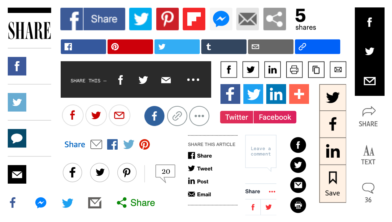
Given that users can share by default, are custom buttons taking up unnecessary space and potentially distracting users from more important actions? And do people actually use them?
A (unscientific) poll of 12,500 CSS-Tricks readers found that 60% of its readers never used custom share buttons. That was in 2014 and native methods for sharing have only improved since then. A more recent poll from Smashing Magazine found much the same thing.
How often do you use social sharing buttons on your mobile device?
— Smashing Magazine (@smashingmag) August 23, 2019
Users come with varying technological proficiency. Not everybody knows their way around there own mobile phone or browser meaning some users would struggle to find the native share button. It’s also worth thinking about what happens on desktop. Desktop browsers generally (with Safari as one exception) offer no built-in sharing functionality — users are left to copy and paste the link into their social network of choice.
Some data suggests that clickthrough rates are relatively low. However, clickthrough rates aren’t the best metric. For technically savvy users aware of how to share without assistance, the buttons can still act as a prompt — a visual reminder to share the content. Regardless of how the link is ultimately shared, a custom share button can still provide a cue, or a little nudge to elicit the share. For this reason, measuring click rates on the buttons themselves may not be entirely fair — people may see the button, feel encouraged to share the content, but then use the browsers built-in share button. A better metric would be whether shares increase after the addition of share buttons, regardless of how they’re shared.
We’ve established that having a share button is probably useful. Websites have traditionally featured separate buttons for two or three of the most popular social networks. With a new-ish API, we can do better. While browser support is currently limited to Chrome for Android and Safari, those two browsers alone make up the vast majority of web traffic.
The Web Share API
The Web Share API offers a simple way to bring up a share sheet — the native bit of UI that’s used for sharing. Rather than offering a standard list of popular social networks to share to (which the user may or may not be a member of), the options of the share sheet are catered to the individual. Only applications they have installed on their phone will be shown. Rather than a uniform list, the user will be shown only the option to share on networks they actually use — whether that be Twitter and Facebook or something more esoteric.
Not showing the user irrelevant networks is obviously a good thing. Unfortunately, this is counterbalanced by the fact that some users visit social media websites rather than downloading them as apps. If you use twitter.com, for example, but haven’t installed the Twitter application natively, then Twitter will not be listed as a sharing option. Currently, only native apps are listed but PWAs will be supported in the future.
websharebutton.addEventListener("click", function() {
  navigator.share({
    url: document.URL,
    title: document.title,
    text: "lorem ipsum..."
  });
});
The API requires user interaction (such as a button click as shown in the above code) to bring up the share sheet. This means you can’t do something obnoxious like bring up the share sheet on page load.
The text might be a short excerpt or a summation of the page. The title is used when sharing via email but will be ignored when sharing to social networks.
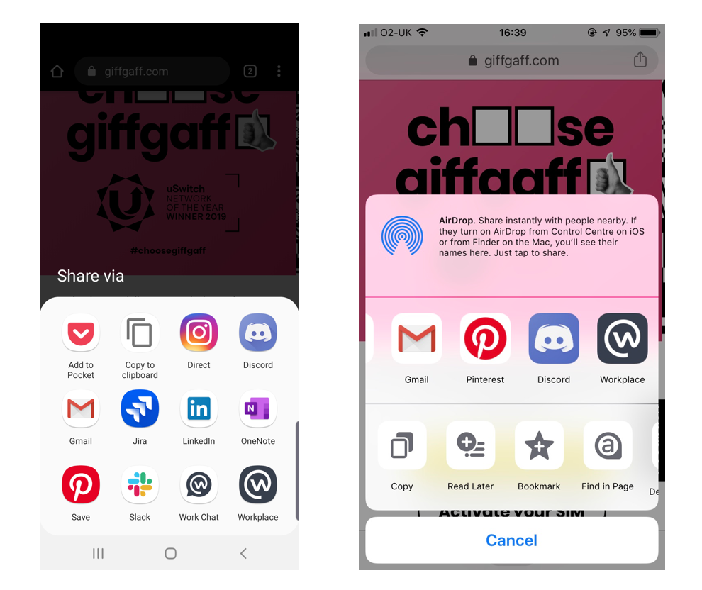
Sharing on desktop
While we are pretty happy with the Web Share API for mobile, its implementation for desktop is currently limited to Safari and leaves a lot to be desired. (Chrome is planning to ship support eventually, but there is no clear timescale).
The provided options — Mail, Message, Airdrop, Notes, Reminders — omit social networks. Native apps for Twitter and Facebook are common on phones, but rare on other devices.
Instead of relying on the Web Share API for desktop, its relatively common to have a generic share button that opens a modal that offers more multiple sharing options. This is the approach adopted by YouTube, Instagram and Pinterest, among others.
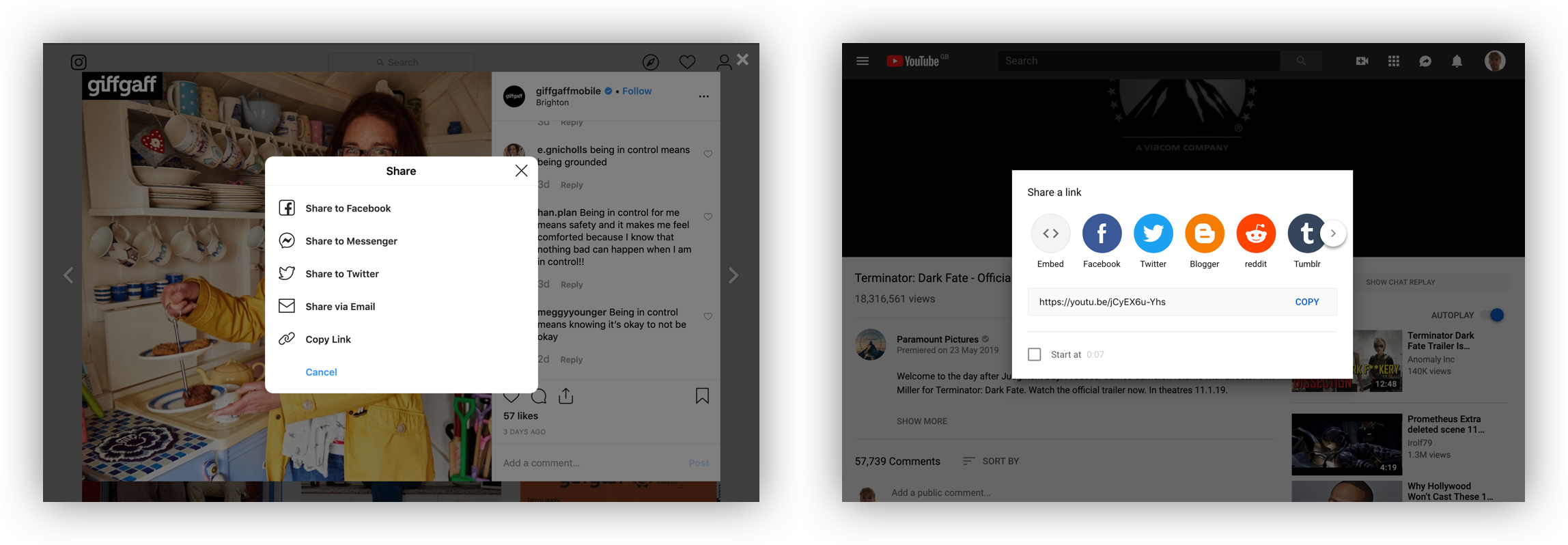
Facebook and Twitter account for the vast majority of sharing online, so offering an exhaustive list of social networks to choose from doesn’t feel necessary. (An option for Instagram would be ideal, but it is currently not technically possible to share to Instagram from a website.) It is also relatively common to include an email option. For anyone using a web-based email client like gmail.com or outlook.com rather than the operating system’s default email application, this is problematic.
Many people make use of web-based email client’s gmail.com or outlook.com. A share-by-email button will open the operating system’s default email application. Users will be greeted by a prompt to set this up, which is far more effort than simply copy and pasting the URL. It is therefore advisable to omit the email option and instead include a button to copy the link to the clipboard, which is only infinitesimally easier than doing a copy in the address bar with the keyboard.
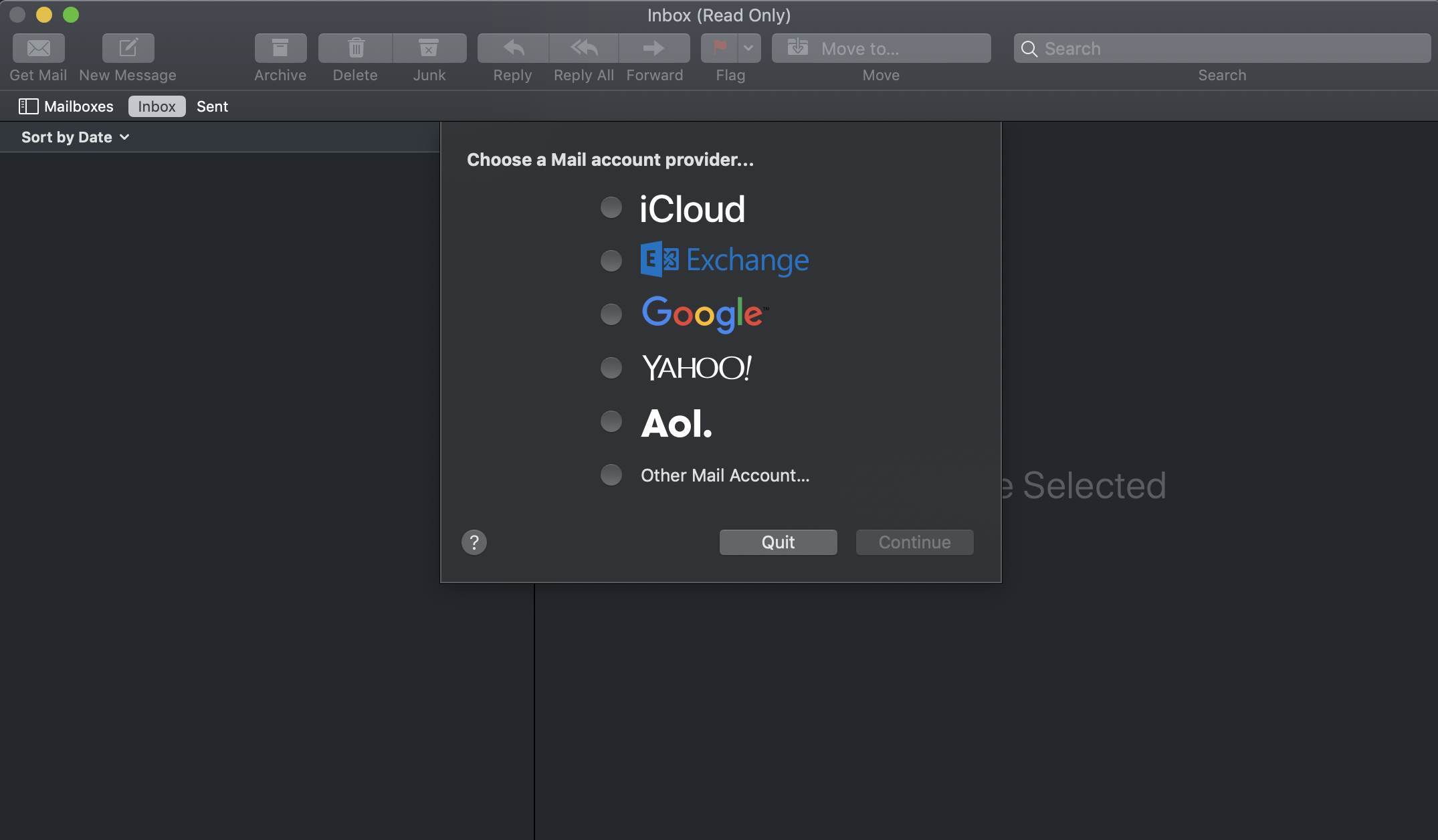
Prompting the user to set up an application they never use is far more effort than simply copy and pasting a URL into my preferred email client.
Choosing a share icon
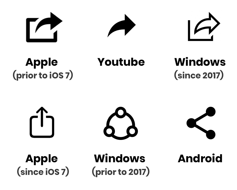
There is no universal standardized share icon — far from it. While the Android symbol might not be recognizable to long-term iPhone users, the iOS icon is problematic. It is identical to the download icon — but with the arrow in the opposite direction, which would imply uploading, not sharing.
Where I work at giffgaff, we polled 69 of our colleagues on whether they recognized the current iOS icon or the current Android icon as representing sharing. The Android icon was an overwhelming winner with 58 votes. While our sample did include iPhone users, some long-term iPhone users may not be familiar with this symbol (even though it has been adopted by some websites). Then there is the forward arrow, an icon that was abandoned by Apple, but adopted elsewhere. Reminiscent of the icon for forwarding an email, this symbol has been made recognizable by its usage on youtube.com. The icon was adopted by Microsoft in 2017 after A/B testing found a high level of familiarity.
It’s also possible to take a contextual approach. Twitter will change the icon used depending on the platform of the user. This approach is also taken by the icon library Ionicons.

Given the lack of a universally understood icon, this seems like a good approach. Alternatively, make sure to include a label alongside the icon to really spell things out to the user.
The post UX Considerations for Web Sharing appeared first on CSS-Tricks.