Web Designs That Feel Like Ancient History, but Are More Recent Than You Think
Publikováno: 12.12.2018
Flickr announced not long ago that they are limiting free accounts to 1,000 photos. I don't particularly mind that (because it seems like sound business sense), although it is a bit sad that a ton of photos will be nuked from the internet. I imagine the Internet Archive will swoop in and get most of it. And oh hey, the Twitter account @FlickrJubilee is showcasing Flickr users that could really use a gifted pro account so their amazing photos are …
The post Web Designs That Feel Like Ancient History, but Are More Recent Than You Think appeared first on CSS-Tricks.
Flickr announced not long ago that they are limiting free accounts to 1,000 photos. I don't particularly mind that (because it seems like sound business sense), although it is a bit sad that a ton of photos will be nuked from the internet. I imagine the Internet Archive will swoop in and get most of it. And oh hey, the Twitter account @FlickrJubilee is showcasing Flickr users that could really use a gifted pro account so their amazing photos are not lost, if you're feeling generous and want to contribute.
This change doesn't affect pro accounts. I've been pro forever on Flickr, so my photos were never at risk, but the big change has me thinking it's about time to spin down Flickr for myself. I've been keeping all my photos on iCloud/Photos for years now anyway so it seems kind redundant to keep Flickr around.
I went into the Flickr settings and exported all my photos, got a bunch of gigabytes of exported photos, and loaded them into Photos. Sadly, the exported photos have zero metadata, so there will forever be this obnoxious chunk of thousands upon thousands of photos in my Photos collection that all look like they were taken on the same day and with no location.
Anyway, that was way too long of an intro to say: I found a bunch of old website screenshots! Not a ton, but it looks like I used Flickr to store a handful of web designs I found interesting in some way a number of years back. What's interesting today is how dated they look when they were created not that long ago. Shows how fast things change.
Here they are.
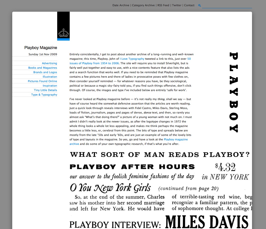
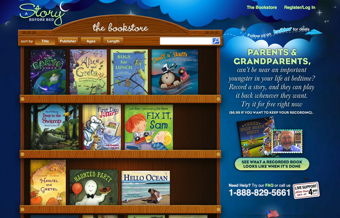

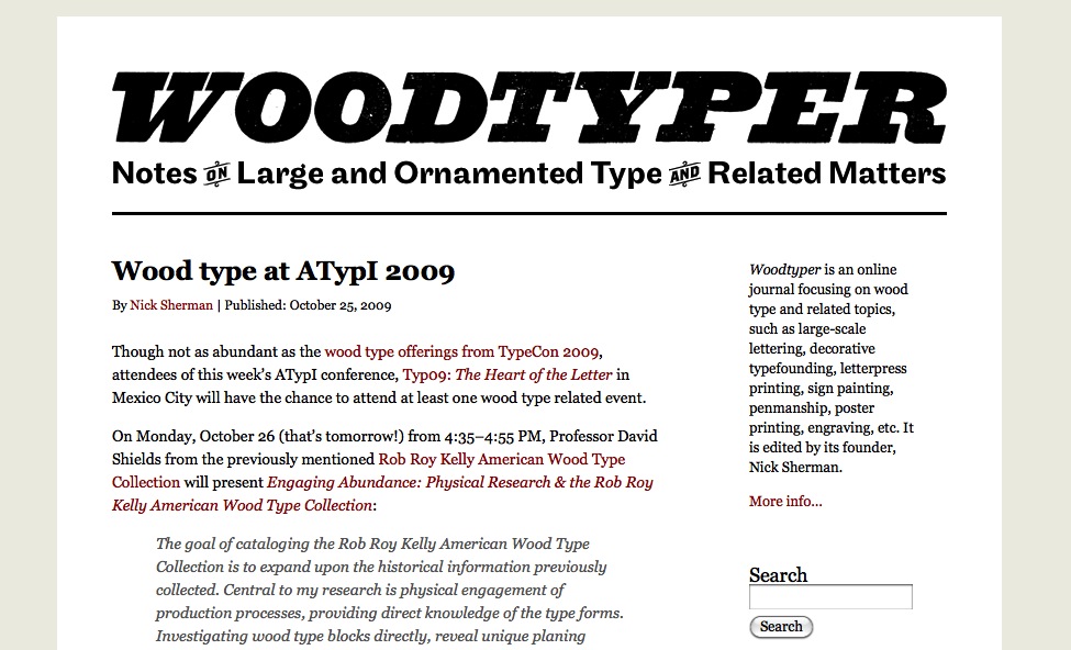

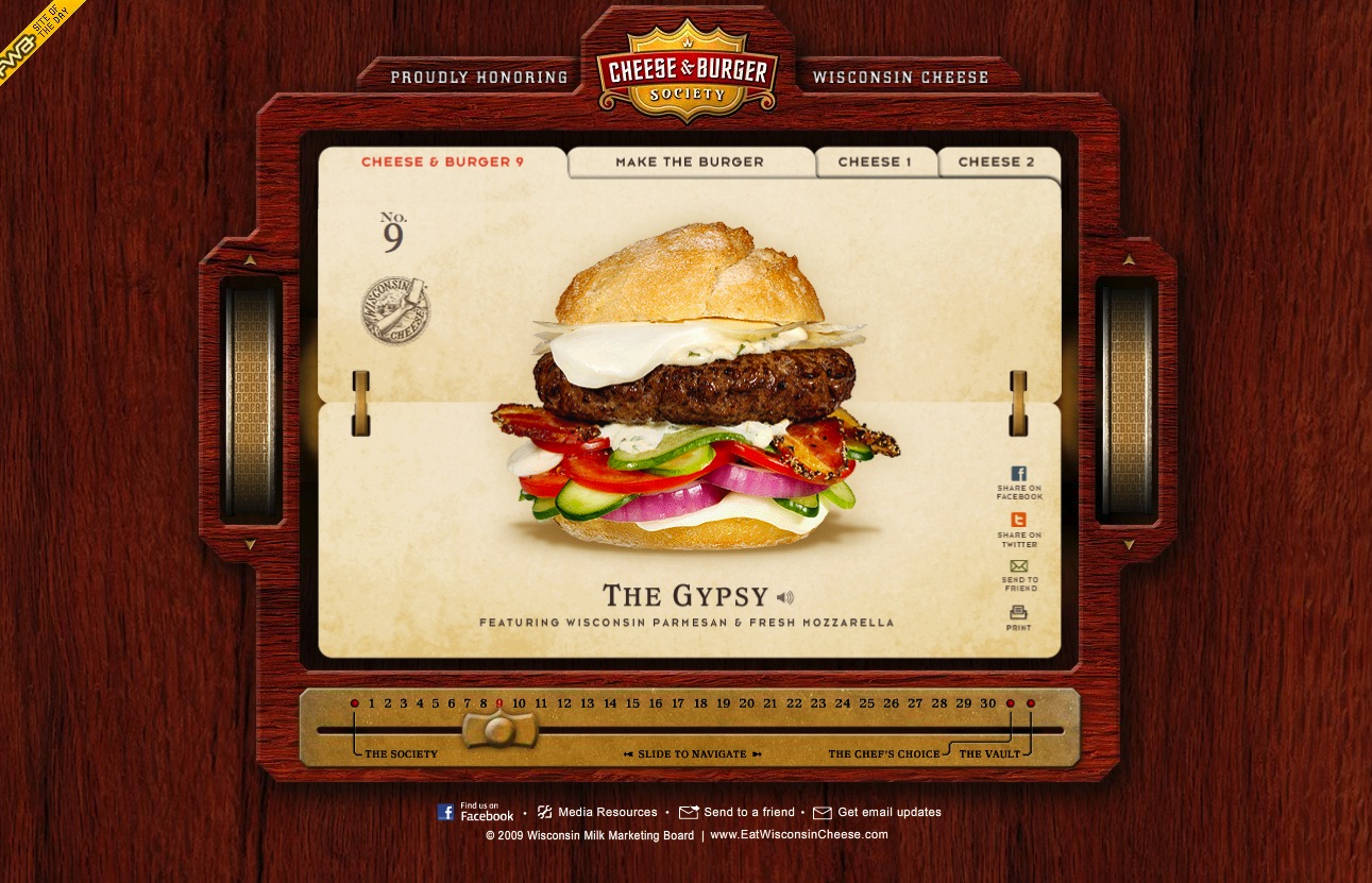
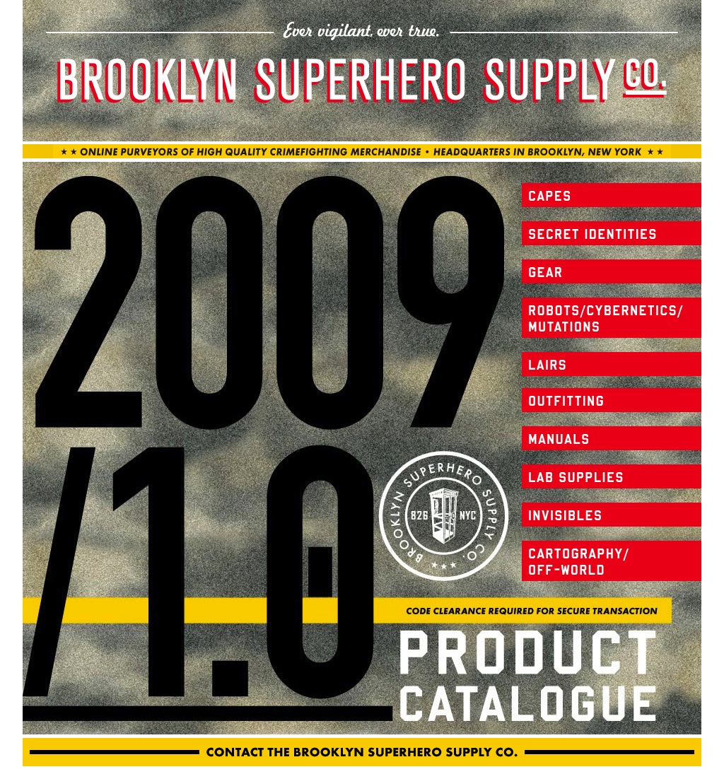
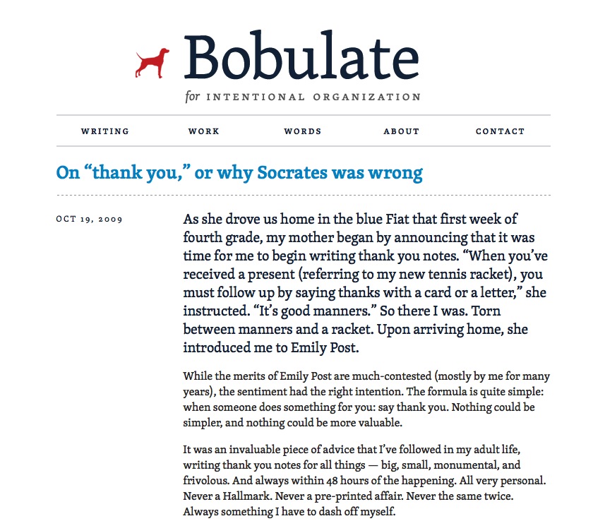
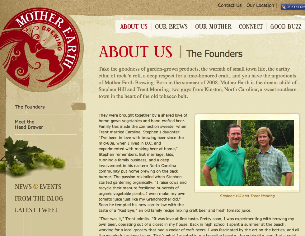

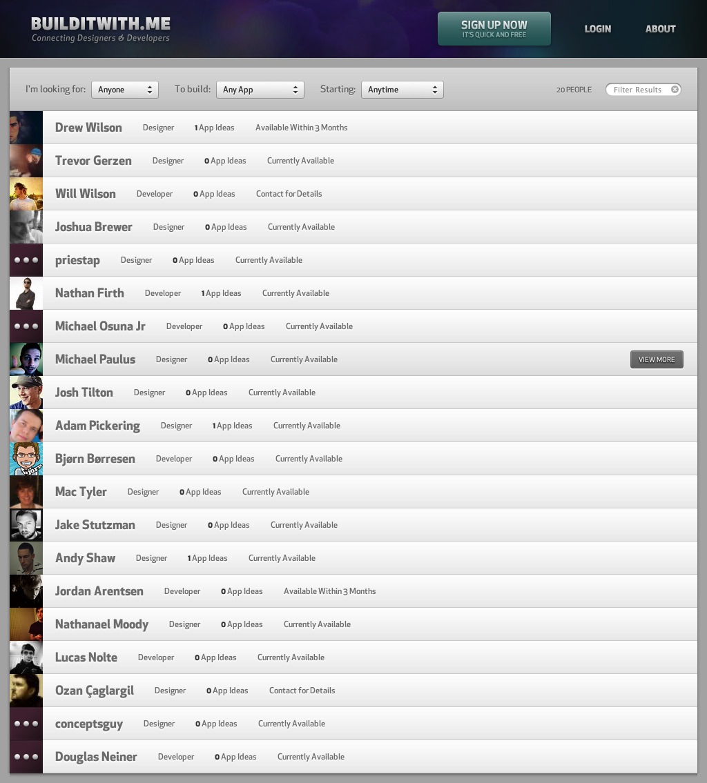
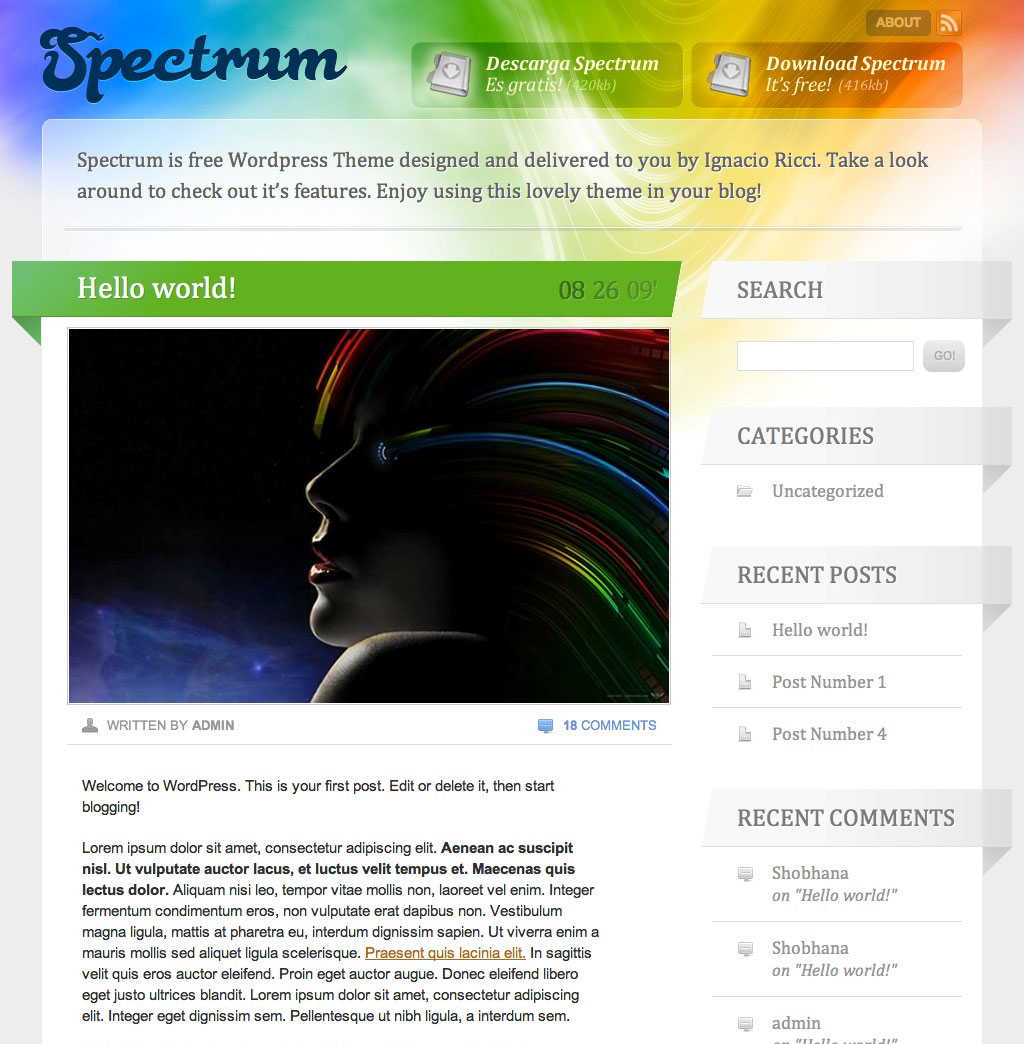

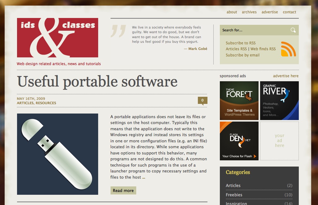
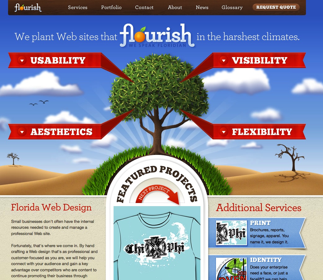

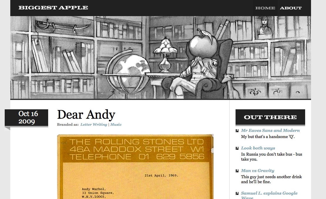
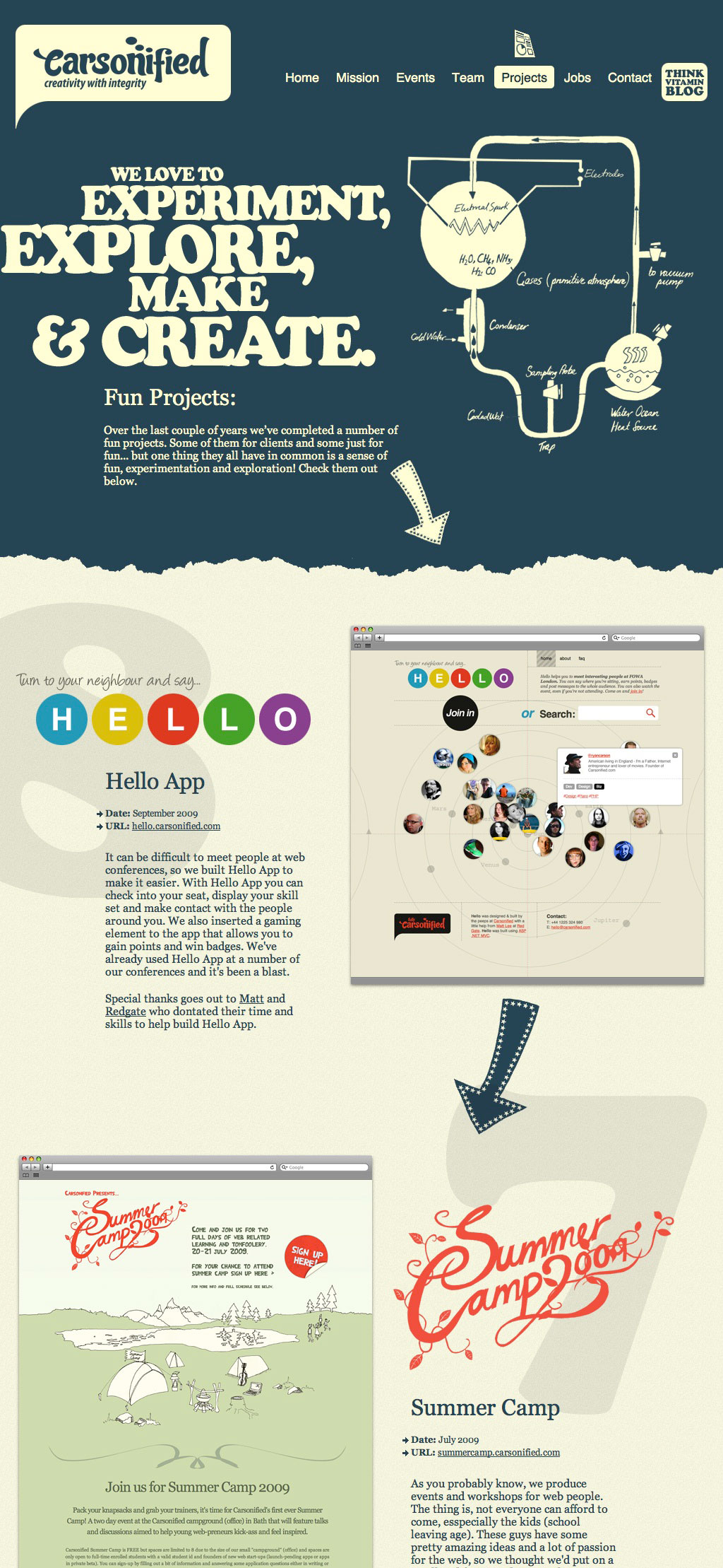
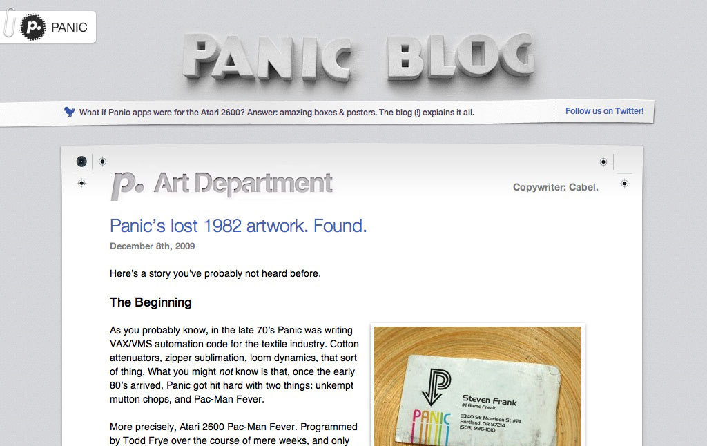
It's not terribly surprising to me to hear people push back on the same-ness of web design these days, and to blame things like frameworks, component-driven architecture, and design systems for it. It wasn't long ago when it seemed like we were trying harder to be fancy and unique with our designs — things like shadow treatments, reflective images and skeuomorphic enhancements. I don't mean to make sweeping generalizations here... merely a difference between what we considered to be boring and fancy work back than compared to now, of course.
The post Web Designs That Feel Like Ancient History, but Are More Recent Than You Think appeared first on CSS-Tricks.