Why, How, and When to Use Semantic HTML and ARIA
Publikováno: 7.5.2019
Semantic HTML and Accessible Rich Internet Applications (ARIA) help create interfaces that work for everyone in the most performant, robust, and simple way possible. They add essential meaning to your content, which lets web browsers, search engines, screen readers, RSS readers, and ultimately users understand it.
And yet, many people still don’t use them. I wanted to know why, so I set up a Twitter poll. The most common reason people gave was a lack of awareness and understanding … Read article
The post Why, How, and When to Use Semantic HTML and ARIA appeared first on CSS-Tricks.
Semantic HTML and Accessible Rich Internet Applications (ARIA) help create interfaces that work for everyone in the most performant, robust, and simple way possible. They add essential meaning to your content, which lets web browsers, search engines, screen readers, RSS readers, and ultimately users understand it.
And yet, many people still don’t use them. I wanted to know why, so I set up a Twitter poll. The most common reason people gave was a lack of awareness and understanding of the benefits of using semantic HTML and ARIA.
Let’s look over the benefits of using HTML and ARIA, why starting with semantic HTML is the way to go, and why ARIA ought to come in as a last resort.
Starting with raw text
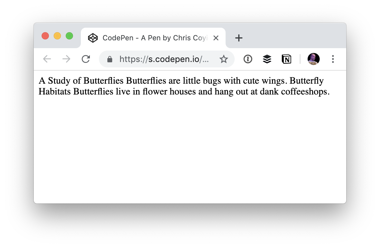
The <body> element of an HTML document contains the main content a user sees on a page. If content is put inside the body without any additional elements, the browser has no way of differentiating between different types of content, like paragraphs and headings.
<body>
A Study of Butterflies

Butterflies are little bugs with cute wings.

Butterfly Habitats

Butterflies live in flower houses and hang out at dank coffeeshops.
</body>
If the browser can’t differentiate between pieces of content, then it can’t present that content to the user in a meaningful way. That means:
- We can’t style the headings differently from paragraphs.
- It’s harder for search engines to interpret the content, meaning it’s likely to rank poorly and be difficult for users to find.
- Screen readers and other assistive technology can’t communicate it properly to the user.
Not to mention, it’s more than a bit awkward visually:
Adding some structure with HTML
To provide some structure we could wrap the lines of text here in divs like this:
<div>A Study of Butterflies.</div>
<div>Butterflies are little bugs with cute wings.</div>
<div>Butterfly Habitats</div>
<div>Butterflies live in flower houses and hang out at dank coffeeshops.</div>
This is slightly better because each piece of content is displayed in the browser on its own line instead of one long unbroken line of text.
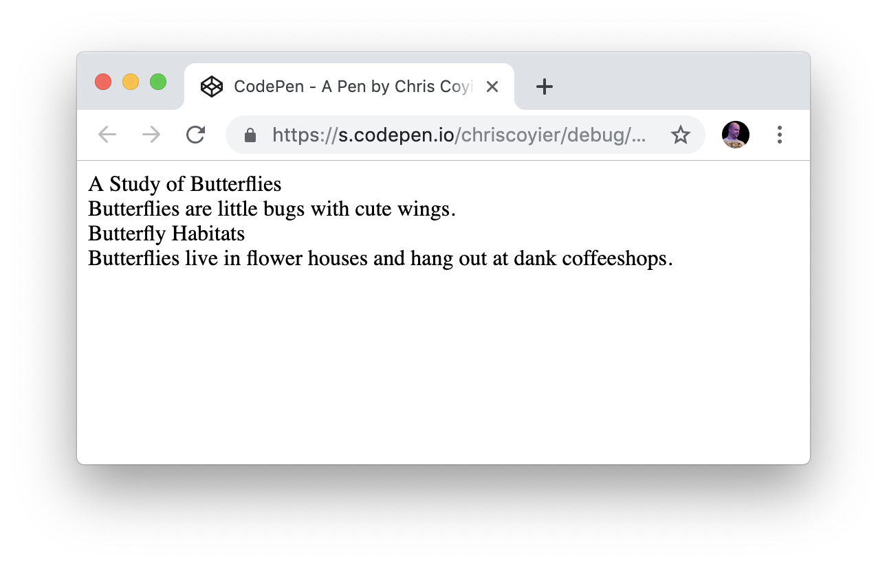
But there’s still a distinct lack of meaning.
Which are headings and which are paragraphs? It’s hard to tell, and impossible for assistive technology to determine. That’s because the headings and paragraphs are wrapped in divs which are meaningless on their own. In this example, browsers, CSS, search engines and screen readers are still none the wiser.
Communicating meaning with styles
We could add styling to the divs because they can be targetted with CSS. This lets us improve the visual appearance to provide meaning, context, and hierarchy.
See the Pen
Non-Semantic HTML Demo by Geoff Graham (@geoffgraham)
on CodePen.
Here the CSS targets the first and third divs to apply heading styles. This isn't maintainable because another paragraph added afterward, for example, would get styled as a heading.
We could give each div a unique attribute such as an ID or class name, to give us more styling control, like this:
<div class="heading1">A Study of Butterflies</div>
<div class="paragraph">Butterflies are little bugs with cute wings.</div>
<div class="heading2">Butterfly Habitats</div>
<div class="paragraph">Butterflies live in flower houses and hang out at dank coffeeshops.</div>
I explain why you should use classes instead of IDs for styling in my online book, MaintainableCSS.
Now we can target the different elements with CSS like this:
.heading1 { /* styles here */ }
.paragraph { /* styles here */ }
.heading2 { /* styles here */ }
While this approach is a little better, it only communicates meaning for sighted users. It doesn't provide meaning to search engines, RSS readers and screen readers. In other words, it’s not semantic and not very accessible as a result.
Introducing semantic HTML
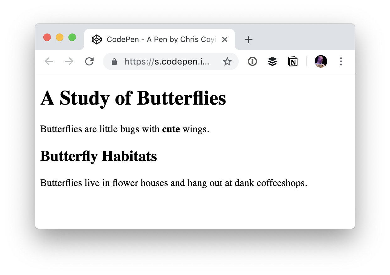
HTML provides many elements that are designed to give meaning to content, including elements for headings and paragraphs. So, instead of relying on divs with classes named by the developer, we can use predefined HTML elements instead.
<h1>A Study of Butterflies</h1>
<p>Butterflies are little bugs with cute wings.</p>
<h2>Butterfly Habitats</h2>
<p>Butterflies live in flower houses and hang out at dank coffeeshops.</p>
Much better! With semantic HTML like this, the content will inherit default styles from the browser (akaUser Agent). We can even use other semantic HTML elements, like <b> which tells the browser to “bring to attention" by making text bold.
Crucially, using semantic HTML also means:
- We can use CSS to add our own styling.
- Search engines can index the content so that it ranks well enough that users can find it.
- RSS readers can parse and style the elements appropriately.
- Screen readers and other assistive technologies can communicate elements properly to the user.
While it’s not massively important in these short examples, the code is also more concise which makes a big difference when considering an entire site.
Semantic HTML is standards-based and stable. This means any HTML processor in the future will be able to understand it and present it correctly to users. It will also help subsequent code authors if they need to make changes.
Additional benefits of semantic HTML
In addition to the benefits we’ve covered so far, some browsers add useful enhancements to semantic HTML for free.
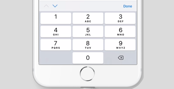
For example, using the HTML telephone input (<input type="tel">) will give users a telephone-specific keypad on some mobile browsers.
Other browsers give users the option to switch to a simplified view of the page, like Safari’s Reader Mode. Without semantic HTML, Reader Mode would produce something much like the one-line string of text we started with. But, by using semantic HTML, we get a clean reading experience without any additional styling on our end:
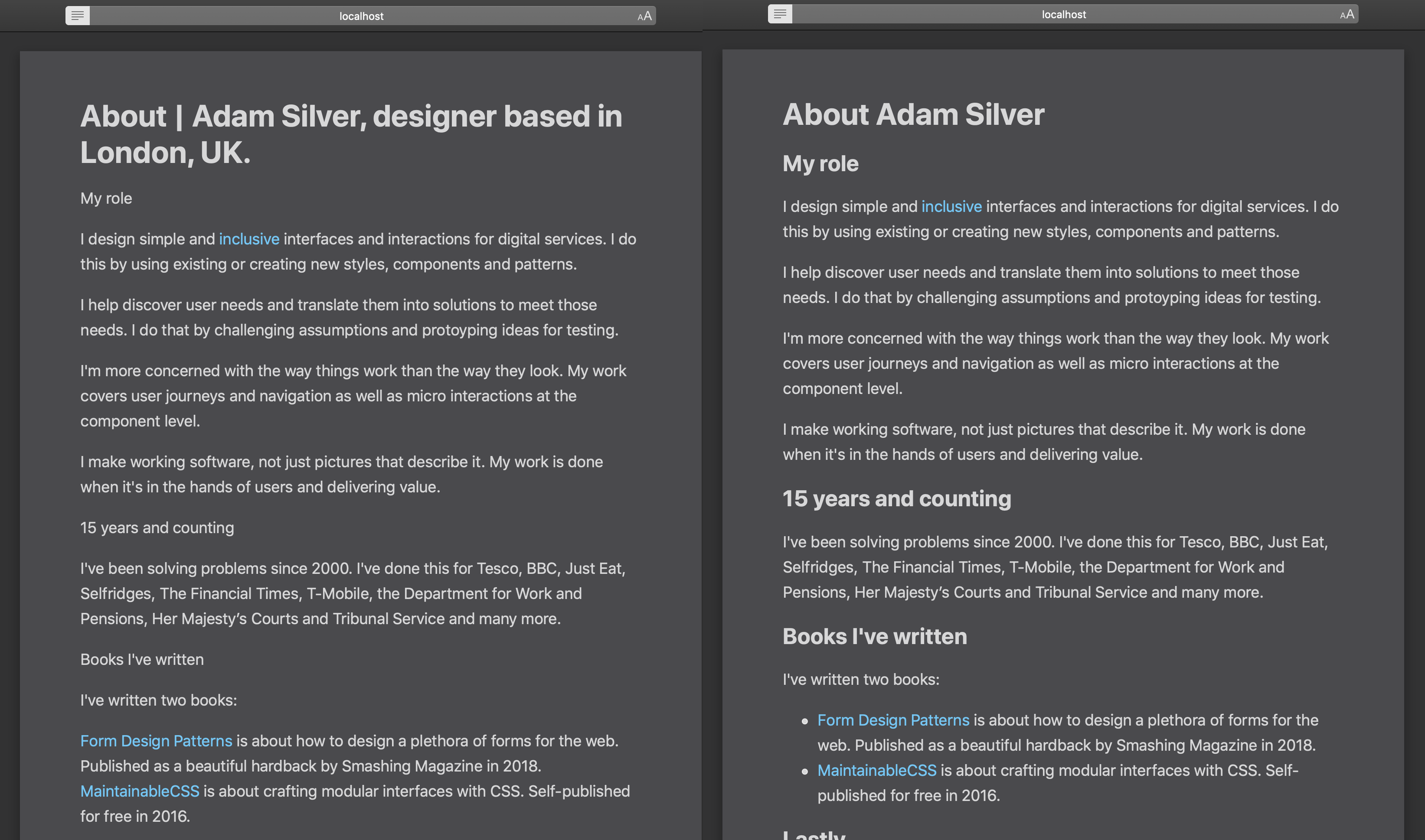
You can read more about this in Mandy Michael’s article on building websites for Safari Reader Mode and other reading apps.
When ARIA makes things better
Like semantic HTML, ARIA is a W3 standard that helps make interfaces more accessible to people who use screen readers and other assistive technologies to consume content.
Error messages are a good example. If a user leaves a required form field blank, the HTML for the error might look like this:
<label for="first-name">First name</label>
<span>Enter your first name</span>
<input type="text" name="first-name" id="first-name">
A sighted user will be able to see the error above the field. But when a screen reader focuses on the input, the error won’t be announced because the error message isn’t linked to the input.
ARIA can be used to associate the error with the input like this:
<label for="first-name">First name</label>
<span id="first-name-error">Enter your first name</span>
<input type="text" name="first-name" id="first-name" aria-describedby="first-name-error">
Now the error message is announced when the input is in focus.
Using ARIA and JavaScript together
ARIA is most useful when JavaScript is involved. JavaScript is usually required to create more complex and dynamic interactions like hiding, showing and changing elements without a page refresh. Think toggle menus, accordions, tabs, auto-completes, sortable tables, loading content and saving, sending or getting data. Enhancing interfaces like this often breaks the experience for screen reader users.
Take a button that, when selected, reveals other content. In the original state, a sighted user will initially see a button and no content and, when the button is clicked, the content appears.
A visually-impaired user with a screen reader, however, usually relies on spoken cues as they navigate through an interface. But when a screen reader focuses on the button, there’s nothing to tell it if the content is currently in view and needs to be read.
The aria-expanded attribute can be added to the button, and JavaScript can toggle its value between true (content is showing) and false (content is hidden). This helps to meet Inclusive Design Principle #1, provide a comparable experience to screen reader users.
<button aria-expanded="false">Toggle content</button>
<div hidden>Some content</div>
Try to avoid using ARIA to fix unsemantic HTML
ARIA attributes can be used to make unsemantic HTML more accessible to screen reader users. For example, a developer who is struggling to style a native checkbox across multiple browsers might decide to use a div and some JavaScript to emulate one.
We can add a role of checkbox to make the div identity itself as a checkbox to screen reader users:
<div role="checkbox"></div>We must also use the aria-checked attribute to indicate whether or not the checkbox is checked like this:
<div role="checkbox" aria-checked="false"></div>But, this still isn’t enough to make it behave like a checkbox because divs aren’t focusable by keyboards like <input type="checkbox"> is. We could make them focusable by adding tabindex="0":
<div role="checkbox" aria-checked="false" tabindex="0"></div>But even then, a real checkbox, when submitted as part of a form, will send its value. Because this isn’t an actual a checkbox, it won’t submit its value without using JavaScript.
And if that weren’t enough already, users can check or un-check a real checkbox by pressing the Space key. And, the form the checkbox belongs to can be submitted by pressing Enter when the checkbox is in focus. But the div-version checkbox won’t do this without even more JavaScript.
Not only is this more work and more code, but the approach only actually works for people who use technology that understands these particular ARIA attributes. That’s a lot of effort, a lot of code and a lot of problems that we can avoid entirely if we just use semantic HTML:
<input type="checkbox">There’s no denying that ARIA is useful in certain situations, but starting with semantic, accessible HTML where possible is infinitely simpler and more reliable. That’s why the first rule of ARIA is not to use it.
Conclusion
Inclusive design is about providing the best possible experience to the broadest range of users. Semantic HTML helps technologies and therefore users understand content on the web. Enhancements offered by some browsers and devices mean that users get an even better experience baked in.
And when semantic HTML alone is not enough on its own, ARIA can provide more context for users of assistive technologies, but use it with caution. It's not a hard and fast cure for unsemantic markup and can become complicated, as we saw in that last example.
In short, do the hard work to make things inclusive. It’s a win for you and a win for the web.
The post Why, How, and When to Use Semantic HTML and ARIA appeared first on CSS-Tricks.